The wine industry has started to move away from the tradition of distinguished, stately wine labels and is trending towards the more youthful, out-there labels commonly employed by craft beers.
As consumers become more familiar with seeing these labels on their local bottle shop shelves, as well as on their hip inner-city café tables, they are coming to expect their wine labels to follow suit.
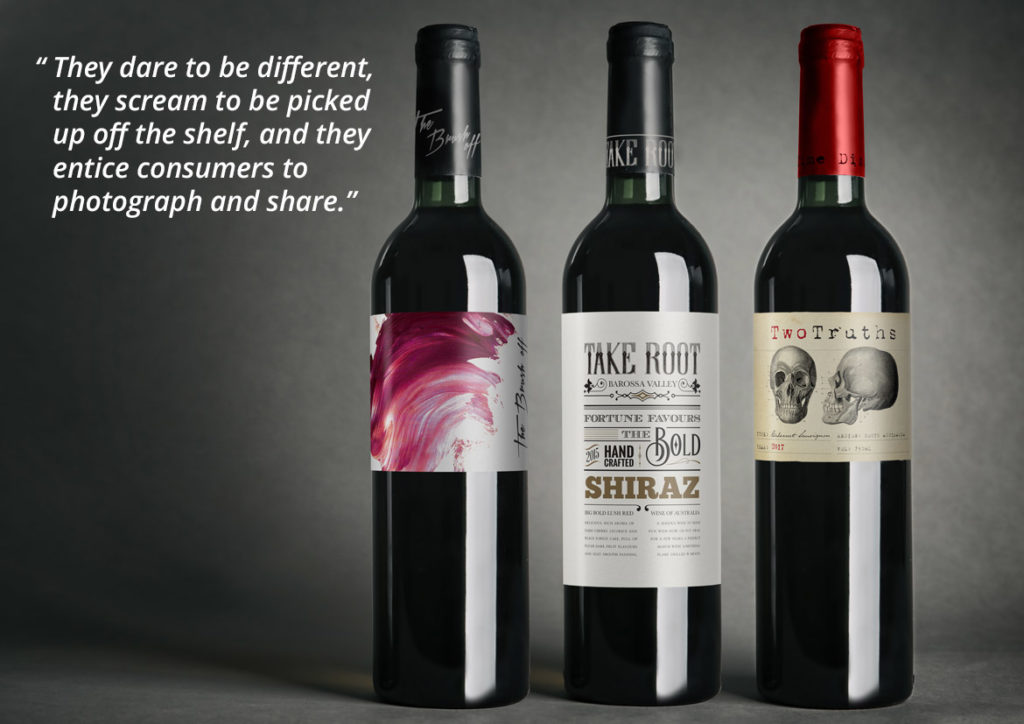
There are two key trends that have emerged as a result of this shift. The first are labels that are dominated by typography, lending a vintage, yet quirky feel. This was a trend that ignited about 10 years ago but quickly disappeared. It is now making a strong and decisive come back.
The second key trend is wine labels that don’t look like wine labels. They carry no distinguishable wine information on the front label and are primarily image driven. They dare to be different, they scream to be picked up off the shelf, and they entice consumers to photograph and share.
These shifts are already happening, with key markets being the UK, USA and China. If you’re interested in hearing more about these current wine label trends, as well as benefiting from John Jewell Design’s in depth understanding of the industry, contact the team on 02 6040 4433.
