June 2017
14/06/2017
Owning the Shelf
The wine can’t speak for itself when it’s sitting on a bottle shop shelf. It needs something to speak for it and that something is the wine label. Bottle shop shelves are a study in trying to be noticed, a plethora of options all screaming “Pick me! Pick me!” They’re all there for the same reason, and they’re all competing against each other to be the lucky one that ends up in the customer’s hands. So how do you make your label stand out from the masses?
How do you make your label stand out from the masses?
Good design is crucial, to the point now where it’s a moot point. Of course it’s important. No one sets out to emblaze their wine bottle with a label that they don’t think is worthy. But sometimes good design alone is not enough.
So if it’s not just design, what else is there in the ‘first-impressions last’ world of the bottle shop? The answer lies in the label itself. The stock, the print, the embellishments, they matter, and they all make a difference.
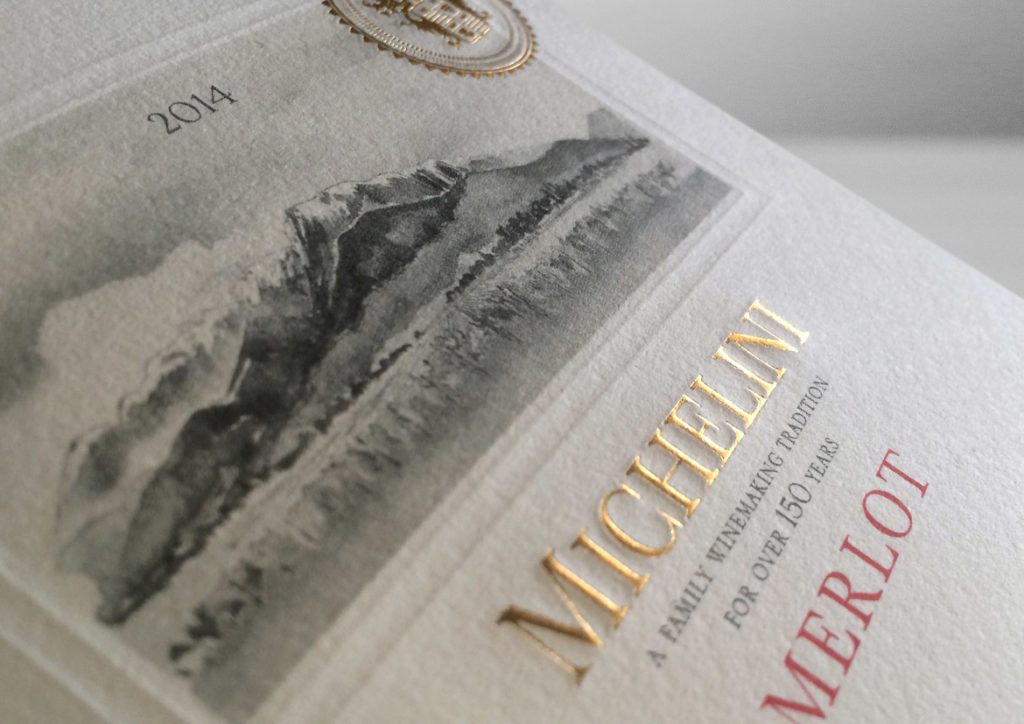
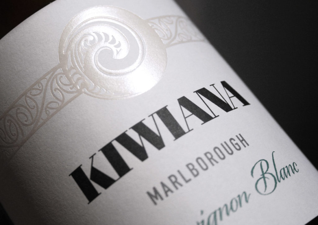
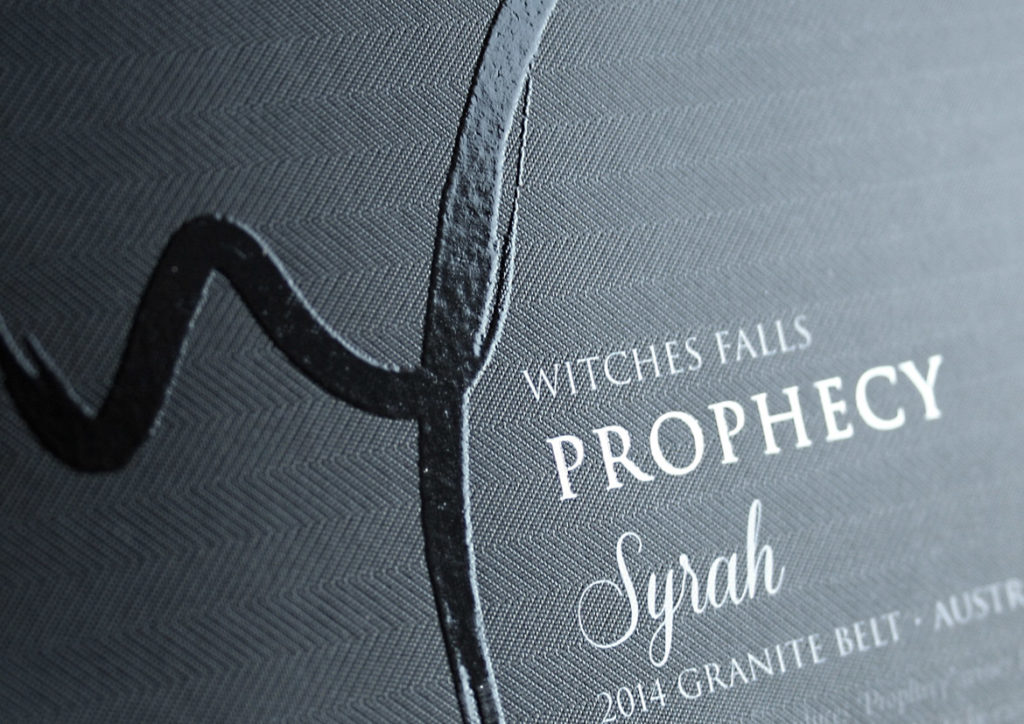
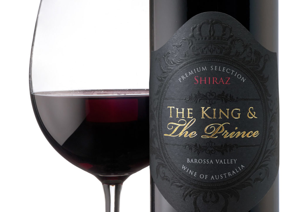
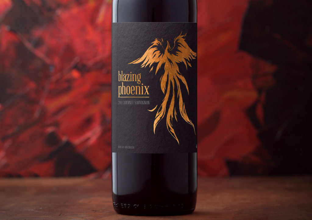
Picture two labels side by side with the same great design. Now imagine one is a standard print, nothing fancy – just ink on paper – whereas the one next to it utilises some strategic embossing, some carefully placed foiling, some artfully applied spot gloss varnish and custom die-cutting. These two labels may boast the exact same design, but the latter is suddenly alive, it radiates light, it intrigues with it’s depth, it exudes luxury and it calls to the customer on a level that the plain label can’t compete on.
And herein lies the challenge for wine businesses looking to create new labels; they need a designer who not only understands the design, but who also understands how embellishments can truly bring each label design to life.
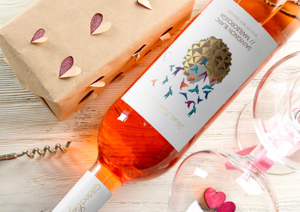
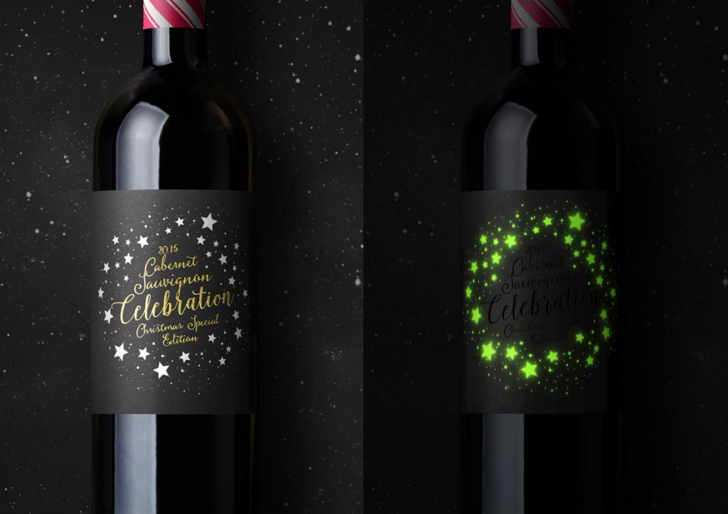
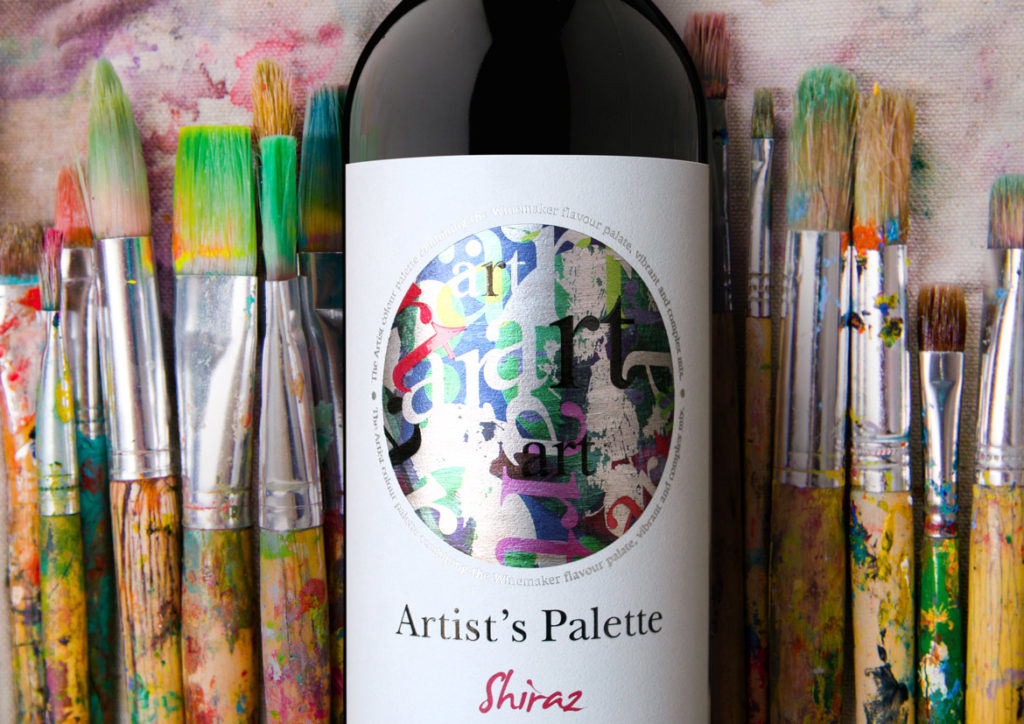
Embellishment options are many and varied and each has its place and purpose; custom die-cutting allows the label to break free from the standard straight-edged mould, offering graceful curves and design hugging edges. And if die-cutting breaks free from the mould then screen printing directly onto the bottle completely breaks the mould, removing all constraints of traditional label printing and allowing complete freedom regarding placement. The use of varnish, either spot gloss or high build is a subtle but highly effective way to highlight key aspects of the label without being overt or gaudy, while foiling instantly lends an air of luxury through its use of metallic foils, most commonly gold and silver.
To make the most of these embellishments, the label needs to be designed with these options already in mind so that the label is created in tandem with its embellishments, the two working hand-in-hand to deliver a truly cohesive result.
So if you’re looking to create a new label and want a designer who knows the ins-and-outs of not only label design, but also label embellishments, contact the team.
