April 2014
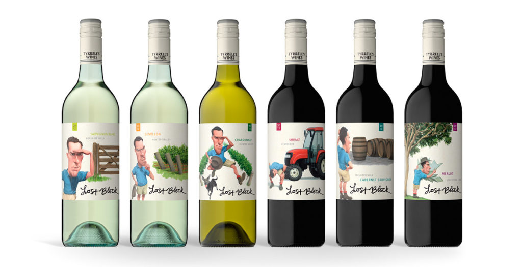
The strength of the new Lost Block labels lies in the distinctive and dynamic illustrations that were brought to life after months
of development.
The previous labels focused solely on typography, however when it came time to re-energise the brand, the brief given to the team at John Jewell Design
was to create a label that would appeal to a younger demographic while also conveying the story of the Lost Block in a contemporary fashion.
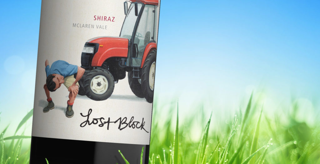
Illustration was key and months were spent on draft sketches to fine-tune the image of the Vineyard Manager, as his presence on each label would play an
integral role in tying the range together. A distinctive scenario was then created to distinguish each varietal, while still utilizing the same design
cues to ensure that each label worked together as part of a cohesive larger story.
Earthy tones were used to create the individual scenarios, whilst the distinctive blue of the vineyard manager’s shirt allows him and his ‘searching’ to
take center stage in each illustration.
To provide existing consumers of Lost Block with an easily identifiable link between the old and new labels, the original typography of the “Lost Block”
was preserved, and the Tyrrell’s name was incorporated into the capsule.
With bold illustrations and a fresh new face, this rebranding of one of Tyrrell’s flagship brands, re-energises it for a whole new generation of wine-lovers.
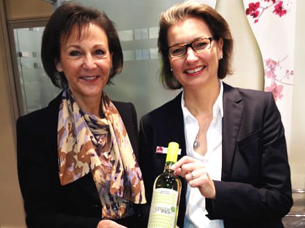
A word from Tyrrell’s…
What we wanted to achieve with this refresh was a more graphic depiction of the ”Lost Block” story, in an interesting and quirky way, we are very happy
with the final resultMike Cutrupi, Sales & Marketing Manager Tyrrell’s Wines
17/04/2014
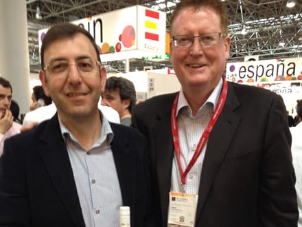
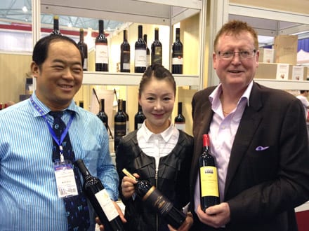
Prowein – March 2014
John travels have seen him recently return from Prowein in Germany and Chengdu Wine Show in China.
Prowein – Germany
John spent his time in Prowein catching up with our European clients, meeting with potential new ones and, with what little time he had left, exploring & researching the international market discovering new styles, trends & labelling techniques in the wine industry.

John’s discoveries will help John Jewell Design develop an extremely creative and varied style of labels whilst also focusing on developing a portfolio of BIB designs that are both revolutionary in the packaging and the imagery.
John also travelled extensively throughout Germany meeting with clients and printers.
It is always fascinating to see what the world is doing in wine and beverage packaging and discovering new wine trends like the “Hugo” brands in Germany and the raft of fruit wine blended products in the market in Europe. It is particularly gratifying to see the explosion of Prosecco sparkling styles now available John Jewell
John also found a number of brilliant printers in Germany that can produce the packaging that the John Jewell Design team needs to be able to satisfy our creative desires. There are some exciting design developments on the horizon.
16/04/2014
Chengdu Wine Show – China
Chengdu Wine Show was a first for John and what an eye opener it was. With the help of Tyler John toured the show every day along with the other 100’000 people.
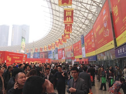
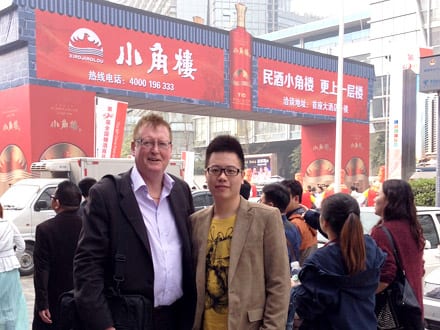
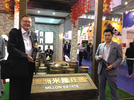
Claustrophobic but fun John Jewell
