March 2015
04/03/2015
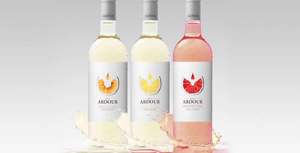
New Work: Fruit Ardour Wine Label Design
Fruit wine is the rising star of the wine market and with it comes the challenge of simultaneously appealing to a new-style of wine drinker, while also engaging the seasoned palate.
This new wave of wine is recognizable by its colourful and fun labels. The design challenge is to harness this youthful exuberance while simultaneously appealing to the traditional wine connoisseur. With Fruit Ardour, the brief was to develop a label that had strong wine cues, delivering a more serious offering whilst still emphasising the fruit aspect.
This brief was achieved primarily through the sophisticated and subtle use of colour and white space. The simple, uncluttered white background is reminiscent of high-end wine labels, whilst the singular use of colour delivers easy varietal differentiation without heading into “juice box” territory. Silver capsules provide continuity across the range, and add to the sophisticated finish.
The central graphic represents both wine being poured into a glass, as well as a geometric visual of the specific fruit, further emphasising the fruit connection but doing so within the domain of wine.
The resulting labels effortlessly combine the best of traditional wine with the modern vibrancy of fruit wines.
