June 2015
08/06/2015
The Impact of a Wine Label

Why are labels so important to our wine-buying choices?
In a busy bottleshop, where shelves are crowded and the choice can be overwhelming, it’s not the winemaker’s resume or even the price that will sell your wine. Learnings from consumer psychology tell us that most wine sales are made purely on the strength of a label.
The reality is most consumers aren’t connoisseurs; they are customers looking to buy an experience.
What their searching eyes see on your wine label lays the foundations for that experience. Purposeful and carefully crafted visual cues subtly influence perceptions of price, quality and even taste.
To encourage a hand to reach deeper into their pocket, consumers expect to see labels that feature minimalist, uncluttered designs and an elegant, refined font. Adding texture – such as embossing – provides a tactile feature that activates increased perceptions of price and correlates with heightened anticipation and an increased drinking experience.
To sell a wine at a value-for-money price point, labels need to visually jump off the shelf through the careful construction of bright colours, bold, fun graphics and quirky or unique fonts.
At the end of the day, your label sets the tone for your customer’s experience and is often as important – if not more important – in driving the sale than the wine itself.
John Jewell spends several months every year traveling the world and acquiring insights into consumer psychology, preferences and trends to bring back home and translate into eye-catching, award-winning labels for his clients. If you have a label or brand that could benefit from John’s experience and knowledge, give him a call on: +61 (0)2 6040 4433 or send him an email.
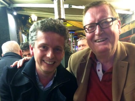
It’s already been a busy year for John, his passport and his ever-growing insights into emerging wine trends throughout the globe. John is undertaking shorter, more frequent trips to the UK and Europe so that he can be responsive in sharing his international knowledge with his valued clients.
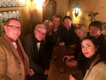
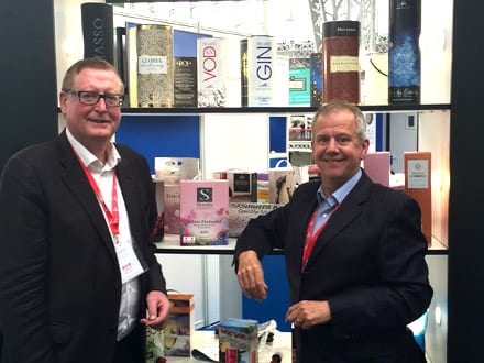
John recently attended ProWein in Dusseldorf Germany, which is now regarded as the biggest trading show in the world. John says…
Prowein is a fantastic opportunity for me to meet with as many international clients as possible in a concentrated period of time. These exchanges are incredibly productive and the resulting work often hits the office before I’m even back in the country.
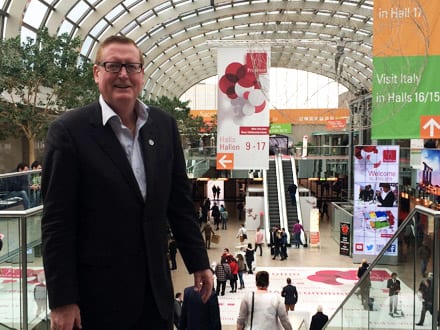
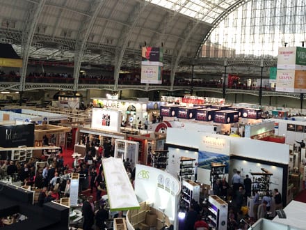
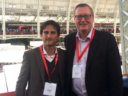
John was back in Australia for a few weeks after ProWein before heading off to the London Wine Fair, which he has participated in since 2002. This year saw him conduct six meetings a day, primarily with distributors. Regarding developments in the industry, John said…
It’s interesting to note the move towards trendy, quirky wine label designs in the U.K. I’ll be keeping an eye out to see how this develops further in the coming year.
John will be back for a total of 13 days before heading off again, this time to Vinexpo in Bordeaux. Stay tuned for further travel updates on this and subsequent trips.
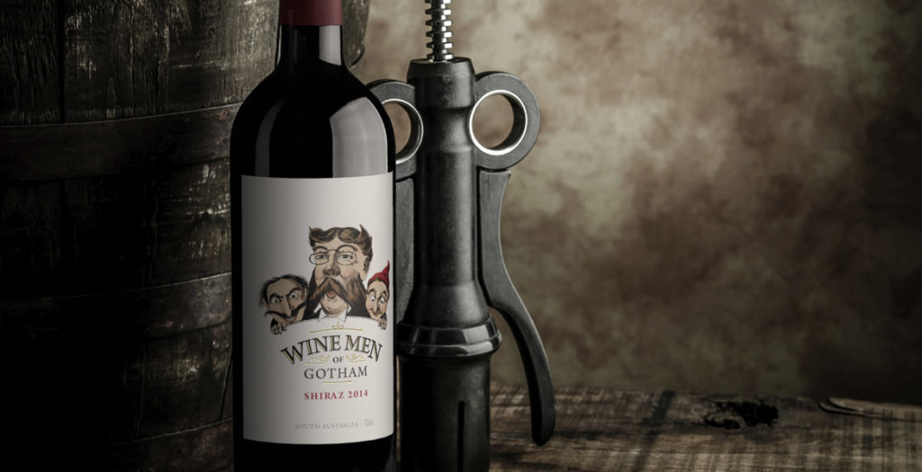
Rejuvenating the Wine Men of Gotham label was about finding a way to pull the existing label into the current market; the key to achieving this was colour.
The existing Wine Men of Gotham label had been in the market for a number of years and was ready for a facelift to ensure it stayed on course. The first task was to take the original black and white illustration and add colour in such a way that the design would feel fresh but still be recognisable. To ensure the illustration had stronger cut-through, the background needed to be stripped back to a crisp white, allowing the now coloured illustration plenty of white space to punch out of the label. Rather than being heavy-handed with varietal colours on the label, bold coloured capsules were used to reinforce individual varietals and make them easier to identify at a glance. This ensured the integrity of the label design was not compromised, but still achieved the varietal differentiation that consumers look for in the retail space. The rejuvenated Wine Men of Gotham label continues to project the same premium cues as the previous label, and also delivers a fresh new image that will see the brand stay relevant in the market for many years to come.
