April 2016
Often when we think of updating a label we imagine a complete overhaul with major changes to logo, layout, colour and typeface. This doesn’t always have to be the case though and sometimes the most effective label updates are those that require a subtle nip-and-tuck rather than an entire facelift.
The Challenge:
The Cranswick Estate label had provided eight solid years of service and whilst it was a solid performer, the march of time required certain updates be made to ensure relevancy in a busy marketplace, whilst still remaining true to the core elements of the original label.
The Solution:
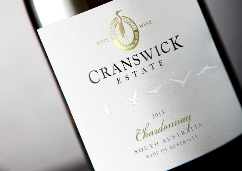
The first task was to identify the key elements that would be carried across to the new label – such as the crane motif and logo style – as well as deduce what new elements were to be incorporated to breathe freshness into the design.
To create a contemporary look, the die-cut lozenge made way for a straight label that immediately raised the tone of the whole design and set the scene for the changes to come. The crane image from the existing logo remained the same but the design was reworked from a solid-colour block into a gold foil portrayal that was both intricate and refined, and served to add premium quality cues.
The bird flight path was retained, however the background label colour was changed from white to a soft grey and the birds were then embossed and changed to white. With this new treatment, they were then moved into the middle of the label to give them prominence and ensure their new look was given plenty of room to fly off the label and grab consumer attention.
Finally, a subtle tweak was made to the varietal font to deliver a classic feel without straying too far from the original.
In Closing:
When a brand is strong and the imagery is still considered crisp and clean, only small changes need to occur to achieve a striking, contemporary update whilst still remaining true to the label that came before.
