January 2014
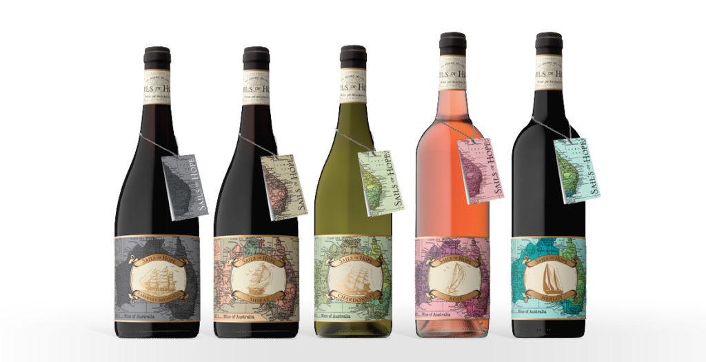
The ‘Sails of Hope’ label provided a unique opportunity for the team at John Jewell Design; create a heritage-style label, but give it a modern, youthful edge.
Starting with traditional ship illustrations and a request that the map of Australia should also be incorporated, our talented designer Bri was able to meld these elements with a lush, contemporary colour palette and a subtle use of rich, gold foil. What resulted was a label that spoke of history and tradition, whilst also portraying a youthful spirit. The clever use of colour allows the label to appeal to a broader audience, whilst still conveying a sense of prestige and quality.
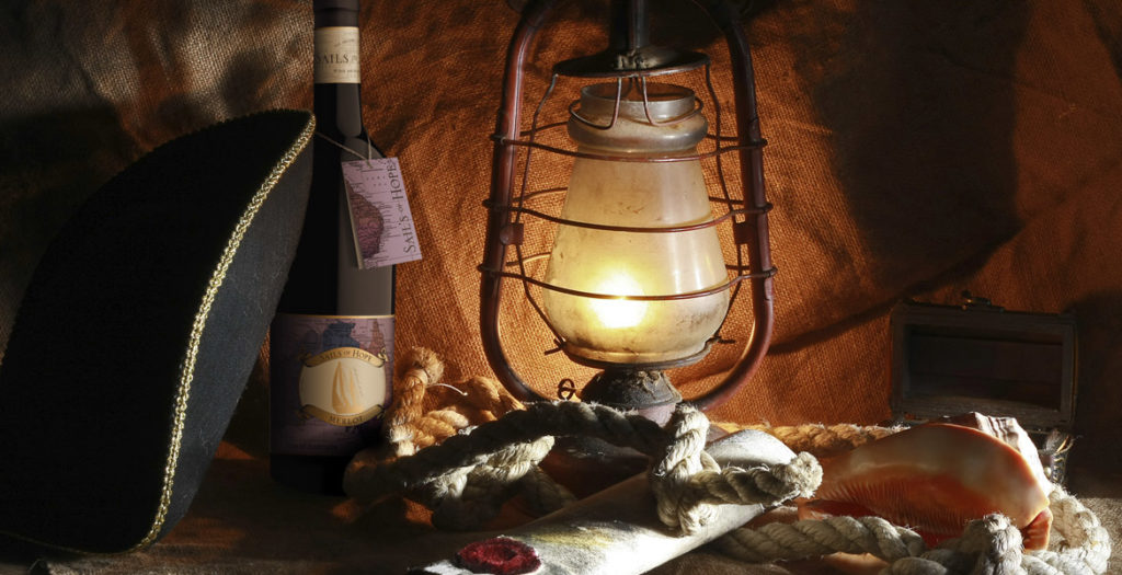
The addition of the neck tag was another important feature of the design. Its seamless integration into the packaging allows the label to remain uncluttered whilst still providing consumers with detailed region and tasting information. It acts to strength shelf presence, providing consumers with a point of difference and by design, it’s removable nature means it can be kept as a cue for repeat purchase.
A word from Mica Australia…
Once again, the team at John Jewell design have done a tremendous job of bringing to life our vision; creating unique, eye-catching labels for a new range of wines. They were professional, easy to work with and created labels that were very much in line with our design brief. We are more than impressed with the quality of the work produced.
Josh P Sawyer, Mica Australia