In: New Work
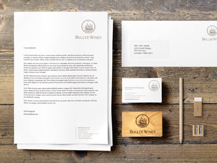
How do you tackle a rebrand when the current imagery is steeped in history and tradition? You look to the past to provide inspiration for the future. This is exactly what the John Jewell Design team did to deliver a refresh and relaunch of the Buller Wines winery and business…
What is Branding?
Branding is the art of imbuing a product with its own unique and authentic personality, making it attractive and memorable to new and loyal customers.
Who are Buller Wines?
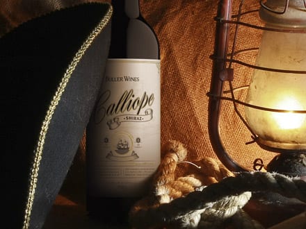
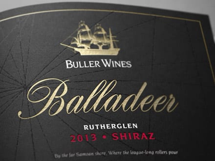
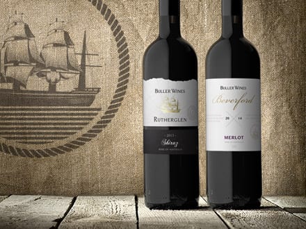
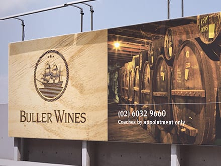
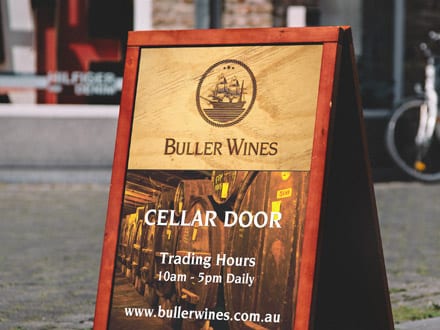
The Buller Wines story was born in the early 1920’s when Reginald Buller purchase a vineyard in Rutherglen and named it Calliope after the famed ship that survived against all odds in the 1880’s. The vineyards, the family and the wine brand continued to evolve through the years and in 2013 the Judd family took the helm and have continued its growth and success.
The Challenge
The Calliope ship is an integral part of the Buller Wines story and imagery however the existing illustration was in need of a modern refresh. Given Calliope was a real vessel the first challenge was to ensure that any new imagery stayed true to the appearance of the original ship. The second challenge was in delivering new imagery that could convey the history of the brand but in a contemporary style that would work successfully across both small and large format requirements.
The Solution
In tackling the rebrand, the John Jewell Design team knew where they had to start. They took the time to look back through the history books and unearthed a bold image of the Calliope, showing it at full mast with a strong, commanding presence.
The image was then skilfully illustrated to best represent the authenticity and integrity of the long established Buller brand and it was then integrated into the brand’s logo and rolled out across labels, printed and electronic collateral and advertising.
In Closing
Rebranding isn’t always about coming up with something new; sometimes it’s about going back to the beginning to draw inspiration for the future. This was definitely the case for the Buller Wine rebrand. To find out how John Jewell Design can help you breathe new life into your brand, contact us.
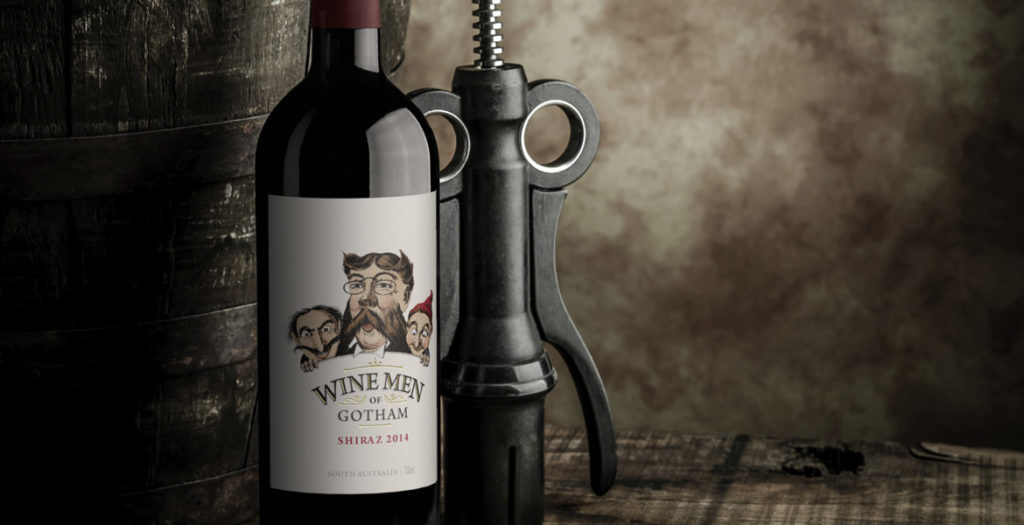
Rejuvenating the Wine Men of Gotham label was about finding a way to pull the existing label into the current market; the key to achieving this was colour.
The existing Wine Men of Gotham label had been in the market for a number of years and was ready for a facelift to ensure it stayed on course. The first task was to take the original black and white illustration and add colour in such a way that the design would feel fresh but still be recognisable. To ensure the illustration had stronger cut-through, the background needed to be stripped back to a crisp white, allowing the now coloured illustration plenty of white space to punch out of the label. Rather than being heavy-handed with varietal colours on the label, bold coloured capsules were used to reinforce individual varietals and make them easier to identify at a glance. This ensured the integrity of the label design was not compromised, but still achieved the varietal differentiation that consumers look for in the retail space. The rejuvenated Wine Men of Gotham label continues to project the same premium cues as the previous label, and also delivers a fresh new image that will see the brand stay relevant in the market for many years to come.
04/03/2015
New Work: Fruit Ardour Wine Label Design
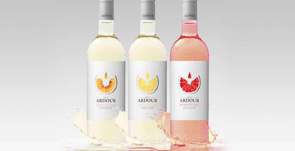
Fruit wine is the rising star of the wine market and with it comes the challenge of simultaneously appealing to a new-style of wine drinker, while also engaging the seasoned palate.
This new wave of wine is recognizable by its colourful and fun labels. The design challenge is to harness this youthful exuberance while simultaneously appealing to the traditional wine connoisseur. With Fruit Ardour, the brief was to develop a label that had strong wine cues, delivering a more serious offering whilst still emphasising the fruit aspect.
This brief was achieved primarily through the sophisticated and subtle use of colour and white space. The simple, uncluttered white background is reminiscent of high-end wine labels, whilst the singular use of colour delivers easy varietal differentiation without heading into “juice box” territory. Silver capsules provide continuity across the range, and add to the sophisticated finish.
The central graphic represents both wine being poured into a glass, as well as a geometric visual of the specific fruit, further emphasising the fruit connection but doing so within the domain of wine.
The resulting labels effortlessly combine the best of traditional wine with the modern vibrancy of fruit wines.
03/12/2014
New Work: Fractal Wine Label Design
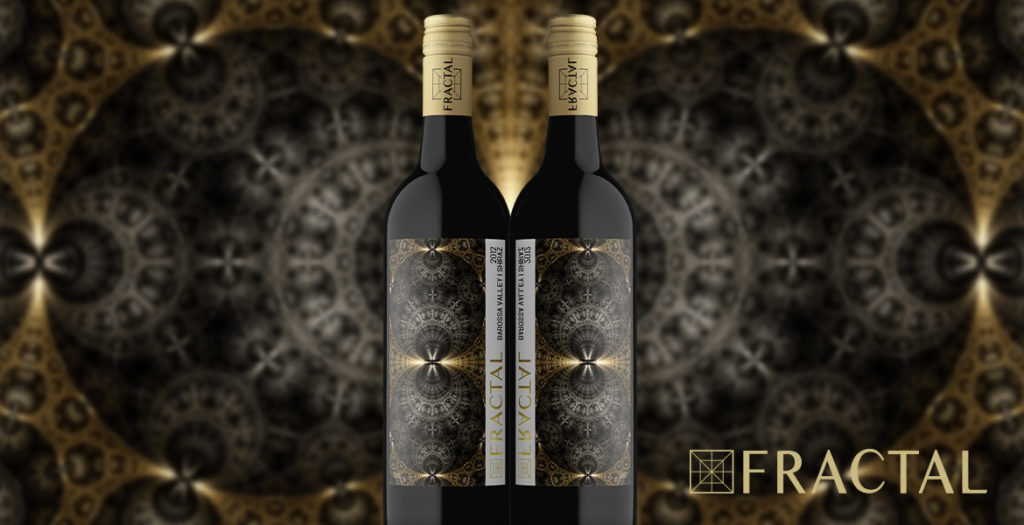
In creating the Fractal wine label, John Jewell Design was tasked with turning winemaker Bruce Clugston’s concept into reality. With a background in mathematics, Bruce was intrigued by fractal designs – structured mathematic formulae which give rise to beautiful patterns – and was searching for a way to utilise these captivating images on a wine label.
Bruce engaged the team at John Jewell Design, whose first task was to research fractal images and then search the globe for somebody who could produce the right designs utilizing this specific mathematical technique. A digital artist was finally located in the USA, and a consultative process began to source designs that best reflected the wines they would adorn.
The chosen images, once skilfully structured to work within the realm of a wine label, were then further enhanced by the use of fragmented foil, designed to give the patterns even more depth, as well as to illustrate the premium nature of the wines. In addition to the foiling, the packaging is further enriched by the use of gold and silver capsules. The final product is a stunning representation of Bruce’s initial vision and John Jewell Design’s knowledge and expertise.
If you’ve got an idea for a label and need the expertise of an award-winning design firm to help bring it to life, contact John Jewell Design.
A word from Bruce Clugston…
The fractal labels look amazing… They should win awards… Thank you to everyone.
Bruce Clugston, Wineinc
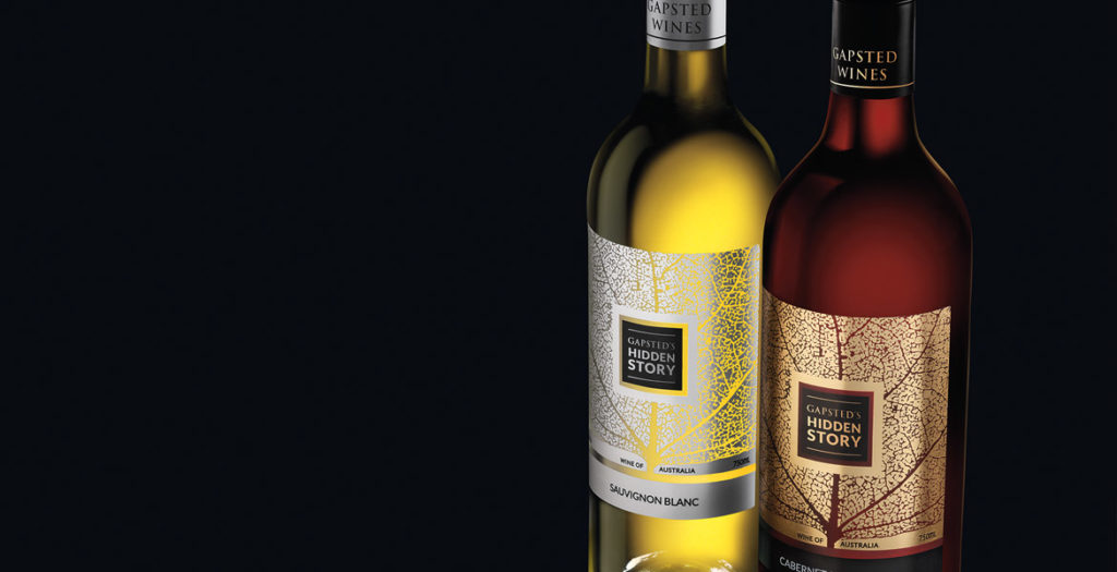
The innovation of the Hidden Story label lies in the combination and application of both paper, gold and silver foils on a clear adhesive label stock. This development for wine labels delivers a premium expensive look for a global market whilst still being cost effective for the client.
John Jewell Design devised the concept for the label, then sent the artwork to printing partners in Germany to prepare full-spec mock-ups for review. The print results were astounding and the overall concept achieved the brief of producing a label that would create maximum interest in a crowded retail environment, whilst delivering something not often seen in the industry.
The design’s objective was to convey the family lineage through a simple graphic representation. This was achieved twofold by illustrating the detailed veins of a leaf, which, upon further inspection, also depicts the silhouette of a tree. Both interpretations of the image symbolising the Gapsted Wines family tree.
So as not to detract from the powerful design, the branding was purposely kept to a minimum, and instead of producing a text heavy back label, a QR code is utilised, leading consumers to the Gapsted website for further information about the brand and the wines.
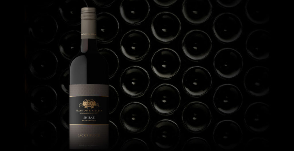
As times rapidly change, everything ages faster. Brand rejuvenation is an integral part of keeping your brand fresh and relevant to today’s consumers and can breathe life into a company, resulting in growth.
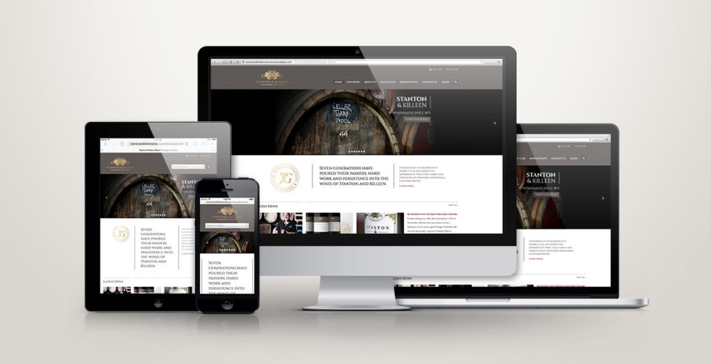
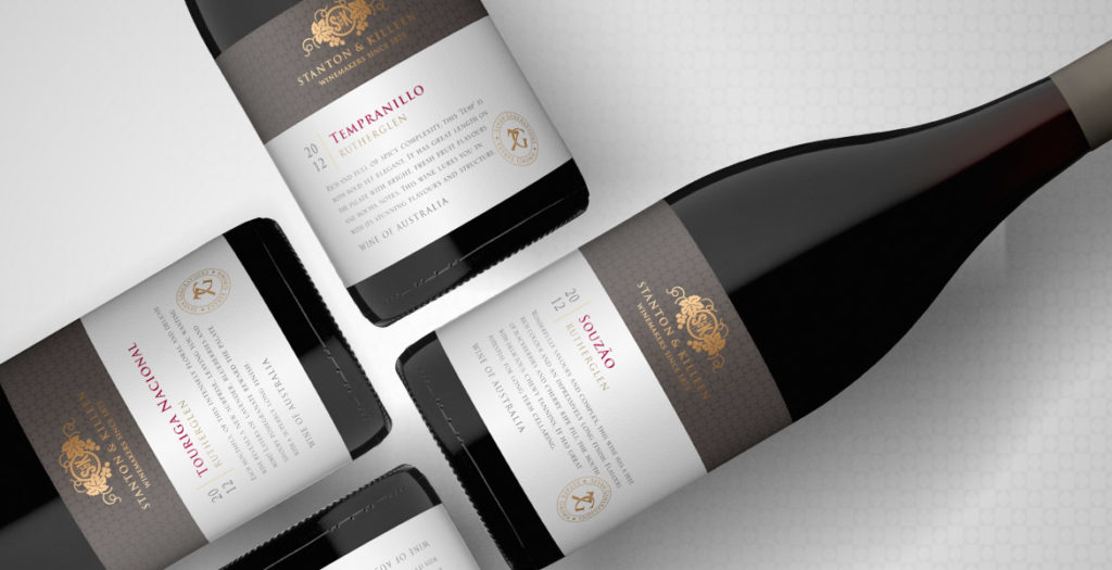
When updating the look and feel of an established brand, it is important to build on the brand’s heritage, to improve on their strengths and appeal to a new generation of consumers without alienating existing relationships. This is something John Jewell Design kept in mind when working with the internationally recognised Stanton & Killeen range.
The brief was to create a range of labels that reflected a sense of place and touched on the long history of the winery.
John Jewell Design developed a comprehensive look and feel that is truly in sync with the overall brand identity. From the Icon range through to the Limited Release, Premium and Everyday range the new labels project a sense of heritage and quality, with the use of rich gold speaking to the distinguished nature of the wines.
We feel the new labels stay true to our 140 year history, yet also invite new people to connect with our brand using contemporary design elements.Natasha Killeen
John Jewell Design also rebuilt the Stanton & Killeen Wines website which was very outdated in both look and functionality. Launched in February this year the new site has been a great success creating a modern, user-friendly design that unifies the Stanton & Killeen brand.
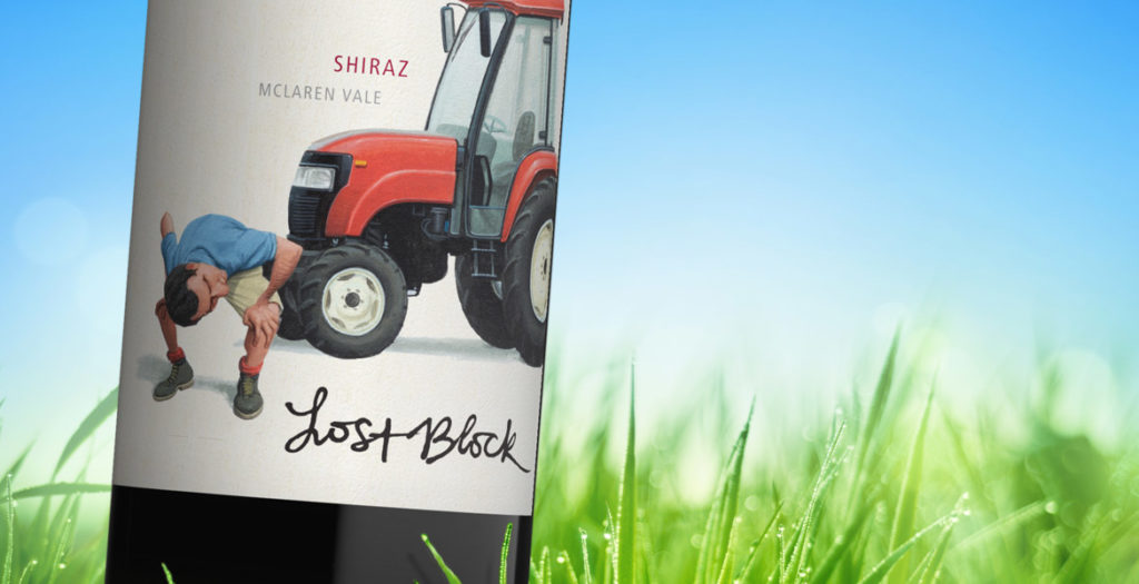
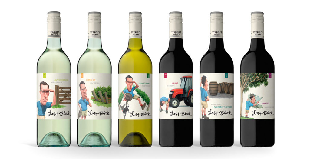
The strength of the new Lost Block labels lies in the distinctive and dynamic illustrations that were brought to life after months
of development.
The previous labels focused solely on typography, however when it came time to re-energise the brand, the brief given to the team at John Jewell Design
was to create a label that would appeal to a younger demographic while also conveying the story of the Lost Block in a contemporary fashion.
Illustration was key and months were spent on draft sketches to fine-tune the image of the Vineyard Manager, as his presence on each label would play an
integral role in tying the range together. A distinctive scenario was then created to distinguish each varietal, while still utilizing the same design
cues to ensure that each label worked together as part of a cohesive larger story.
Earthy tones were used to create the individual scenarios, whilst the distinctive blue of the vineyard manager’s shirt allows him and his ‘searching’ to
take center stage in each illustration.
To provide existing consumers of Lost Block with an easily identifiable link between the old and new labels, the original typography of the “Lost Block”
was preserved, and the Tyrrell’s name was incorporated into the capsule.
With bold illustrations and a fresh new face, this rebranding of one of Tyrrell’s flagship brands, re-energises it for a whole new generation of wine-lovers.
A word from Tyrrell’s…
What we wanted to achieve with this refresh was a more graphic depiction of the ”Lost Block” story, in an interesting and quirky way, we are very happy
with the final resultMike Cutrupi, Sales & Marketing Manager Tyrrell’s Wines
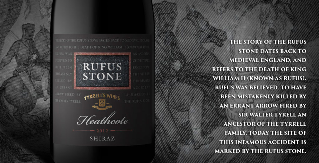
After nearly 20 years the Rufus label needed an update. John Jewell Design was able to provide that whilst maintaining the key elements of the packaging.
Bruce Tyrrell, Tyrrells Wines
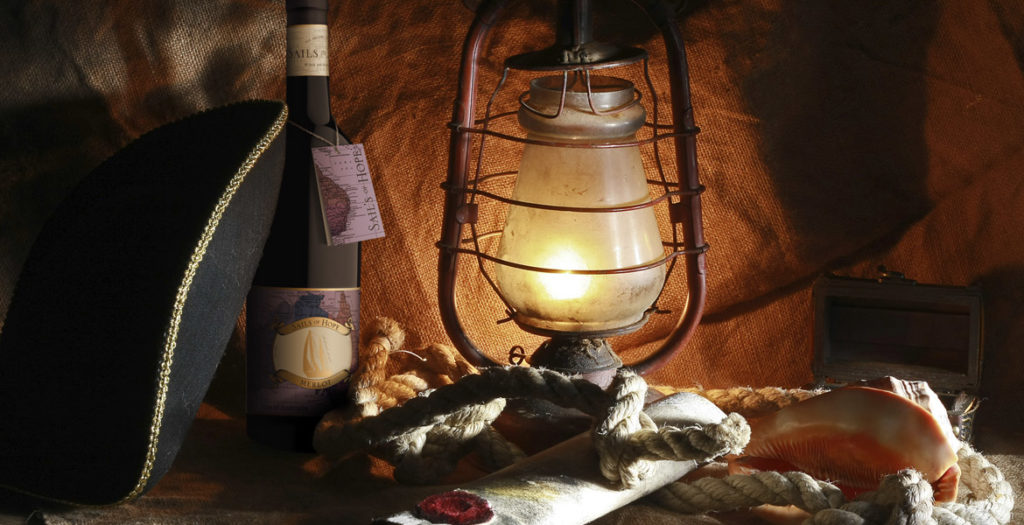
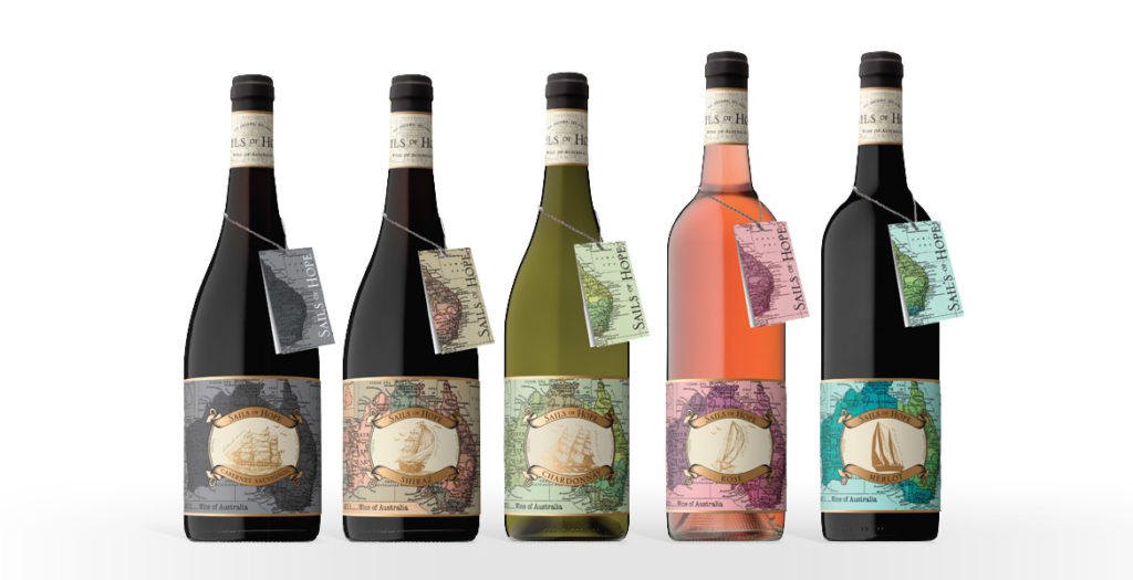
The ‘Sails of Hope’ label provided a unique opportunity for the team at John Jewell Design; create a heritage-style label, but give it a modern, youthful edge.
Starting with traditional ship illustrations and a request that the map of Australia should also be incorporated, our talented designer Bri was able to meld these elements with a lush, contemporary colour palette and a subtle use of rich, gold foil. What resulted was a label that spoke of history and tradition, whilst also portraying a youthful spirit. The clever use of colour allows the label to appeal to a broader audience, whilst still conveying a sense of prestige and quality.
The addition of the neck tag was another important feature of the design. Its seamless integration into the packaging allows the label to remain uncluttered whilst still providing consumers with detailed region and tasting information. It acts to strength shelf presence, providing consumers with a point of difference and by design, it’s removable nature means it can be kept as a cue for repeat purchase.
A word from Mica Australia…
Once again, the team at John Jewell design have done a tremendous job of bringing to life our vision; creating unique, eye-catching labels for a new range of wines. They were professional, easy to work with and created labels that were very much in line with our design brief. We are more than impressed with the quality of the work produced.
Josh P Sawyer, Mica Australia
12/11/2013
New Work: Summer White Wine Label Design
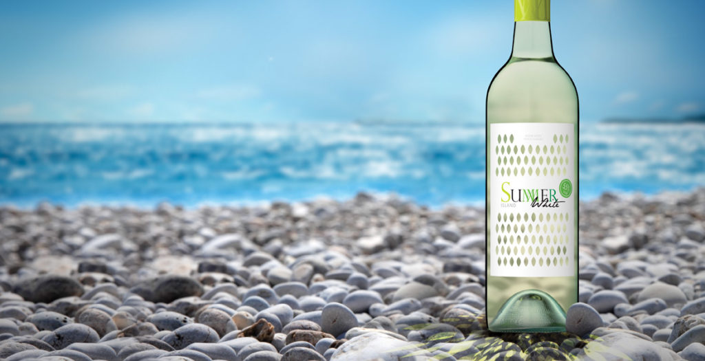
Innovative wine label design!
We were looking for an eye-catching and fresh approach for a category that is just building up in Europe. John Jewell Design came up with a great idea first time round. They createda cost-effective packaging concept taking into account technical feasibility. We are confident that this label will be the break-through for our product!
Heidrun Bebendorf, WSK OSTRAU GmbH
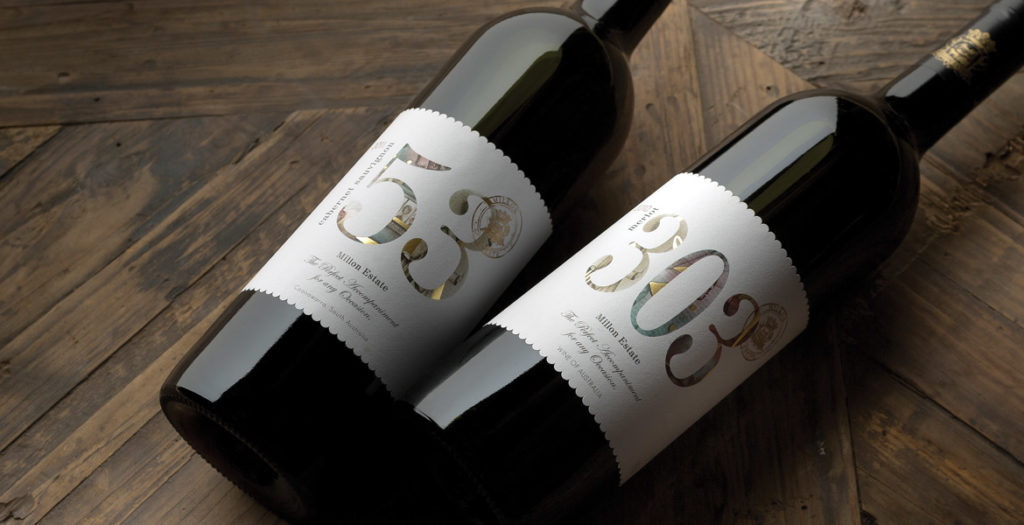
We have been very impressed with the design of our 2 labels, the ‘53’ and ‘303’. John Jewell Design has struck just the right balance in creating something of a contemporary style while at the same time maintaining a distinct level of elegance and sophistication, which is perhaps more associated with traditional ‘old world’ label design.
We needed something that would be eye-catching and stand out on the shelf, yet at the same time we needed to be mindful of what consumers in our target market have come to expect in terms of wine label design. It couldn’t be anything too eclectic and ‘out there’, but we also wanted to get away from some of the boring clichés common of the more traditional label styles. John’s design accomplished all of that, and we could not be happier with how our target consumers have responded to these labels. The end result has been a pair of labels that are stylish, attractive to the eye and unique in their own way.
Josh Sawyer, Marketing Coordinator Mica Australia
14/02/2013
New Work: Zilzie Wines Website
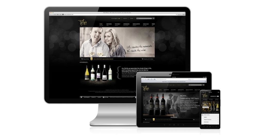
It’s not enough these days for websites to just look “pretty”, they need to be fully functional across a range of different platforms (desktop, tablet and mobile devices), as well as provide users with an interface that is easy to use, and our clients with a content management system that allows them to change their website at a moment’s notice.
We had all this in mind when taking onboard the task of rebuilding the Zilzie Wines website.
Zilzie were looking for a site that would reflect their new wine branding, as well provide consumers with a personalized experience that would encourage purchase through the online store, as well as repeat visits to the site.
The build process we undertake at John Jewell Design is all-encompassing and includes website analysis, concept development, social media integration, testing over multiple platforms, and even staff training. We also believe in taking a collaborative approach with our clients, and we worked hand-in-hand with the Zilzie team throughout the process to ensure that the finished product delivered well beyond expectations.
A word from Zilzie…
The e-commerce channel is growing and changing everyday, JJD was able to offer the creative vision and technical know-how to build not only an impressive looking website, but a functional shopping cart that is easy for our wine-club members to navigate. Nothing usually beats on time and on budget, but we also regained control, JJD provided a manual and training, giving us the capabilities to edit 100% of our website so that it can change and grow alongside our business.
Carolyn Simonis, Zilzie Wines
