August 2014
As times rapidly change, everything ages faster. Brand rejuvenation is an integral part of keeping your brand fresh and relevant to today’s consumers and can breathe life into a company, resulting in growth.
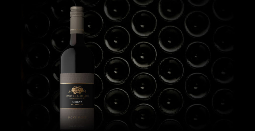
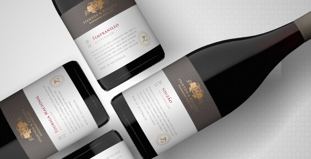
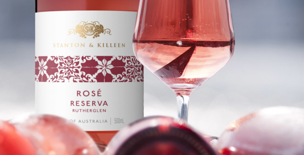
When updating the look and feel of an established brand, it is important to build on the brand’s heritage, to improve on their strengths and appeal to a new generation of consumers without alienating existing relationships. This is something John Jewell Design kept in mind when working with the internationally recognised Stanton & Killeen range.
The brief was to create a range of labels that reflected a sense of place and touched on the long history of the winery.
John Jewell Design developed a comprehensive look and feel that is truly in sync with the overall brand identity. From the Icon range through to the Limited Release, Premium and Everyday range the new labels project a sense of heritage and quality, with the use of rich gold speaking to the distinguished nature of the wines.
We feel the new labels stay true to our 140 year history, yet also invite new people to connect with our brand using contemporary design elements.Natasha Killeen
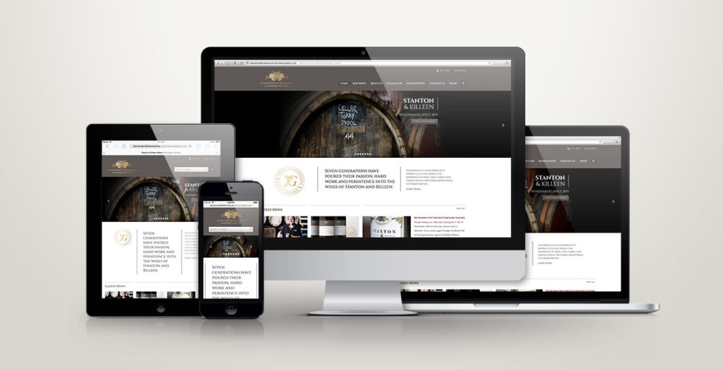
John Jewell Design also rebuilt the Stanton & Killeen Wines website which was very outdated in both look and functionality. Launched in February this year the new site has been a great success creating a modern, user-friendly design that unifies the Stanton & Killeen brand.
