In: Updates
16/08/2024
Devils Creek to feature in ‘DesignRush’
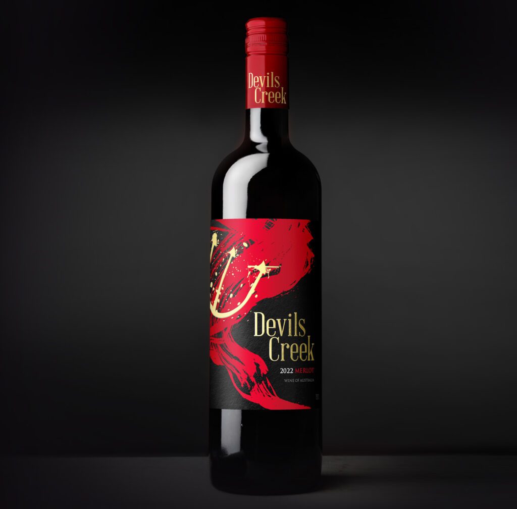
We are so pleased and excited see some great recognition for our design for Michelini Wines ‘Devils Creek’. In the coming weeks It will feature in ‘The Best Beverage Packaging Designs by DesignRush’.
Check it out https://www.designrush.com/best-designs/packaging/devils-creek-packaging-design
25/08/2019
Printex19 – Step into the Future

Printex19 is the leading show for print, sign, display, label and packaging professionals and this year I was privileged to be a guest speaker to present my inside knowledge on wine label trends and the importance of end-to-end design.
I shared my insights on design trends, and dived into the specifics on how wine label design is only one piece of the puzzle. Good quality paper, print techniques and the correct application of embellishments can enhance the consumer experience by creating an emotional connection that is driven by tactile design. Heightening these elements can elevate a wine’s characteristics or aid in reinforcing the brand’s story. These features work twofold to increase the saleability of the product in the first instance, as well as to keep consumers engaged and coming back for more.
I was pleased to have such an outstanding turn-out to my presentation and it was an excellent opportunity to impart my knowledge on how to leave behind the world of mass produced, inferior wine and position your brand as a quality, high end product worthy of selection.
The show featured over 120 exhibitors as well as keynotes, masterclasses, panel sessions and workshops, and through this packed schedule I was able to absorb invaluable information from other leading industry experts to further drive our own innovation as well.
With a wealth of experience both nationally and internationally, if you’d like me to be part of your next event, please drop me a line.
Cheers
John
28/11/2018
Winner Gmund Award 2018 – PACKAGING
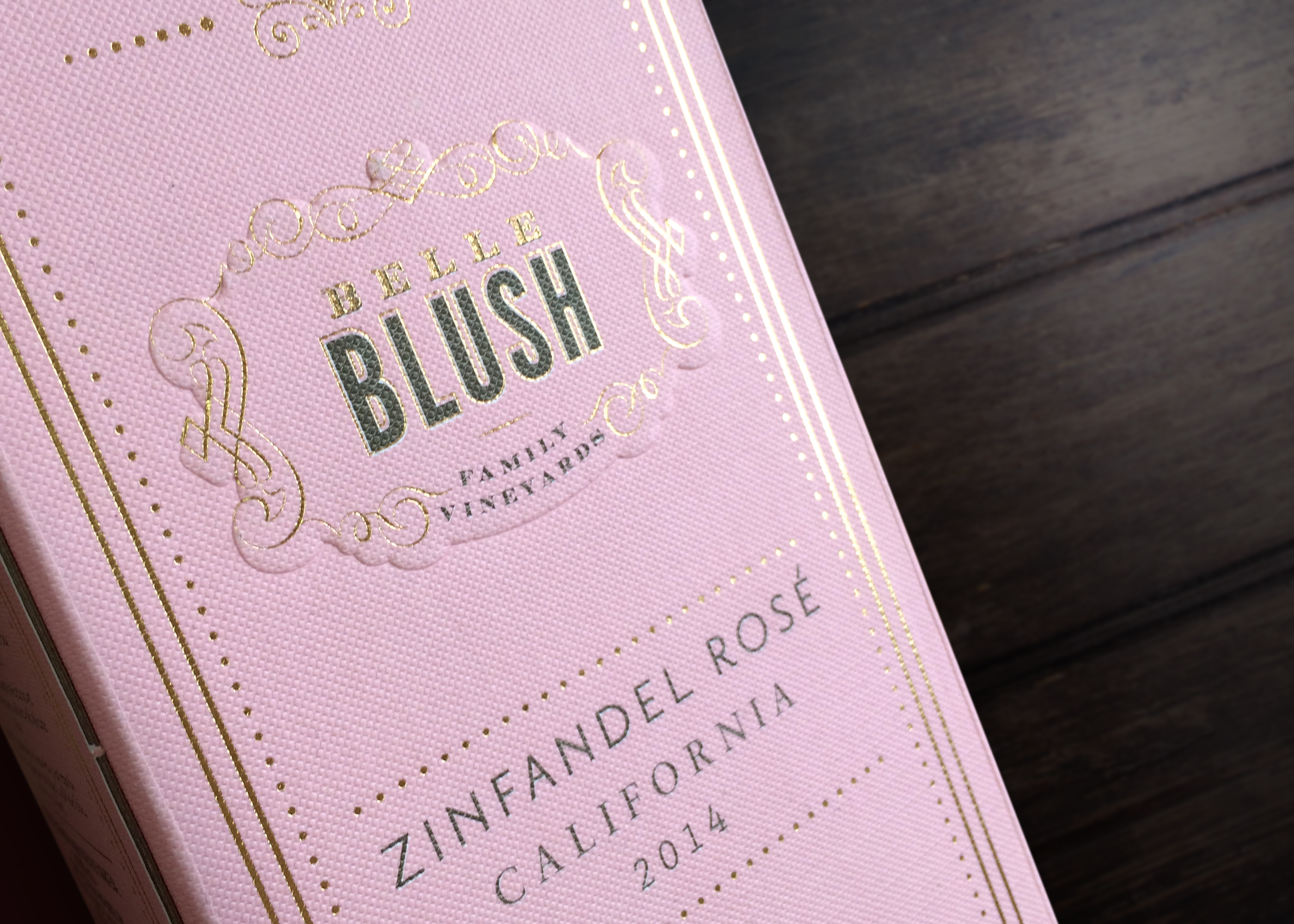
We are pleased to announce that our design The Belle Blush won the Gmund prize in the “Best packaging” category. This award was held in Germany and evaluated the implementation and success of the product in the market, its print quality and its creativity, innovation and design. We are happy and grateful to receive this award and we expect more projects in which our customers can show the best of their products through our designs.
“Here, the packaging not only supports the product, but also enhances the value and serves as a good selling point”, so the jury’s argument.
If a wine label can’t capture the consumer’s attention, then it doesn’t matter how good the wine in the bottle is; it simply won’t make it off the shelf and into the glass.
The label is also the mouthpiece of a wine; it needs to fluently convey the essence of what consumers can expect to taste inside the bottle. It can be challenging to create a synergy between these two elements but it’s here that John Jewell Design really comes into its own.
Led by the irrepressible John Jewell, the entire team at JJD are united in their global focus on consumer preferences and emerging trends. With over two decades of international wine shows and continued market visits, John headlines his globally-experienced team in understanding what drives consumers and benefits his clients. Equipped with these global perspectives, the team craft labels that effortlessly champion the wines within.
Looking to move from the shelf to the glass? Contact the team at John Jewell Design today.
“John Jewell Design always deliver creative work with professional approach. When we work together, they have decant tools to help us discover right direction, in the meantime they listen to our ideas and needs all the time with efficient updates, which make every project inspiring and exciting!” Elizabeth Rice, Director International Operations & Business Development and Jing Jin, Associate Marketing Manager International. Delicato Family Vineyards.
“Working with John Jewell Design is always a pleasure! Their expertise, creativity and knowledge out the last design trends and what’s going on in the wine industry, helps to get the best out of every request/task. The time difference (Europe/Australia) is ideal, sending a request end of the day, the next morning you will have a proposal in your e-mail” Jeroen van Sermondt – LFE B.V. The Netherland.
“I have been working with John Jewel Design since 2008. John and his team are behind many success stories of our portfolio. They are a dynamic, agile and creative team who is always ready for a new challenge. I am very satisfied with their deliveries and I am sure we will continue working with John Jewel Design in the next 10 years” Rogério Barbosa, Managing Director Grape Company.
14/06/2017
Owning the Shelf
The wine can’t speak for itself when it’s sitting on a bottle shop shelf. It needs something to speak for it and that something is the wine label. Bottle shop shelves are a study in trying to be noticed, a plethora of options all screaming “Pick me! Pick me!” They’re all there for the same reason, and they’re all competing against each other to be the lucky one that ends up in the customer’s hands. So how do you make your label stand out from the masses?
How do you make your label stand out from the masses?
Good design is crucial, to the point now where it’s a moot point. Of course it’s important. No one sets out to emblaze their wine bottle with a label that they don’t think is worthy. But sometimes good design alone is not enough.
So if it’s not just design, what else is there in the ‘first-impressions last’ world of the bottle shop? The answer lies in the label itself. The stock, the print, the embellishments, they matter, and they all make a difference.
Picture two labels side by side with the same great design. Now imagine one is a standard print, nothing fancy – just ink on paper – whereas the one next to it utilises some strategic embossing, some carefully placed foiling, some artfully applied spot gloss varnish and custom die-cutting. These two labels may boast the exact same design, but the latter is suddenly alive, it radiates light, it intrigues with it’s depth, it exudes luxury and it calls to the customer on a level that the plain label can’t compete on.
And herein lies the challenge for wine businesses looking to create new labels; they need a designer who not only understands the design, but who also understands how embellishments can truly bring each label design to life.
Embellishment options are many and varied and each has its place and purpose; custom die-cutting allows the label to break free from the standard straight-edged mould, offering graceful curves and design hugging edges. And if die-cutting breaks free from the mould then screen printing directly onto the bottle completely breaks the mould, removing all constraints of traditional label printing and allowing complete freedom regarding placement. The use of varnish, either spot gloss or high build is a subtle but highly effective way to highlight key aspects of the label without being overt or gaudy, while foiling instantly lends an air of luxury through its use of metallic foils, most commonly gold and silver.
To make the most of these embellishments, the label needs to be designed with these options already in mind so that the label is created in tandem with its embellishments, the two working hand-in-hand to deliver a truly cohesive result.
So if you’re looking to create a new label and want a designer who knows the ins-and-outs of not only label design, but also label embellishments, contact the team.
19/03/2017
Emerging Wine Label Trends for 2017
John’s travels always provide a wealth of knowledge regarding emerging trends and shifts in the market and his latest expeditions overseas were certainly no different. Want to know what role craft beers are playing and how drinks other than wines are leading the charge? Then read on….
The industry has started to move away from the tradition of distinguished, stately wine labels and is trending towards the more youthful, out-there labels commonly employed by craft beers. As consumers become more familiar with seeing these labels on their local bottle shop shelves, as well as on their hip inner-city café tables, they are coming to expect their wine labels to follow suit. They don’t want labels that just sit back and wait to be noticed, they want something that jumps out at them, grabs their attention and demands to be photographed for their social media feeds.
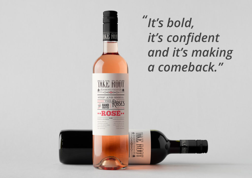
There are two key trends that have emerged as a result of this shift and interestingly the first is one that ignited about 10 years ago but disappeared almost as quickly as it appeared. We are talking about labels that are dominated by typography, lending a vintage, yet quirky feel. These often employ subtle uses of colour and occasional imagery but none of this distracts from the hero of the label, which is the typography. It’s bold, it’s confident and it’s making a comeback.
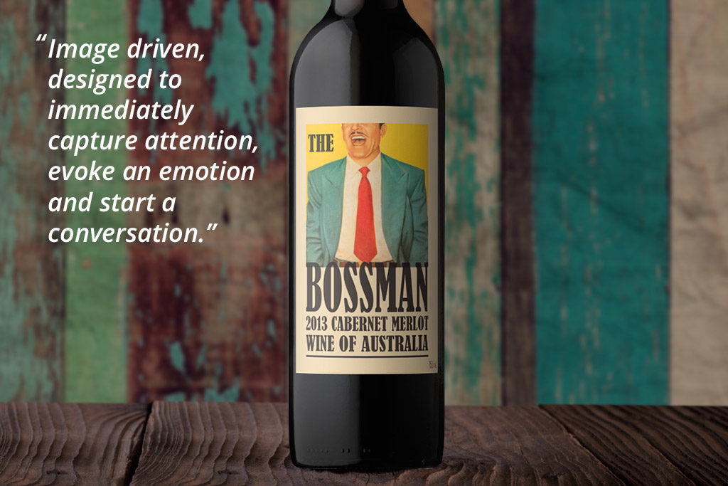
The second key trend is even more curious than the first in that they are wine labels that don’t look like wine labels. They carry no distinguishable wine information on the front label and could be at home on the front of any type of beverage. These labels are image driven, designed to immediately capture attention, evoke an emotion and start a conversation. They dare to be different, they scream to be picked up off the shelf, and they entice consumers to photograph and share. On the shelf, they rely on the bottle itself as the sole wine identifier, preferring to keep all wine-related information to the back of the bottle.
These shifts are already happening, with key markets being the UK, USA and China. If you’re interested in hearing more about these current wine label trends, as well as benefiting from John Jewell Design’s in depth understanding of the industry, contact the team.
06/11/2016
Online Wine Label Solutions
The benefits of buying off-the-shelf
It all starts with understanding your market, and then building a memorable brand that is brought to life through outstanding design. It’s about cutting through shelf clutter so your wine is the stand-out choice for your customer.
Here at John Jewell Design, we are constantly travelling and studying the wine markets around the world. This is to ensure our wine label offerings target the unique needs of the many different wine businesses, both here in Australia and abroad.
In addition to our extensive bespoke design services, we have used this expert knowledge to create a considered collection of wine label designs, all available for immediate perusal and purchase via the John Jewell Design website.
This online gallery takes the guesswork out of choosing a wine label by guiding you through the selection process. You can search by a particular design style, which is perfect for when you already have an idea about the type of label you require. Or alternatively, you can search by country, to be shown styles that are best suited to your specific market.
Depending on your requirements, you can also explore our different tiers, as we know every one has their own design needs and budgets. The VALUE section offers exactly that – fantastic front label designs at a pocket-friendly price. Or you can step up to the PREMIUM section if you require a full suite of design elements. All premium concepts include a unique brand name, a front label and back label design, plus capsule graphics. You can also search the Organic Wine Infusions section, which has been created specifically for this niche and emerging segment.
All label designs are print-ready and deliverable worldwide, resulting in fast turn-around times to get your product straight to market.
To protect the exclusivity of the labels on offer, access to the gallery is via invitation only. So if you’re in need of a new wine label and want to be guided by the best in the business, we invite you to get in touch today.
Contact Elise on please enable javascript to view or +61 (0)2 6040 4433 Monday to Thursday or send us your details and we’ll get back to you. Once approved we will email you your individual username and password.
Often when we think of updating a label we imagine a complete overhaul with major changes to logo, layout, colour and typeface. This doesn’t always have to be the case though and sometimes the most effective label updates are those that require a subtle nip-and-tuck rather than an entire facelift.
The Challenge:
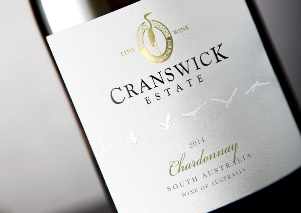
The Cranswick Estate label had provided eight solid years of service and whilst it was a solid performer, the march of time required certain updates be made to ensure relevancy in a busy marketplace, whilst still remaining true to the core elements of the original label.
The Solution:
The first task was to identify the key elements that would be carried across to the new label – such as the crane motif and logo style – as well as deduce what new elements were to be incorporated to breathe freshness into the design.
To create a contemporary look, the die-cut lozenge made way for a straight label that immediately raised the tone of the whole design and set the scene for the changes to come. The crane image from the existing logo remained the same but the design was reworked from a solid-colour block into a gold foil portrayal that was both intricate and refined, and served to add premium quality cues.
The bird flight path was retained, however the background label colour was changed from white to a soft grey and the birds were then embossed and changed to white. With this new treatment, they were then moved into the middle of the label to give them prominence and ensure their new look was given plenty of room to fly off the label and grab consumer attention.
Finally, a subtle tweak was made to the varietal font to deliver a classic feel without straying too far from the original.
In Closing:
When a brand is strong and the imagery is still considered crisp and clean, only small changes need to occur to achieve a striking, contemporary update whilst still remaining true to the label that came before.
24/01/2016
Wine Infusions
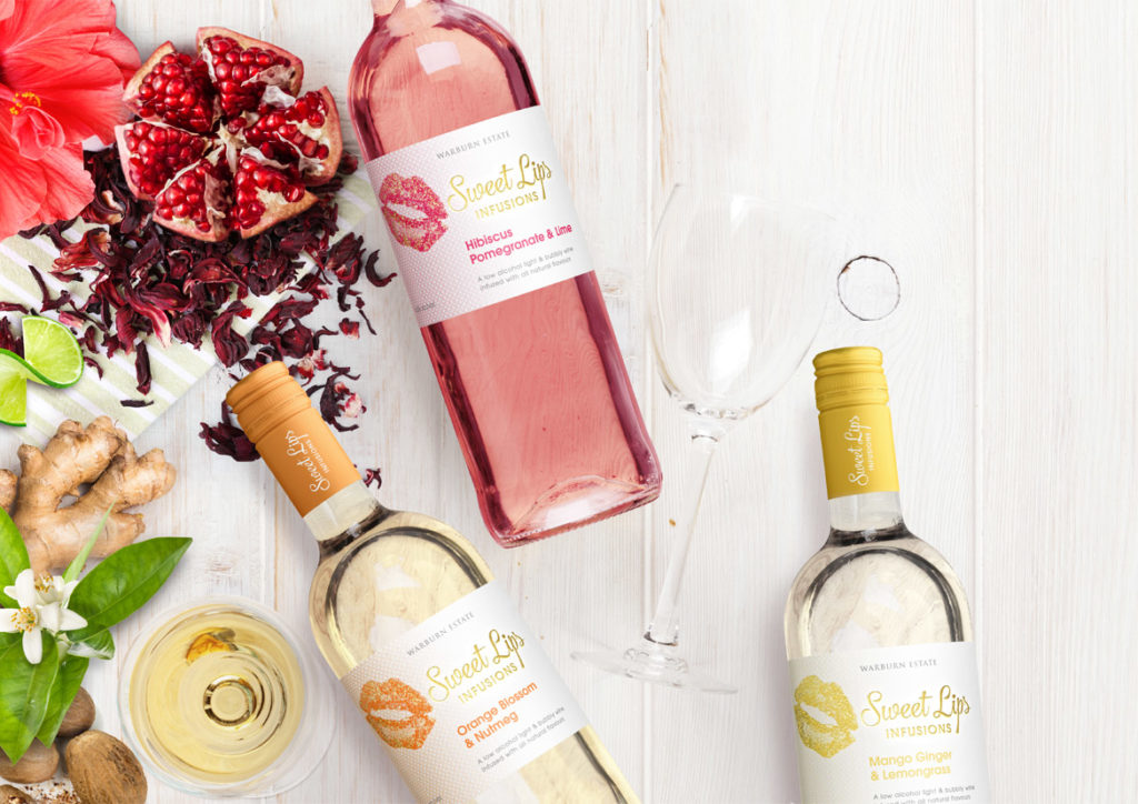
The whispers about wine infusions are now a buzz that cannot be ignored.
Led by European trends, predominately from Germany and the Netherlands, this category is growing rapidly. Winemakers and retailers alike are making strong moves towards wine infusions in an effort to secure the coveted 18-24 female demographic.
But what exactly is it that attracts consumers to wine infusions, and how can your label design capitalise on this trend?
There’s a whole host of reasons why wine infusions are generating so much interest amongst consumers. First and foremost, wine infusions are both lower in alcohol and lower in calories. For 18-24 year old females – who are generally very health conscious – this alone is hugely enticing.
Secondly, the addition of natural plant and fruit flavours means the wine infusions have a hint of sweetness that makes for a far more palatable drinking experience for those new to the world of wine. This, combined with the addition of a light spritz, makes for an overall easy drinking experience, particularly served over ice in the warmer months.
To a wine novice, the “rules” around wine can be confusing, and traditional wine blends are often perceived as harsh and too dry for an untrained palate. Fruit-driven infusions remove the mysticism around wine, providing a sweet, satisfying entry point for new consumers.
All this must be kept in mind when developing labels for wine infusion brands. It’s important to ensure the labels are both accessible and engaging to appeal to the new generation of wine consumer, steering clear of any old-world wine label cues. Labels should be bright and fun, reflecting the vibrant colours of the wine infusions themselves, whilst maintaining an overall finish that is both fresh and uncluttered.
The recently designed Sweet Lips reflects the above thinking. The label employs vibrant, striking colour that simultaneously draws the eye and acts as a subconscious cue to the flavours within. The vivid colours are given room to shine on a crisp white background with minimal distractions, while the use of gold foil adds a premium feel to the label.
If you’re interested in developing your own wine infusion brand, John Jewell Design has a range of off-the-shelf options available on their website for you to review and purchase. Check them out here.
08/06/2015
The Impact of a Wine Label

Why are labels so important to our wine-buying choices?
In a busy bottleshop, where shelves are crowded and the choice can be overwhelming, it’s not the winemaker’s resume or even the price that will sell your wine. Learnings from consumer psychology tell us that most wine sales are made purely on the strength of a label.
The reality is most consumers aren’t connoisseurs; they are customers looking to buy an experience.
What their searching eyes see on your wine label lays the foundations for that experience. Purposeful and carefully crafted visual cues subtly influence perceptions of price, quality and even taste.
To encourage a hand to reach deeper into their pocket, consumers expect to see labels that feature minimalist, uncluttered designs and an elegant, refined font. Adding texture – such as embossing – provides a tactile feature that activates increased perceptions of price and correlates with heightened anticipation and an increased drinking experience.
To sell a wine at a value-for-money price point, labels need to visually jump off the shelf through the careful construction of bright colours, bold, fun graphics and quirky or unique fonts.
At the end of the day, your label sets the tone for your customer’s experience and is often as important – if not more important – in driving the sale than the wine itself.
John Jewell spends several months every year traveling the world and acquiring insights into consumer psychology, preferences and trends to bring back home and translate into eye-catching, award-winning labels for his clients. If you have a label or brand that could benefit from John’s experience and knowledge, give him a call on: +61 (0)2 6040 4433 or send him an email.

Across many industries within the commercial world, the digital revolution has changed the way that individuals and organisations go about their work. The designing and printing of premium wine labels is no different. Pencils and stencils have been replaced by complex design software and when it comes to the actual printing, the costly means of analogue production is being replaced by digital technologies.
Conventional printing methods are by no means obsolete technologies; they still have their place for longer print runs and on specialised projects. In recent years however, the quality of digital printing technology has progressed dramatically and now the quality of ‘digital offset’ rivals its traditional counterpart. In addition, what makes digital printing so enticing these days is that the range of papers and substrates is more extensive than ever before; be it premium papers, textured papers or transparent polymeric films.
Ultimately, digital printing gives both designers and label printers more flexibility than was ever available with analogue printing.
Here’s our short take on how and why:
Design/Proofing/Samples
Artwork can be loaded onto digital presses within seconds. We, along with our clients, are able to work hand-in-hand with label printing companies, allowing us to review proofs as they are printed and even make immediate changes while we wait.
Multi-versioned runs
Digital printing allows for cost-effective multi-versioning of labels within one print run. This is perfect for different vintages, varietals and even when catering to different geographical markets.
Cost-effectiveness
There was a time when commercial label printing was very much centered on long print runs. The longer print runs essentially absorbed the high set-up fees; this is no longer necessary. Short runs, anywhere from as little as 1000 labels, can be produced cost effectively.
Short lead times
Minimal set-up and no need for producing print plates means reduced turnaround times. It is now possible to be applying wine labels to bottles that were printed and finished less than 24 hours ago.
Finishing touches
When it comes to premium wine labels, the focus isn’t solely on the quality of the print. Premium wine labels use finishes such as hot foil stamping, embossing and spot varnishing, all these options can be used to great effect with digitally printed labels.
As more and more designers and printers move their businesses towards digital printing, the ability for greater creative freedom is being realised and this ultimately benefits not only clients, but also the industry as a whole.
label.co.uk (the label printers ltd) is an online label printing company that has embraced the digital revolution and invested heavily in a fleet of state of the art presses, finishing machines and an online ‘web2press’ procurement and management format. The company produces premium quality wine labels and other product labeling for brands of all shapes and sizes worldwide. The company stems out of the wine producing region of Germany (operating as ‘etikett.de’ in mainland Europe) and also owns and operates a number of conventional offset machines to aid with print runs that are longer in nature.
For more information about digital label printing, please contact John Jewell Design.

We asked Brett Lewis of Davies Collison Cave a few questions on registering a Trade Mark.
Do you need a Trade Mark Registration?
A trade mark registration is very often a key business asset. It turns an intangible property right into a tangible one, something that can be sold and licensed.
Registration typically provides exclusive rights and not only to the actual mark registered. The rights can be enforced against unauthorised users of that mark and deceptively similar marks.
In addition, a registration typically blocks others from registering the same or similar mark in relation to your product or service area and closely-related areas. For example, registration of a mark for wines can block others from registering in relation to other alcoholic beverages and even non-alcoholic wines!
What Can Be Registered as a Trade Mark?
Almost anything that distinguishes your product or service from those of your competitors is a trade mark and almost anything can be registered. This includes words, logos, product shapes, aspects of packaging, sounds and even scents.
The benefits of owning a trade mark registration, Why bother?
It’s all about acquiring and consolidating your rights, blocking others, giving you a competitive edge and creating a valuable property right. A brand is a key business asset: a strong brand adds significantly to the value of the business it represents.
Is it expensive?
The costs will vary from case to case but are relatively small in the overall context of the business development costs, brand creation, product launch and ongoing marketing. Registrations run for renewable periods of 10 years so the annual cost is small
The Process
- Searching –
Proper clearance searching is a highly skilled task and developing the correct search strategy to capture all relevant marks is key. There is no substitute for a professional search but a good starting point is the official database of trade marks. Here’s a link: http://pericles.ipaustralia.gov.au/atmoss/falcon.application_start. Before you apply and even more importantly, before you make a commitment to a new mark invest in a full clearance search. - Registration/application –
Registration/application – The process is long: the delay between filing an application and obtaining a Certificate of Registration is at least 8 months but the rights are retrospective to the date on which the application was filed.
International Registration
National applications can be filed in almost every country. There are also regional registrations, like the Community Trade Mark for the EU and international registrations covering 90+ countries. Choosing the right registration path at the outset is an important decision and should be left to a professional firm.
How Davies Collison Cave can help
Davies Collison Cave is a specialised Intellectual Property firm and is widely recognised locally and internationally as the leading IP firm in Australia. It has offices in Melbourne, Sydney and Brisbane and strong relationships with corporate clients and other IP firms around the world. The firm specialises in acquisition and enforcement of trade mark rights and these notes were contributed by one of its partners, Brett Lewis: [email protected]
