In: bespoke design
22/06/2018
Blurring the Lines
The wine industry has started to move away from the tradition of distinguished, stately wine labels and is trending towards the more youthful, out-there labels commonly employed by craft beers.
As consumers become more familiar with seeing these labels on their local bottle shop shelves, as well as on their hip inner-city café tables, they are coming to expect their wine labels to follow suit.
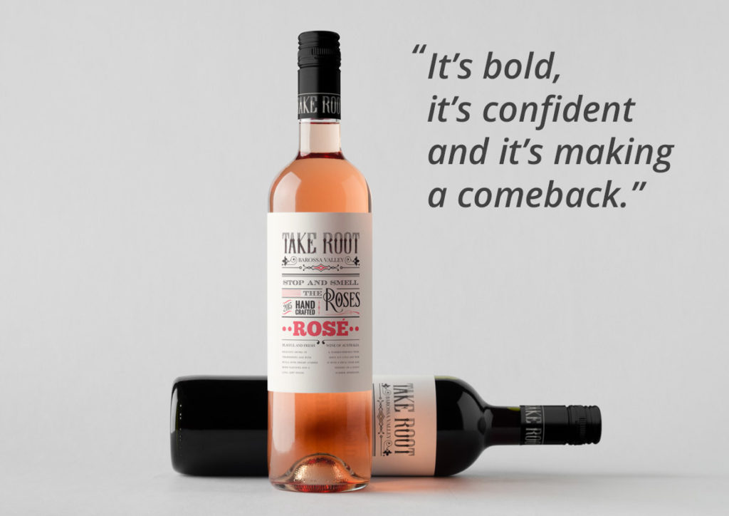
There are two key trends that have emerged as a result of this shift. The first are labels that are dominated by typography, lending a vintage, yet quirky feel. This was a trend that ignited about 10 years ago but quickly disappeared. It is now making a strong and decisive come back.
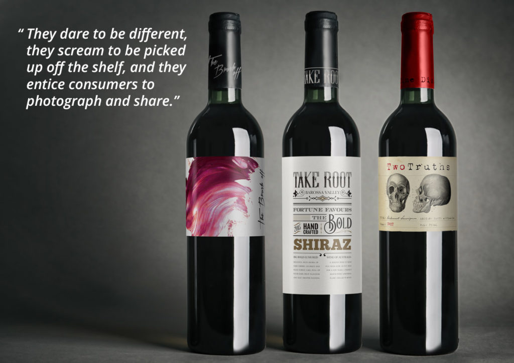
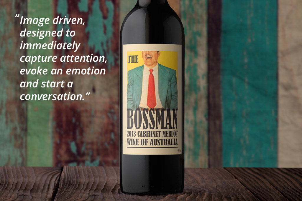
The second key trend is wine labels that don’t look like wine labels. They carry no distinguishable wine information on the front label and are primarily image driven. They dare to be different, they scream to be picked up off the shelf, and they entice consumers to photograph and share.
These shifts are already happening, with key markets being the UK, USA and China. If you’re interested in hearing more about these current wine label trends, as well as benefiting from John Jewell Design’s in depth understanding of the industry, contact the team on 02 6040 4433.
19/03/2017
Emerging Wine Label Trends for 2017
John’s travels always provide a wealth of knowledge regarding emerging trends and shifts in the market and his latest expeditions overseas were certainly no different. Want to know what role craft beers are playing and how drinks other than wines are leading the charge? Then read on….
The industry has started to move away from the tradition of distinguished, stately wine labels and is trending towards the more youthful, out-there labels commonly employed by craft beers. As consumers become more familiar with seeing these labels on their local bottle shop shelves, as well as on their hip inner-city café tables, they are coming to expect their wine labels to follow suit. They don’t want labels that just sit back and wait to be noticed, they want something that jumps out at them, grabs their attention and demands to be photographed for their social media feeds.
There are two key trends that have emerged as a result of this shift and interestingly the first is one that ignited about 10 years ago but disappeared almost as quickly as it appeared. We are talking about labels that are dominated by typography, lending a vintage, yet quirky feel. These often employ subtle uses of colour and occasional imagery but none of this distracts from the hero of the label, which is the typography. It’s bold, it’s confident and it’s making a comeback.
The second key trend is even more curious than the first in that they are wine labels that don’t look like wine labels. They carry no distinguishable wine information on the front label and could be at home on the front of any type of beverage. These labels are image driven, designed to immediately capture attention, evoke an emotion and start a conversation. They dare to be different, they scream to be picked up off the shelf, and they entice consumers to photograph and share. On the shelf, they rely on the bottle itself as the sole wine identifier, preferring to keep all wine-related information to the back of the bottle.
These shifts are already happening, with key markets being the UK, USA and China. If you’re interested in hearing more about these current wine label trends, as well as benefiting from John Jewell Design’s in depth understanding of the industry, contact the team.
Often when we think of updating a label we imagine a complete overhaul with major changes to logo, layout, colour and typeface. This doesn’t always have to be the case though and sometimes the most effective label updates are those that require a subtle nip-and-tuck rather than an entire facelift.
The Challenge:
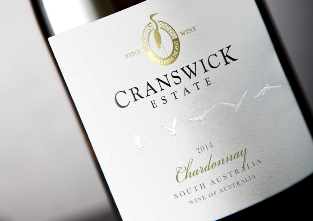
The Cranswick Estate label had provided eight solid years of service and whilst it was a solid performer, the march of time required certain updates be made to ensure relevancy in a busy marketplace, whilst still remaining true to the core elements of the original label.
The Solution:
The first task was to identify the key elements that would be carried across to the new label – such as the crane motif and logo style – as well as deduce what new elements were to be incorporated to breathe freshness into the design.
To create a contemporary look, the die-cut lozenge made way for a straight label that immediately raised the tone of the whole design and set the scene for the changes to come. The crane image from the existing logo remained the same but the design was reworked from a solid-colour block into a gold foil portrayal that was both intricate and refined, and served to add premium quality cues.
The bird flight path was retained, however the background label colour was changed from white to a soft grey and the birds were then embossed and changed to white. With this new treatment, they were then moved into the middle of the label to give them prominence and ensure their new look was given plenty of room to fly off the label and grab consumer attention.
Finally, a subtle tweak was made to the varietal font to deliver a classic feel without straying too far from the original.
In Closing:
When a brand is strong and the imagery is still considered crisp and clean, only small changes need to occur to achieve a striking, contemporary update whilst still remaining true to the label that came before.
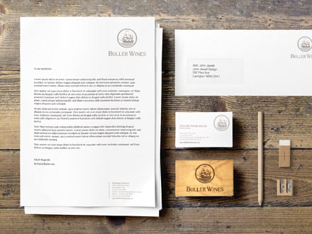
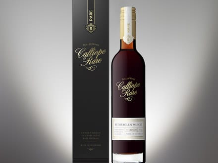
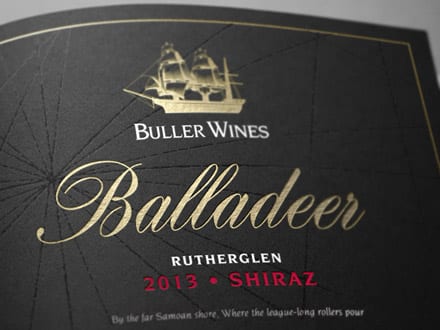
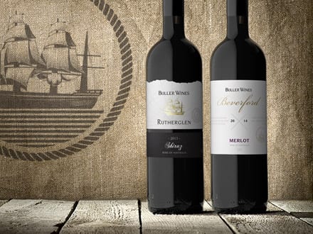
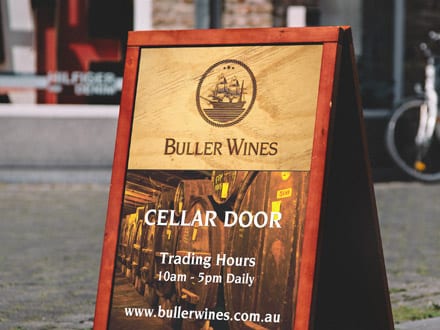
How do you tackle a rebrand when the current imagery is steeped in history and tradition? You look to the past to provide inspiration for the future. This is exactly what the John Jewell Design team did to deliver a refresh and relaunch of the Buller Wines winery and business…
What is Branding?
Branding is the art of imbuing a product with its own unique and authentic personality, making it attractive and memorable to new and loyal customers.
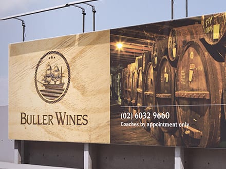
Who are Buller Wines?
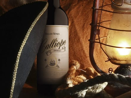
The Buller Wines story was born in the early 1920’s when Reginald Buller purchase a vineyard in Rutherglen and named it Calliope after the famed ship that survived against all odds in the 1880’s. The vineyards, the family and the wine brand continued to evolve through the years and in 2013 the Judd family took the helm and have continued its growth and success.
The Challenge
The Calliope ship is an integral part of the Buller Wines story and imagery however the existing illustration was in need of a modern refresh. Given Calliope was a real vessel the first challenge was to ensure that any new imagery stayed true to the appearance of the original ship. The second challenge was in delivering new imagery that could convey the history of the brand but in a contemporary style that would work successfully across both small and large format requirements.
The Solution
In tackling the rebrand, the John Jewell Design team knew where they had to start. They took the time to look back through the history books and unearthed a bold image of the Calliope, showing it at full mast with a strong, commanding presence.
The image was then skilfully illustrated to best represent the authenticity and integrity of the long established Buller brand and it was then integrated into the brand’s logo and rolled out across labels, printed and electronic collateral and advertising.
In Closing
Rebranding isn’t always about coming up with something new; sometimes it’s about going back to the beginning to draw inspiration for the future. This was definitely the case for the Buller Wine rebrand. To find out how John Jewell Design can help you breathe new life into your brand, contact us.
08/06/2015
The Impact of a Wine Label
Why are labels so important to our wine-buying choices?
In a busy bottleshop, where shelves are crowded and the choice can be overwhelming, it’s not the winemaker’s resume or even the price that will sell your wine. Learnings from consumer psychology tell us that most wine sales are made purely on the strength of a label.
The reality is most consumers aren’t connoisseurs; they are customers looking to buy an experience.
What their searching eyes see on your wine label lays the foundations for that experience. Purposeful and carefully crafted visual cues subtly influence perceptions of price, quality and even taste.
To encourage a hand to reach deeper into their pocket, consumers expect to see labels that feature minimalist, uncluttered designs and an elegant, refined font. Adding texture – such as embossing – provides a tactile feature that activates increased perceptions of price and correlates with heightened anticipation and an increased drinking experience.
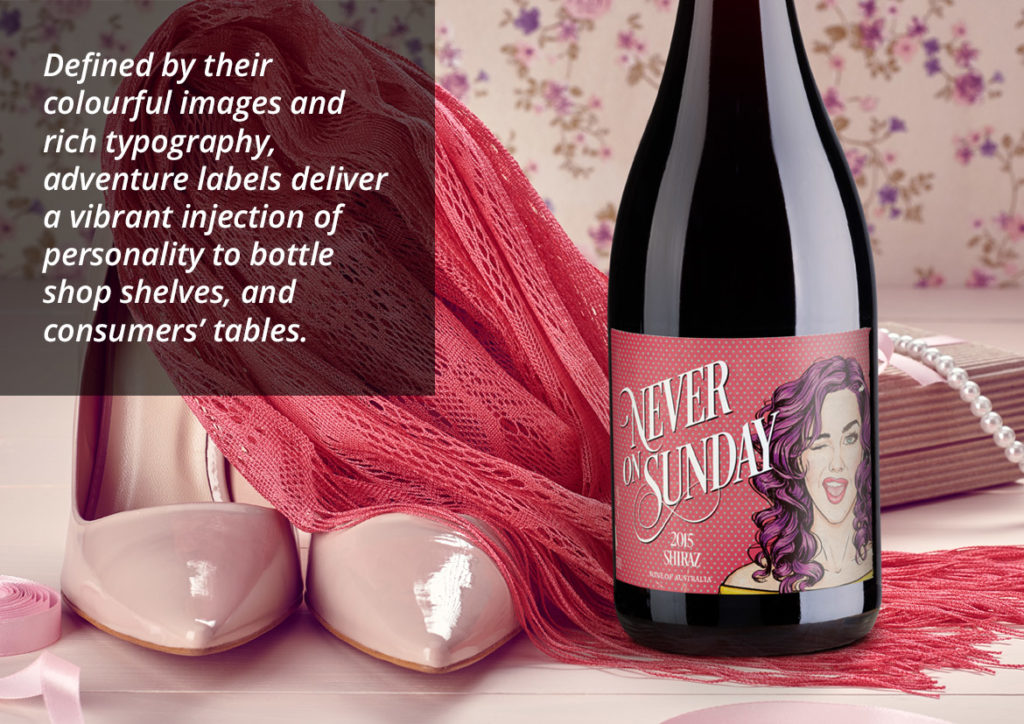
To sell a wine at a value-for-money price point, labels need to visually jump off the shelf through the careful construction of bright colours, bold, fun graphics and quirky or unique fonts.
At the end of the day, your label sets the tone for your customer’s experience and is often as important – if not more important – in driving the sale than the wine itself.
John Jewell spends several months every year traveling the world and acquiring insights into consumer psychology, preferences and trends to bring back home and translate into eye-catching, award-winning labels for his clients. If you have a label or brand that could benefit from John’s experience and knowledge, give him a call on: +61 (0)2 6040 4433 or send him an email.
04/03/2015
New Work: Fruit Ardour Wine Label Design
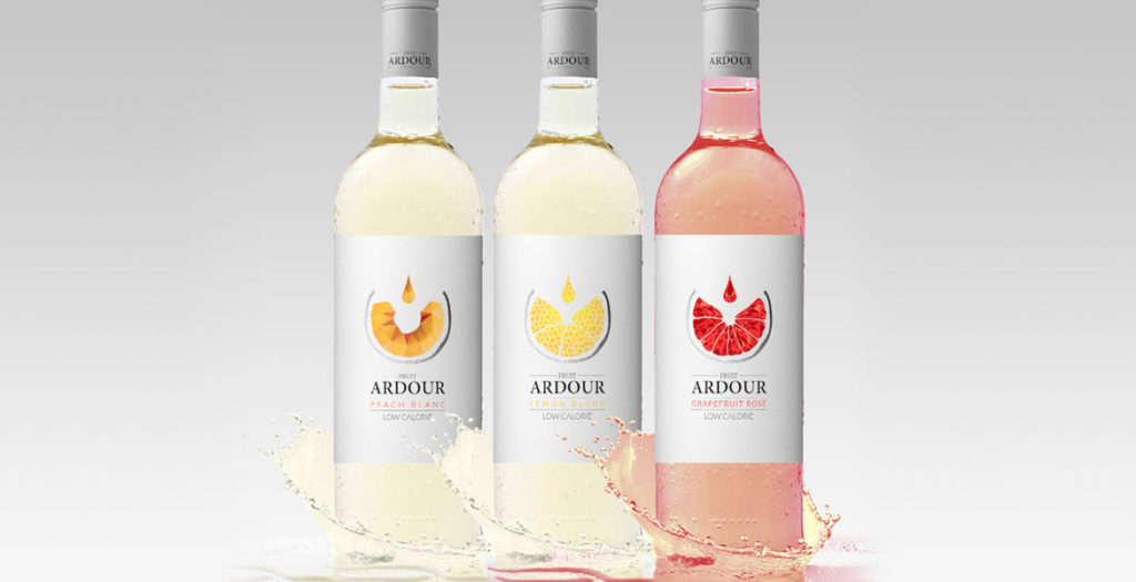
Fruit wine is the rising star of the wine market and with it comes the challenge of simultaneously appealing to a new-style of wine drinker, while also engaging the seasoned palate.
This new wave of wine is recognizable by its colourful and fun labels. The design challenge is to harness this youthful exuberance while simultaneously appealing to the traditional wine connoisseur. With Fruit Ardour, the brief was to develop a label that had strong wine cues, delivering a more serious offering whilst still emphasising the fruit aspect.
This brief was achieved primarily through the sophisticated and subtle use of colour and white space. The simple, uncluttered white background is reminiscent of high-end wine labels, whilst the singular use of colour delivers easy varietal differentiation without heading into “juice box” territory. Silver capsules provide continuity across the range, and add to the sophisticated finish.
The central graphic represents both wine being poured into a glass, as well as a geometric visual of the specific fruit, further emphasising the fruit connection but doing so within the domain of wine.
The resulting labels effortlessly combine the best of traditional wine with the modern vibrancy of fruit wines.
03/12/2014
New Work: Fractal Wine Label Design
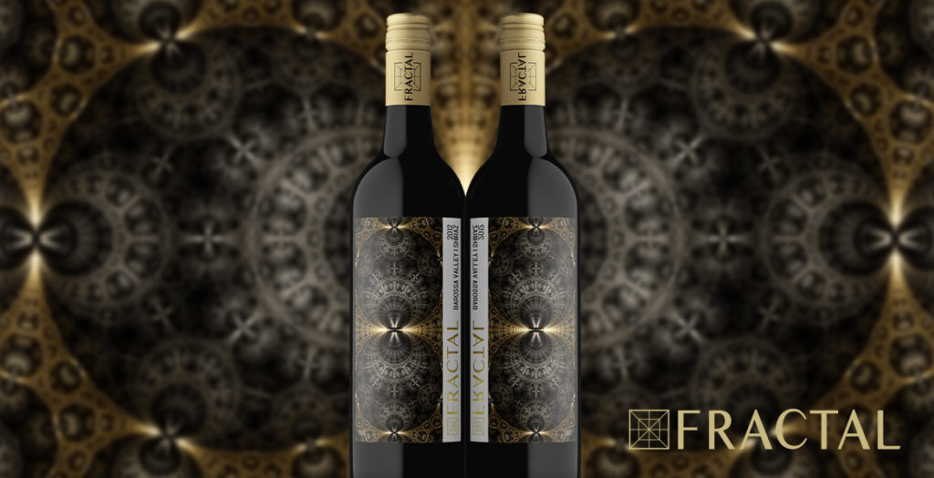
In creating the Fractal wine label, John Jewell Design was tasked with turning winemaker Bruce Clugston’s concept into reality. With a background in mathematics, Bruce was intrigued by fractal designs – structured mathematic formulae which give rise to beautiful patterns – and was searching for a way to utilise these captivating images on a wine label.
Bruce engaged the team at John Jewell Design, whose first task was to research fractal images and then search the globe for somebody who could produce the right designs utilizing this specific mathematical technique. A digital artist was finally located in the USA, and a consultative process began to source designs that best reflected the wines they would adorn.
The chosen images, once skilfully structured to work within the realm of a wine label, were then further enhanced by the use of fragmented foil, designed to give the patterns even more depth, as well as to illustrate the premium nature of the wines. In addition to the foiling, the packaging is further enriched by the use of gold and silver capsules. The final product is a stunning representation of Bruce’s initial vision and John Jewell Design’s knowledge and expertise.
If you’ve got an idea for a label and need the expertise of an award-winning design firm to help bring it to life, contact John Jewell Design.
A word from Bruce Clugston…
The fractal labels look amazing… They should win awards… Thank you to everyone.
Bruce Clugston, Wineinc
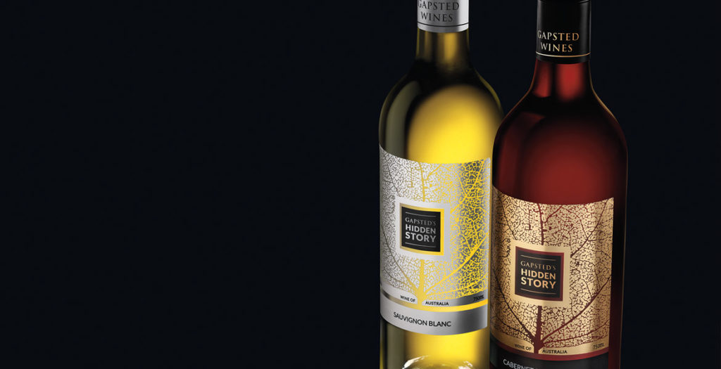
The innovation of the Hidden Story label lies in the combination and application of both paper, gold and silver foils on a clear adhesive label stock. This development for wine labels delivers a premium expensive look for a global market whilst still being cost effective for the client.
John Jewell Design devised the concept for the label, then sent the artwork to printing partners in Germany to prepare full-spec mock-ups for review. The print results were astounding and the overall concept achieved the brief of producing a label that would create maximum interest in a crowded retail environment, whilst delivering something not often seen in the industry.
The design’s objective was to convey the family lineage through a simple graphic representation. This was achieved twofold by illustrating the detailed veins of a leaf, which, upon further inspection, also depicts the silhouette of a tree. Both interpretations of the image symbolising the Gapsted Wines family tree.
So as not to detract from the powerful design, the branding was purposely kept to a minimum, and instead of producing a text heavy back label, a QR code is utilised, leading consumers to the Gapsted website for further information about the brand and the wines.
As times rapidly change, everything ages faster. Brand rejuvenation is an integral part of keeping your brand fresh and relevant to today’s consumers and can breathe life into a company, resulting in growth.
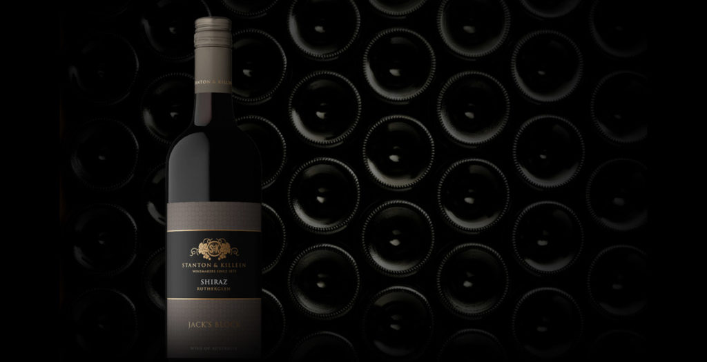
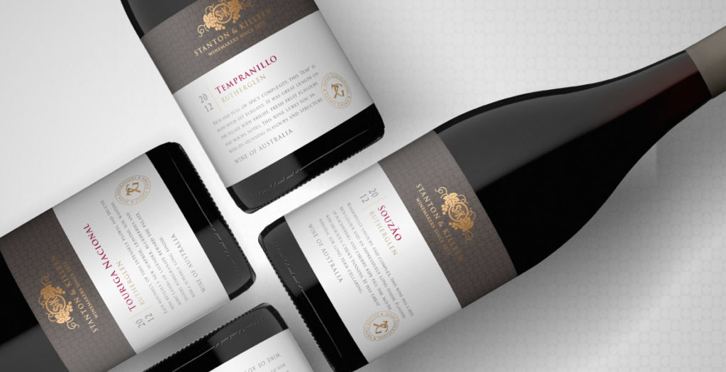
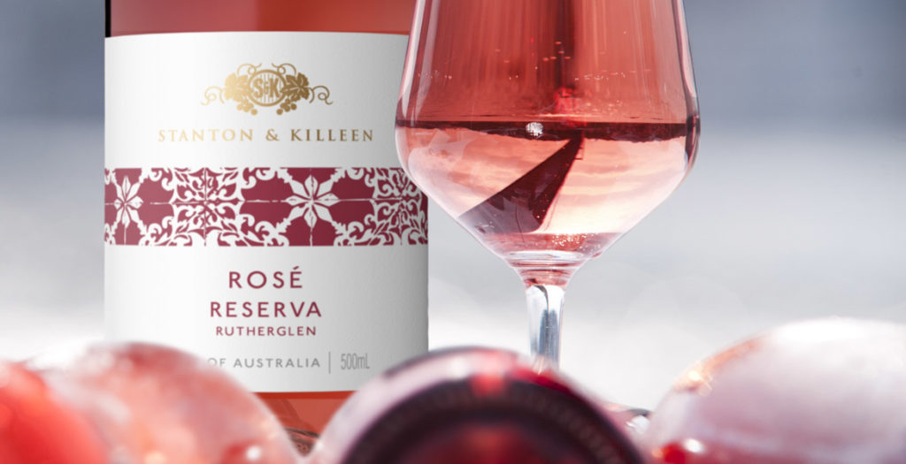
When updating the look and feel of an established brand, it is important to build on the brand’s heritage, to improve on their strengths and appeal to a new generation of consumers without alienating existing relationships. This is something John Jewell Design kept in mind when working with the internationally recognised Stanton & Killeen range.
The brief was to create a range of labels that reflected a sense of place and touched on the long history of the winery.
John Jewell Design developed a comprehensive look and feel that is truly in sync with the overall brand identity. From the Icon range through to the Limited Release, Premium and Everyday range the new labels project a sense of heritage and quality, with the use of rich gold speaking to the distinguished nature of the wines.
We feel the new labels stay true to our 140 year history, yet also invite new people to connect with our brand using contemporary design elements.Natasha Killeen
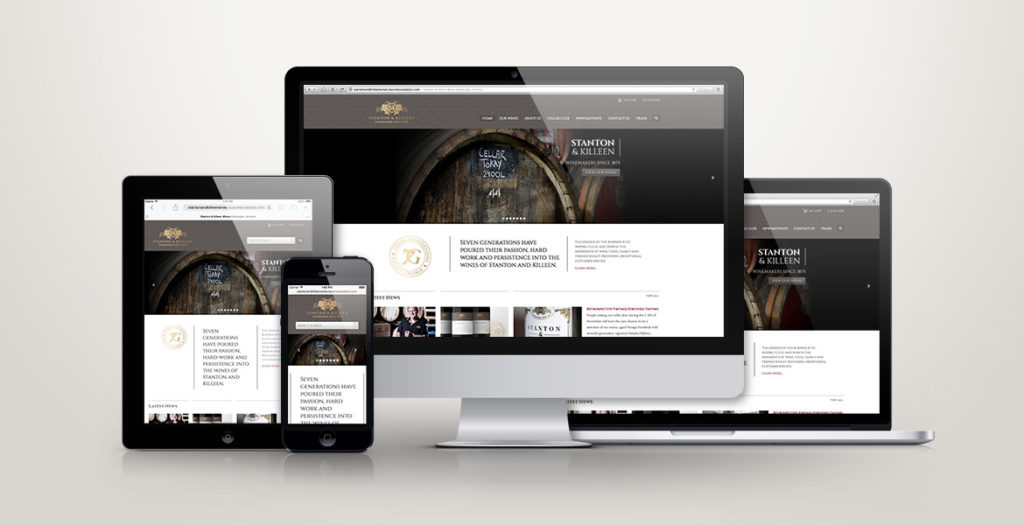
John Jewell Design also rebuilt the Stanton & Killeen Wines website which was very outdated in both look and functionality. Launched in February this year the new site has been a great success creating a modern, user-friendly design that unifies the Stanton & Killeen brand.
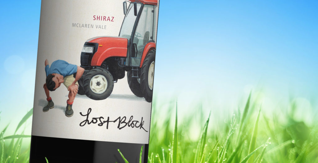
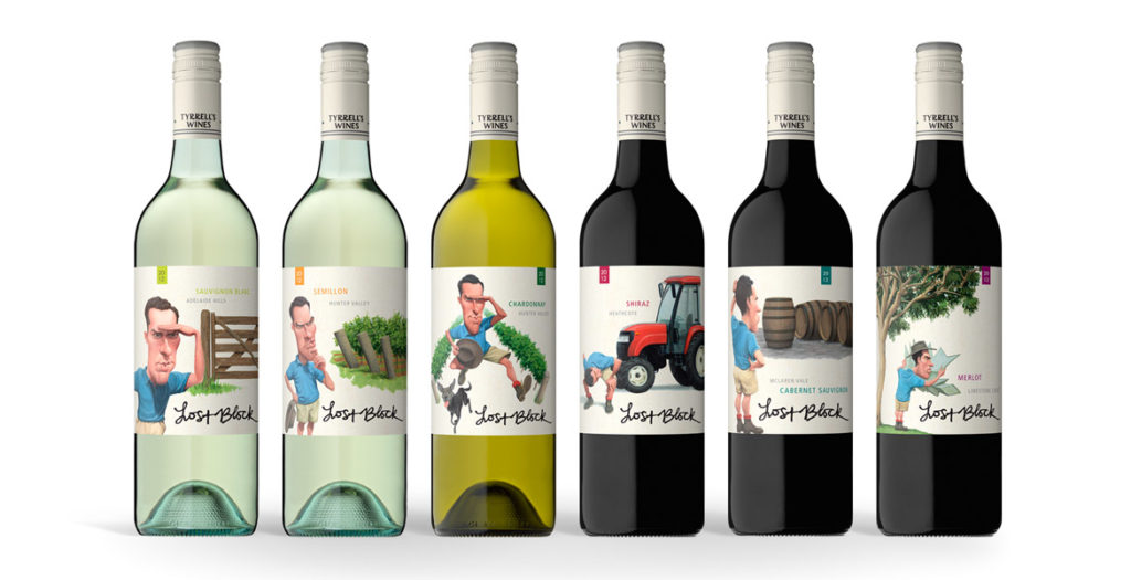
The strength of the new Lost Block labels lies in the distinctive and dynamic illustrations that were brought to life after months
of development.
The previous labels focused solely on typography, however when it came time to re-energise the brand, the brief given to the team at John Jewell Design
was to create a label that would appeal to a younger demographic while also conveying the story of the Lost Block in a contemporary fashion.
Illustration was key and months were spent on draft sketches to fine-tune the image of the Vineyard Manager, as his presence on each label would play an
integral role in tying the range together. A distinctive scenario was then created to distinguish each varietal, while still utilizing the same design
cues to ensure that each label worked together as part of a cohesive larger story.
Earthy tones were used to create the individual scenarios, whilst the distinctive blue of the vineyard manager’s shirt allows him and his ‘searching’ to
take center stage in each illustration.
To provide existing consumers of Lost Block with an easily identifiable link between the old and new labels, the original typography of the “Lost Block”
was preserved, and the Tyrrell’s name was incorporated into the capsule.
With bold illustrations and a fresh new face, this rebranding of one of Tyrrell’s flagship brands, re-energises it for a whole new generation of wine-lovers.
A word from Tyrrell’s…
What we wanted to achieve with this refresh was a more graphic depiction of the ”Lost Block” story, in an interesting and quirky way, we are very happy
with the final resultMike Cutrupi, Sales & Marketing Manager Tyrrell’s Wines
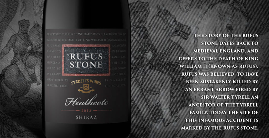
After nearly 20 years the Rufus label needed an update. John Jewell Design was able to provide that whilst maintaining the key elements of the packaging.
Bruce Tyrrell, Tyrrells Wines
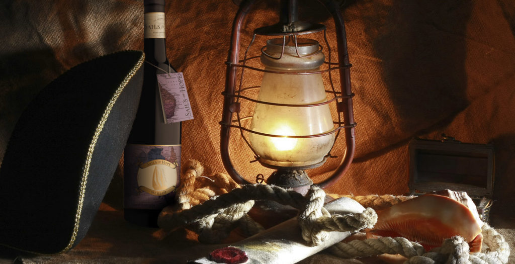
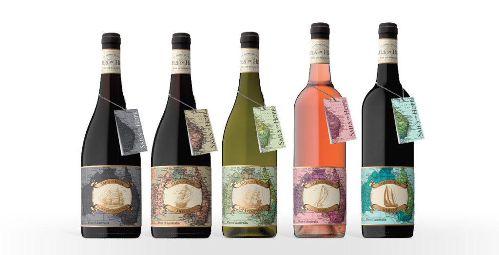
The ‘Sails of Hope’ label provided a unique opportunity for the team at John Jewell Design; create a heritage-style label, but give it a modern, youthful edge.
Starting with traditional ship illustrations and a request that the map of Australia should also be incorporated, our talented designer Bri was able to meld these elements with a lush, contemporary colour palette and a subtle use of rich, gold foil. What resulted was a label that spoke of history and tradition, whilst also portraying a youthful spirit. The clever use of colour allows the label to appeal to a broader audience, whilst still conveying a sense of prestige and quality.
The addition of the neck tag was another important feature of the design. Its seamless integration into the packaging allows the label to remain uncluttered whilst still providing consumers with detailed region and tasting information. It acts to strength shelf presence, providing consumers with a point of difference and by design, it’s removable nature means it can be kept as a cue for repeat purchase.
A word from Mica Australia…
Once again, the team at John Jewell design have done a tremendous job of bringing to life our vision; creating unique, eye-catching labels for a new range of wines. They were professional, easy to work with and created labels that were very much in line with our design brief. We are more than impressed with the quality of the work produced.
Josh P Sawyer, Mica Australia