In: bespoke design
12/11/2013
New Work: Summer White Wine Label Design
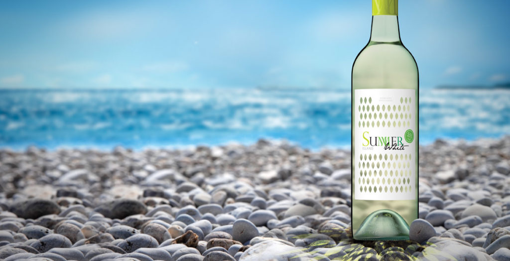
Innovative wine label design!
We were looking for an eye-catching and fresh approach for a category that is just building up in Europe. John Jewell Design came up with a great idea first time round. They createda cost-effective packaging concept taking into account technical feasibility. We are confident that this label will be the break-through for our product!
Heidrun Bebendorf, WSK OSTRAU GmbH
15/01/2013
New Work: Athena Rosé Wine Label Design
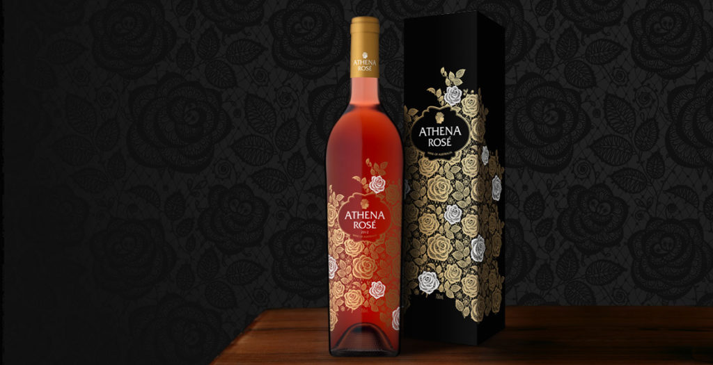
A feminine aesthetic, a premium offering and a touch of mysticism were the key drivers of the brief in creating Athena Rosé.
This stand-alone Rosé would join the current stable of wines, however it was to be a completely unique proposition, with a specifically female target market and designed to be seated as a super premium offering within the range.
To achieve the feminine atmosphere that our client was seeking, the completed imagery features an intricate lace-like design, which is further enhanced by the use of gold foil with striking white accents. The artwork was screen printed directly onto the bottle and by using this technique we were able to achieve an elegant sense of fluidity that would not have been possible with traditional label printing methods. This also allowed the colour of the bottled Rosé to play an integral part in the design, filling the space between the roses, enhancing the beauty of the artwork and ensuring the gold foil shimmers.
The rose-patterned design wraps completely around the bottle, delivering a lush, seamless finish, while the use of minimal text allows the beauty of the design to shine through without distraction.
With a name heralded from a Greek goddess, the label has a sense of wonder, a touch of the divine, and so an image of Athena’s face in profile was incorporated into the design to tie-back to the brand name.
To underpin the feminine nature of the brand, a slim, elegant French bottle was selected, allowing the design ample room to dreamily encompass the space, and was completed with a gold foil capsule.
The elegant imagery of Athena Rosé was reinforced by its application across all packaging and marketing materials, ensuring a complete sensory experience for consumers.
A word from Mica Australia…
We’ve been fortunate enough to work with John Jewell on a number of occasions now and we’ve always been very impressed with the quality of his work. In this instance however, when it came to the final design for our ‘Athena Rose’, his work exceeded all of our expectations and we’re absolutely delighted with how the artwork turned out. With only a short marketing brief from which to get an idea of the direction we wished to take, John has come back with a design that perfectly hits the mark. It’s detailed, intricate and extremely sophisticated; a design that we feel confident will help to position the product as intended in the eyes of target consumer segments.
John Jewell is very capable and passionate designer that has an intimate knowledge of what makes for a successful wine label. I cannot recommend him highly enough.Josh P Sawyer, Mica Australia
This is fantastic work! When the design came out, we knew it was going to sell well. The finished product was even better than we expected, our customer loves it. Thanks John Jewell Design!
George Wang, WinWorld Australia
21/11/2012
New Work: Journey Wines Label
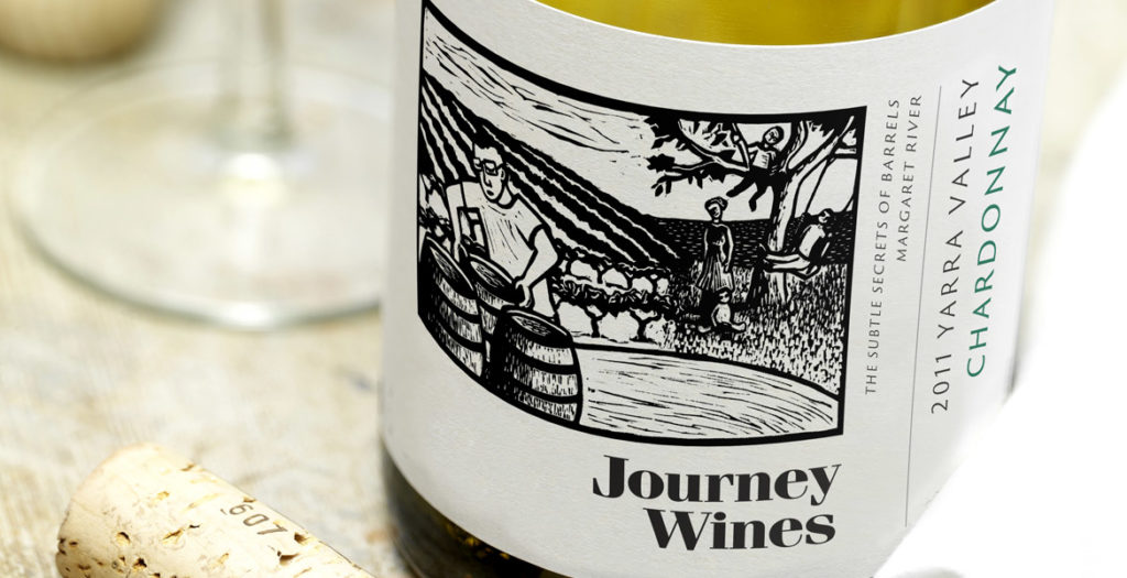
I couldn’t be happier with Kim’s work on the Journey Wines label design. They are brilliant at interpreting a brief, the reaction to the labels in the market has been exceptional!
Damian North, Managing Director & Winemaker, Journey Wines
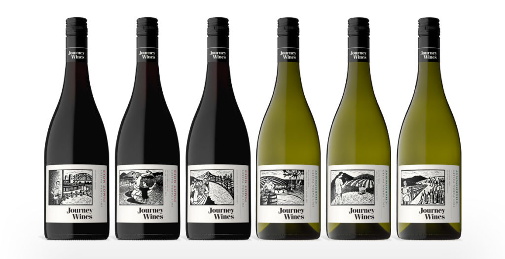
Linocuts by Shana James
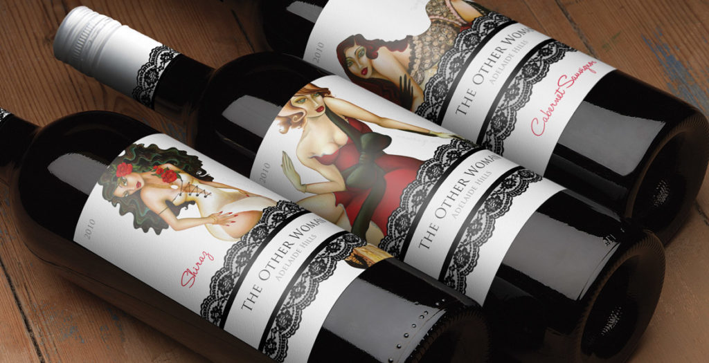
John Jewell Design has won bronze at the 2011 LATMA Label Competition.
The striking, contemporary label design was entered in the Flexo – Colour Process category and was printed by Studio Labels, Adelaide. Graphic designer Kim Ratcliffe, from John Jewell Design, created the award winning ‘The Other Woman’ wine label.
