January 2013
29/01/2013
John Out and About
John has been doing alot of travel since the begining of 2013.
On one of his trips he was able to meet with the General Manager of AGDA, Rita Siow and Irene Previn. This was an exciting meeting for John Jewell Design helping create future business oppotunities.
15/01/2013
New Work: Athena Rosé Wine Label Design
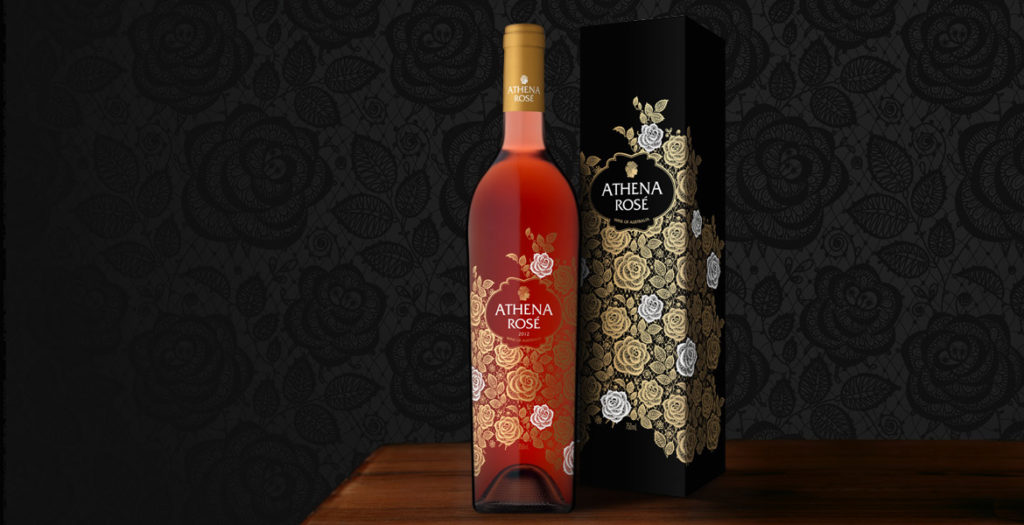
A feminine aesthetic, a premium offering and a touch of mysticism were the key drivers of the brief in creating Athena Rosé.
This stand-alone Rosé would join the current stable of wines, however it was to be a completely unique proposition, with a specifically female target market and designed to be seated as a super premium offering within the range.
To achieve the feminine atmosphere that our client was seeking, the completed imagery features an intricate lace-like design, which is further enhanced by the use of gold foil with striking white accents. The artwork was screen printed directly onto the bottle and by using this technique we were able to achieve an elegant sense of fluidity that would not have been possible with traditional label printing methods. This also allowed the colour of the bottled Rosé to play an integral part in the design, filling the space between the roses, enhancing the beauty of the artwork and ensuring the gold foil shimmers.
The rose-patterned design wraps completely around the bottle, delivering a lush, seamless finish, while the use of minimal text allows the beauty of the design to shine through without distraction.
With a name heralded from a Greek goddess, the label has a sense of wonder, a touch of the divine, and so an image of Athena’s face in profile was incorporated into the design to tie-back to the brand name.
To underpin the feminine nature of the brand, a slim, elegant French bottle was selected, allowing the design ample room to dreamily encompass the space, and was completed with a gold foil capsule.
The elegant imagery of Athena Rosé was reinforced by its application across all packaging and marketing materials, ensuring a complete sensory experience for consumers.
A word from Mica Australia…
We’ve been fortunate enough to work with John Jewell on a number of occasions now and we’ve always been very impressed with the quality of his work. In this instance however, when it came to the final design for our ‘Athena Rose’, his work exceeded all of our expectations and we’re absolutely delighted with how the artwork turned out. With only a short marketing brief from which to get an idea of the direction we wished to take, John has come back with a design that perfectly hits the mark. It’s detailed, intricate and extremely sophisticated; a design that we feel confident will help to position the product as intended in the eyes of target consumer segments.
John Jewell is very capable and passionate designer that has an intimate knowledge of what makes for a successful wine label. I cannot recommend him highly enough.Josh P Sawyer, Mica Australia
