By: John Jewell
22/06/2018
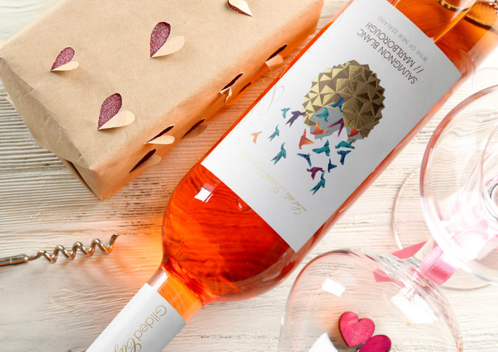
Blurring the Lines
The wine industry has started to move away from the tradition of distinguished, stately wine labels and is trending towards the more youthful, out-there labels commonly employed by craft beers.
As consumers become more familiar with seeing these labels on their local bottle shop shelves, as well as on their hip inner-city café tables, they are coming to expect their wine labels to follow suit.
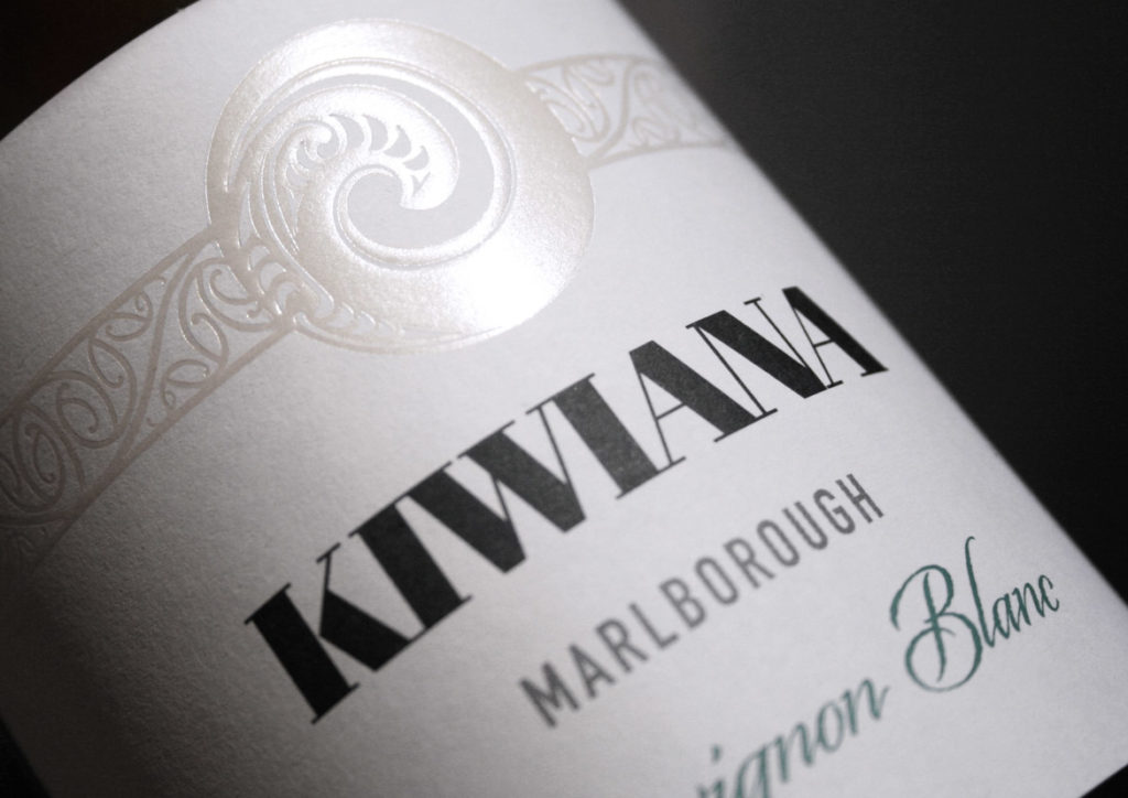
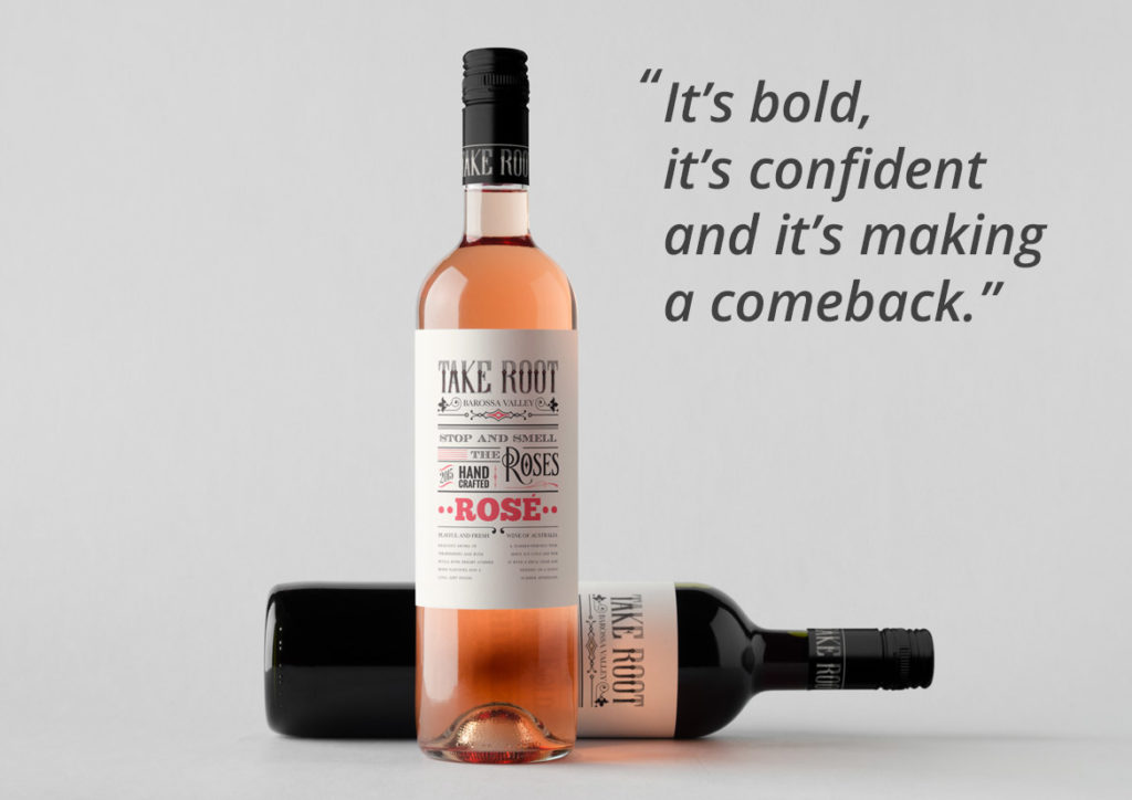
There are two key trends that have emerged as a result of this shift. The first are labels that are dominated by typography, lending a vintage, yet quirky feel. This was a trend that ignited about 10 years ago but quickly disappeared. It is now making a strong and decisive come back.
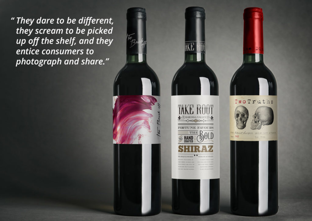
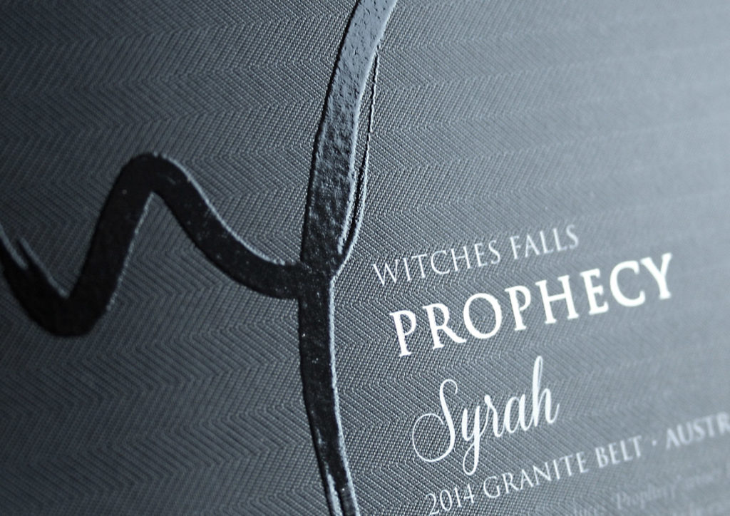
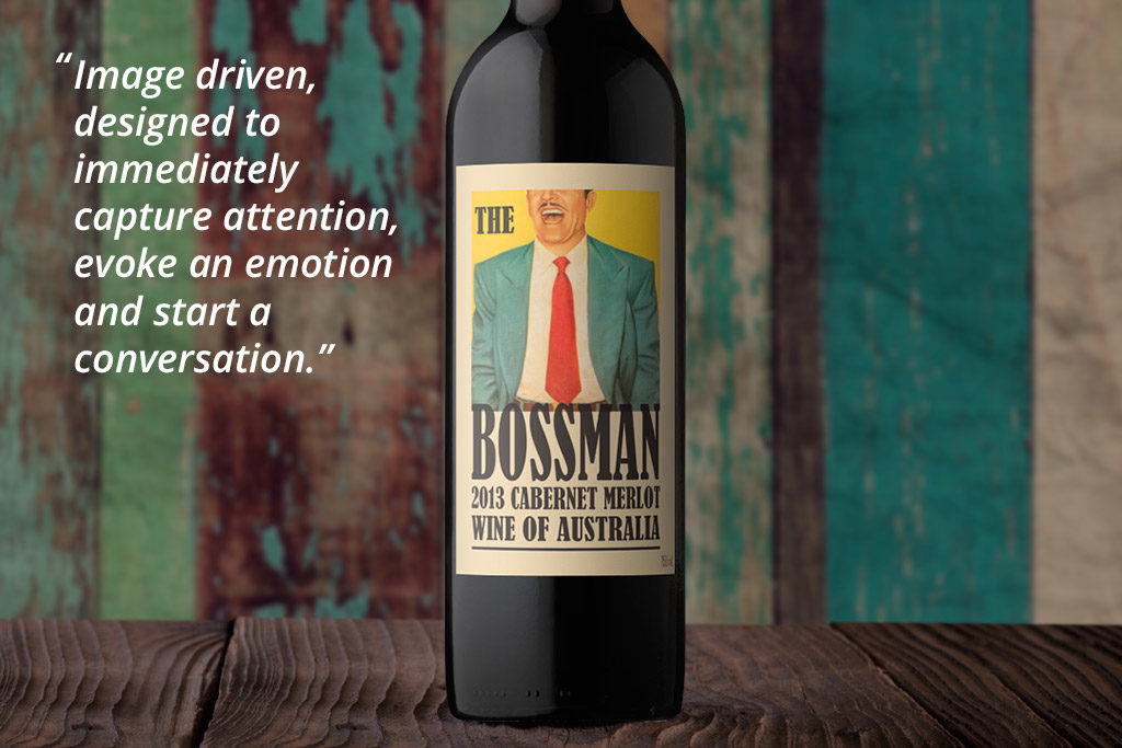
The second key trend is wine labels that don’t look like wine labels. They carry no distinguishable wine information on the front label and are primarily image driven. They dare to be different, they scream to be picked up off the shelf, and they entice consumers to photograph and share.
These shifts are already happening, with key markets being the UK, USA and China. If you’re interested in hearing more about these current wine label trends, as well as benefiting from John Jewell Design’s in depth understanding of the industry, contact the team on 02 6040 4433.
15/08/2017
Reshaping the Wine Industry
At John Jewell Design we invest in understanding trends. We don’t consider it a nicety, it’s a necessity. We research, we travel, we observe and we process all this knowledge to deliver designs for our clients that reflect emerging market needs.
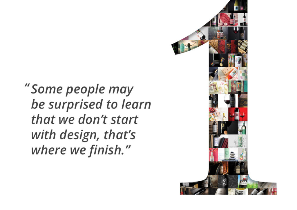
Some people may be surprised to learn that we don’t start with design; that’s where we finish. We are fully immersed in the nuances and intricacies of the wine industry landscape, and it’s here that we find our starting point. This knowledge informs our design direction and how we advise our clients.
Whether it’s a private label design or a refresh of a current brand the rules are the same, always start with what’s driving the consumer at that point in time. We can fully understand our client’s needs because we are across the trends that will influence their customer’s buying habits and this allows us to give clients what they need: labels that drive results.
Trends in wine label design – as in any design-driven industry – tend to be cyclical, with labels that may have been popular a decade ago suddenly enjoying a revival among the masses. We’ve seen this recently with typographic labels and the art is in knowing how to rework these designs for a market that is split between those who nostalgically remember the first incarnation, and those who are experiencing this trend for the first time.
Clients can sometimes be hesitant to revisit past trends, but a willingness to take a calculated step back in time can often result in taking a big step forward.
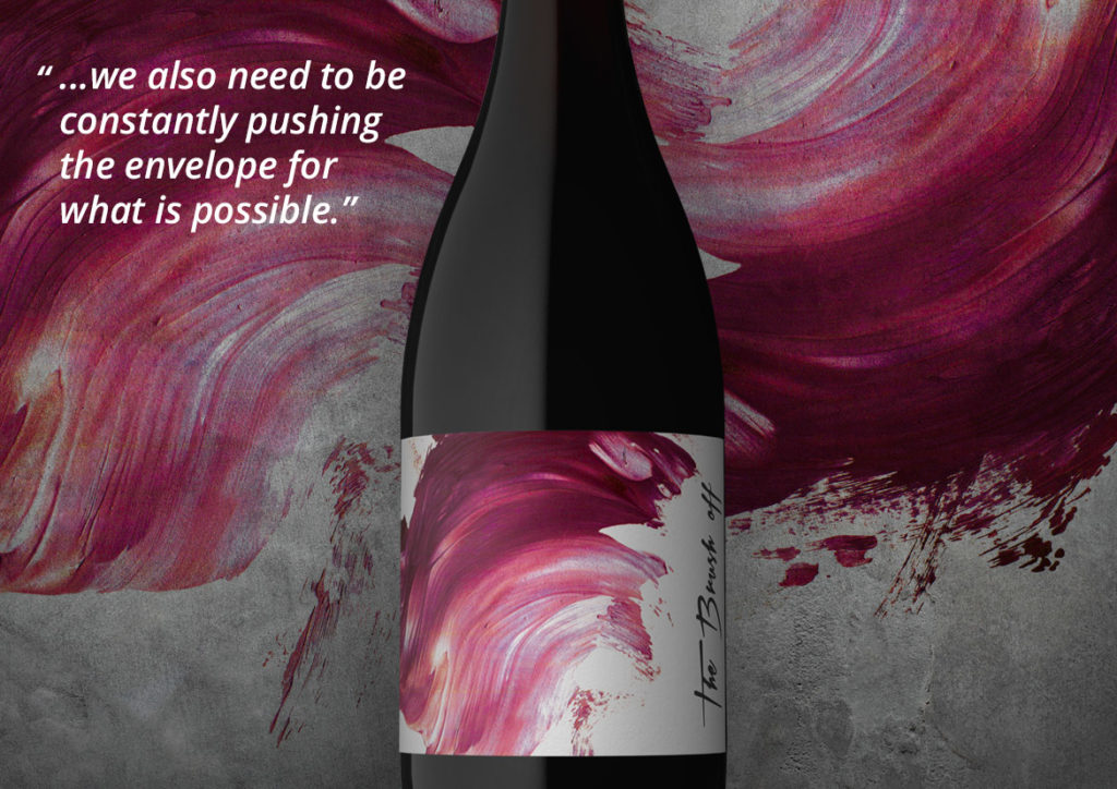
In addition to being immersed in these trends, we also appreciate how imperative it is to constantly develop as an industry. To evoke real, meaningful change that continues to attract and captivate customers, we also need to be constantly pushing the envelope for what is possible. We are continually experimenting with designs, techniques and processes to develop label design concepts that have never been done before. This provides our clients with options that can’t be found elsewhere.
Customers are constantly changing and evolving. As an industry, we need to keep evolving too. At John Jewell Design we’re making a contribution to this evolution. One label at a time.
14/06/2017
Owning the Shelf
The wine can’t speak for itself when it’s sitting on a bottle shop shelf. It needs something to speak for it and that something is the wine label. Bottle shop shelves are a study in trying to be noticed, a plethora of options all screaming “Pick me! Pick me!” They’re all there for the same reason, and they’re all competing against each other to be the lucky one that ends up in the customer’s hands. So how do you make your label stand out from the masses?
How do you make your label stand out from the masses?
Good design is crucial, to the point now where it’s a moot point. Of course it’s important. No one sets out to emblaze their wine bottle with a label that they don’t think is worthy. But sometimes good design alone is not enough.
So if it’s not just design, what else is there in the ‘first-impressions last’ world of the bottle shop? The answer lies in the label itself. The stock, the print, the embellishments, they matter, and they all make a difference.
Picture two labels side by side with the same great design. Now imagine one is a standard print, nothing fancy – just ink on paper – whereas the one next to it utilises some strategic embossing, some carefully placed foiling, some artfully applied spot gloss varnish and custom die-cutting. These two labels may boast the exact same design, but the latter is suddenly alive, it radiates light, it intrigues with it’s depth, it exudes luxury and it calls to the customer on a level that the plain label can’t compete on.
And herein lies the challenge for wine businesses looking to create new labels; they need a designer who not only understands the design, but who also understands how embellishments can truly bring each label design to life.
Embellishment options are many and varied and each has its place and purpose; custom die-cutting allows the label to break free from the standard straight-edged mould, offering graceful curves and design hugging edges. And if die-cutting breaks free from the mould then screen printing directly onto the bottle completely breaks the mould, removing all constraints of traditional label printing and allowing complete freedom regarding placement. The use of varnish, either spot gloss or high build is a subtle but highly effective way to highlight key aspects of the label without being overt or gaudy, while foiling instantly lends an air of luxury through its use of metallic foils, most commonly gold and silver.
To make the most of these embellishments, the label needs to be designed with these options already in mind so that the label is created in tandem with its embellishments, the two working hand-in-hand to deliver a truly cohesive result.
So if you’re looking to create a new label and want a designer who knows the ins-and-outs of not only label design, but also label embellishments, contact the team.
19/03/2017
Emerging Wine Label Trends for 2017
John’s travels always provide a wealth of knowledge regarding emerging trends and shifts in the market and his latest expeditions overseas were certainly no different. Want to know what role craft beers are playing and how drinks other than wines are leading the charge? Then read on….
The industry has started to move away from the tradition of distinguished, stately wine labels and is trending towards the more youthful, out-there labels commonly employed by craft beers. As consumers become more familiar with seeing these labels on their local bottle shop shelves, as well as on their hip inner-city café tables, they are coming to expect their wine labels to follow suit. They don’t want labels that just sit back and wait to be noticed, they want something that jumps out at them, grabs their attention and demands to be photographed for their social media feeds.
There are two key trends that have emerged as a result of this shift and interestingly the first is one that ignited about 10 years ago but disappeared almost as quickly as it appeared. We are talking about labels that are dominated by typography, lending a vintage, yet quirky feel. These often employ subtle uses of colour and occasional imagery but none of this distracts from the hero of the label, which is the typography. It’s bold, it’s confident and it’s making a comeback.
The second key trend is even more curious than the first in that they are wine labels that don’t look like wine labels. They carry no distinguishable wine information on the front label and could be at home on the front of any type of beverage. These labels are image driven, designed to immediately capture attention, evoke an emotion and start a conversation. They dare to be different, they scream to be picked up off the shelf, and they entice consumers to photograph and share. On the shelf, they rely on the bottle itself as the sole wine identifier, preferring to keep all wine-related information to the back of the bottle.
These shifts are already happening, with key markets being the UK, USA and China. If you’re interested in hearing more about these current wine label trends, as well as benefiting from John Jewell Design’s in depth understanding of the industry, contact the team.
06/11/2016
Online Wine Label Solutions
The benefits of buying off-the-shelf
It all starts with understanding your market, and then building a memorable brand that is brought to life through outstanding design. It’s about cutting through shelf clutter so your wine is the stand-out choice for your customer.
Here at John Jewell Design, we are constantly travelling and studying the wine markets around the world. This is to ensure our wine label offerings target the unique needs of the many different wine businesses, both here in Australia and abroad.
In addition to our extensive bespoke design services, we have used this expert knowledge to create a considered collection of wine label designs, all available for immediate perusal and purchase via the John Jewell Design website.
This online gallery takes the guesswork out of choosing a wine label by guiding you through the selection process. You can search by a particular design style, which is perfect for when you already have an idea about the type of label you require. Or alternatively, you can search by country, to be shown styles that are best suited to your specific market.
Depending on your requirements, you can also explore our different tiers, as we know every one has their own design needs and budgets. The VALUE section offers exactly that – fantastic front label designs at a pocket-friendly price. Or you can step up to the PREMIUM section if you require a full suite of design elements. All premium concepts include a unique brand name, a front label and back label design, plus capsule graphics. You can also search the Organic Wine Infusions section, which has been created specifically for this niche and emerging segment.
All label designs are print-ready and deliverable worldwide, resulting in fast turn-around times to get your product straight to market.
To protect the exclusivity of the labels on offer, access to the gallery is via invitation only. So if you’re in need of a new wine label and want to be guided by the best in the business, we invite you to get in touch today.
Contact Elise on please enable javascript to view or +61 (0)2 6040 4433 Monday to Thursday or send us your details and we’ll get back to you. Once approved we will email you your individual username and password.
11/07/2016
Trends in Labelling

While visiting Vinexpo Hong Kong, John sat down with the editor of VINEXPO Daily Magazine to share his thoughts on the latest trends in wine label design and branding.

Towards more funky, trendy design –the expert’s point of view
John Jewell Design was established in 1995 with the sole aim of creatinginnovative branding and labelling for the wine industry. We asked Johnto tell us a little more about his background…
When I started out I had two or threehundred clients in Australia and I woulddrive around and see people at theirvineyards. At that time there were 3,200winegrowers in Australia, and I realisedthat if we were only working on wine,the market was too small. So I went toLondon and had a meeting with MartinCampion, who was head of designfor Direct Wines, and after a shortmeeting we had his account. Today,our core markets are Australia, Chinaand Europe, especially in Norway andSweden.
What are the trends today?
Millennium buyers are the biggesttarget in the world today, and it’s a verydifficult one, because they rarely everbuy the same thing twice – so they’re amoving target. In the past six months, ascraft beer designs have been changingthe world’s thinking on designs andpackaging, the wine industry is tending to follow suit. A year or so ago in thewine industry it was all about stately,classic, distinguished products. Nowthey’re tending towards funky, trendy,out-there, look-different, and be loudoff the shelf. I see a major trend aroundthe world as following what craft beershave done.
What’s the secret to a successful design job?
You can design whatever you like,but it has to be economically viable.Printing techniques vary greatly aroundthe world. We’ve done a lot of sleevedesign work, but production aroundthe world is a bit of a problem withsleeves. Screen-printing on bottles looksfantastic, but logistically, you have aproblem. The world market is looking forsomething new in wine, and our HolyGrail is trying to find out what the nextbig trend will be!
Read the full issue here >
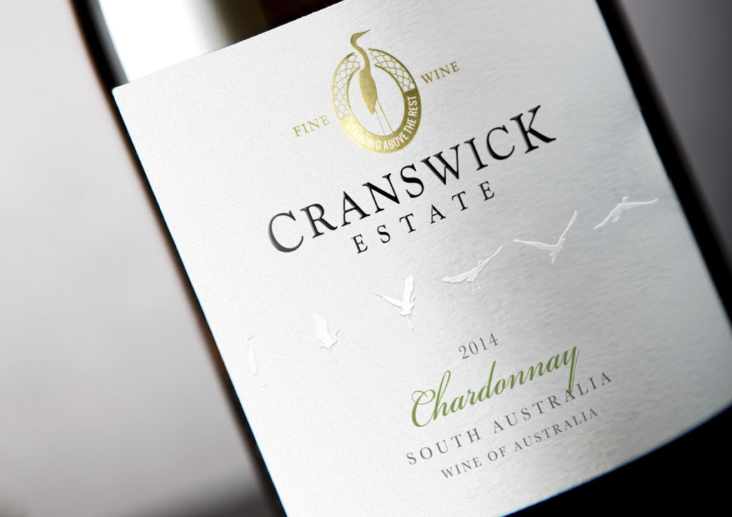
Often when we think of updating a label we imagine a complete overhaul with major changes to logo, layout, colour and typeface. This doesn’t always have to be the case though and sometimes the most effective label updates are those that require a subtle nip-and-tuck rather than an entire facelift.
The Challenge:
The Cranswick Estate label had provided eight solid years of service and whilst it was a solid performer, the march of time required certain updates be made to ensure relevancy in a busy marketplace, whilst still remaining true to the core elements of the original label.
The Solution:
The first task was to identify the key elements that would be carried across to the new label – such as the crane motif and logo style – as well as deduce what new elements were to be incorporated to breathe freshness into the design.
To create a contemporary look, the die-cut lozenge made way for a straight label that immediately raised the tone of the whole design and set the scene for the changes to come. The crane image from the existing logo remained the same but the design was reworked from a solid-colour block into a gold foil portrayal that was both intricate and refined, and served to add premium quality cues.
The bird flight path was retained, however the background label colour was changed from white to a soft grey and the birds were then embossed and changed to white. With this new treatment, they were then moved into the middle of the label to give them prominence and ensure their new look was given plenty of room to fly off the label and grab consumer attention.
Finally, a subtle tweak was made to the varietal font to deliver a classic feel without straying too far from the original.
In Closing:
When a brand is strong and the imagery is still considered crisp and clean, only small changes need to occur to achieve a striking, contemporary update whilst still remaining true to the label that came before.
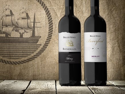
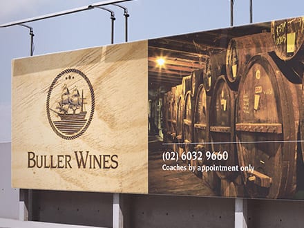
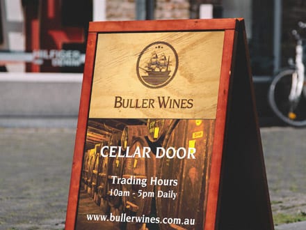
How do you tackle a rebrand when the current imagery is steeped in history and tradition? You look to the past to provide inspiration for the future. This is exactly what the John Jewell Design team did to deliver a refresh and relaunch of the Buller Wines winery and business…
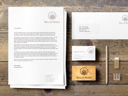
What is Branding?
Branding is the art of imbuing a product with its own unique and authentic personality, making it attractive and memorable to new and loyal customers.
Who are Buller Wines?
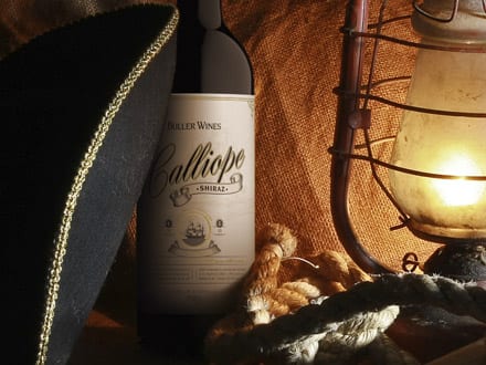
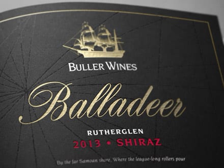
The Buller Wines story was born in the early 1920’s when Reginald Buller purchase a vineyard in Rutherglen and named it Calliope after the famed ship that survived against all odds in the 1880’s. The vineyards, the family and the wine brand continued to evolve through the years and in 2013 the Judd family took the helm and have continued its growth and success.
The Challenge
The Calliope ship is an integral part of the Buller Wines story and imagery however the existing illustration was in need of a modern refresh. Given Calliope was a real vessel the first challenge was to ensure that any new imagery stayed true to the appearance of the original ship. The second challenge was in delivering new imagery that could convey the history of the brand but in a contemporary style that would work successfully across both small and large format requirements.
The Solution
In tackling the rebrand, the John Jewell Design team knew where they had to start. They took the time to look back through the history books and unearthed a bold image of the Calliope, showing it at full mast with a strong, commanding presence.
The image was then skilfully illustrated to best represent the authenticity and integrity of the long established Buller brand and it was then integrated into the brand’s logo and rolled out across labels, printed and electronic collateral and advertising.
In Closing
Rebranding isn’t always about coming up with something new; sometimes it’s about going back to the beginning to draw inspiration for the future. This was definitely the case for the Buller Wine rebrand. To find out how John Jewell Design can help you breathe new life into your brand, contact us.
24/01/2016
Wine Infusions
The whispers about wine infusions are now a buzz that cannot be ignored.
Led by European trends, predominately from Germany and the Netherlands, this category is growing rapidly. Winemakers and retailers alike are making strong moves towards wine infusions in an effort to secure the coveted 18-24 female demographic.
But what exactly is it that attracts consumers to wine infusions, and how can your label design capitalise on this trend?
There’s a whole host of reasons why wine infusions are generating so much interest amongst consumers. First and foremost, wine infusions are both lower in alcohol and lower in calories. For 18-24 year old females – who are generally very health conscious – this alone is hugely enticing.
Secondly, the addition of natural plant and fruit flavours means the wine infusions have a hint of sweetness that makes for a far more palatable drinking experience for those new to the world of wine. This, combined with the addition of a light spritz, makes for an overall easy drinking experience, particularly served over ice in the warmer months.
To a wine novice, the “rules” around wine can be confusing, and traditional wine blends are often perceived as harsh and too dry for an untrained palate. Fruit-driven infusions remove the mysticism around wine, providing a sweet, satisfying entry point for new consumers.
All this must be kept in mind when developing labels for wine infusion brands. It’s important to ensure the labels are both accessible and engaging to appeal to the new generation of wine consumer, steering clear of any old-world wine label cues. Labels should be bright and fun, reflecting the vibrant colours of the wine infusions themselves, whilst maintaining an overall finish that is both fresh and uncluttered.
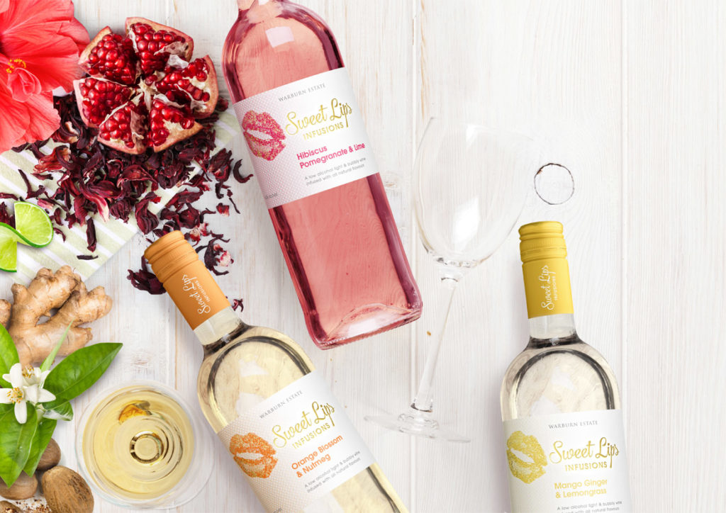
The recently designed Sweet Lips reflects the above thinking. The label employs vibrant, striking colour that simultaneously draws the eye and acts as a subconscious cue to the flavours within. The vivid colours are given room to shine on a crisp white background with minimal distractions, while the use of gold foil adds a premium feel to the label.
If you’re interested in developing your own wine infusion brand, John Jewell Design has a range of off-the-shelf options available on their website for you to review and purchase. Check them out here.
21/01/2016
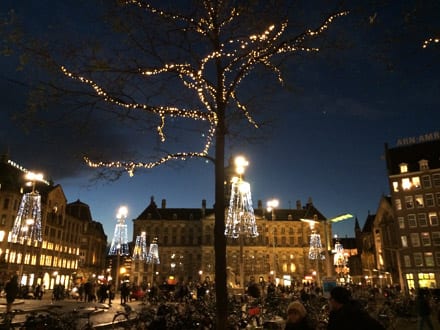
A year in travel
As a seasoned traveller who undertakes several international trips a year, John Jewell implemented a new travel strategy in 2015, undertaking shorter, more frequent trips, allowing leads and subsequent projects to be followed up faster and more effectively. With 2016 well underway, what are John’s thoughts on the new strategy?
The new approach to travel worked incredibly well in 2015. It allowed for increased exposure to international trends and even more dedicated face-to-face time with existing clients. When you travel as much as I do, it’s important to continually evaluate and refine the year’s travel strategy to make sure the time spent abroad is as productive as possible for both myself and my clients.
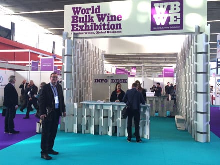
John spent almost 3 months overseas in 2015, attending wine shows such as Prowein, London International Wine Fair, Bordeaux Wine Fair and the Bulk Wine Exhibition in Amsterdam. The time abroad is also used to visit retailers to identify emerging trends and any shifts in the market. Of his discoveries for 2015, John says,
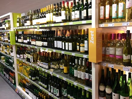
Supermarkets and wine stores are ranging wine by flavour profile rather than grape variety (i.e. Red wines are listed as either light, easy of powerful. White wines are listed as dry, medium sweet or sweet and Rose is listed as either fresh or sweet. Sparkling is still listed under the sparkling category), this is a big change in the way wine is displayed and we’ve yet to see this reflected in Australian retail outlets.
The other shift that has become evident in the last 12 months is the move in London and China from conservative wine label designs to more modern and contemporary styles. Specifically in China, this change seems to be driven by young entrepreneurs having an increased influence on the market.
Year after year, John still believes Prowein in Dusseldorf is his most successful, saying,
I’ve been attending Prowein for 12 years now and it continues to be the stand-out. In 2015 I was booked out for 3 days straight with meetings every 45 minutes for 8 hours each day.
The continual success of John’s visits to Prowein means this year he’ll be accompanied by Melissa, another member of the JJD team to help in delivering even greater outcomes from the fair.
The extra pair of legs on the ground isn’t the only change for the year ahead, 2016 will also see John attending additional wine shows in New York, Shanghai, Singapore and Hong Kong.
With all this locked in and other plans in the works, 2016 is already shaping up to be a busy one!
08/06/2015
The Impact of a Wine Label

Why are labels so important to our wine-buying choices?
In a busy bottleshop, where shelves are crowded and the choice can be overwhelming, it’s not the winemaker’s resume or even the price that will sell your wine. Learnings from consumer psychology tell us that most wine sales are made purely on the strength of a label.
The reality is most consumers aren’t connoisseurs; they are customers looking to buy an experience.
What their searching eyes see on your wine label lays the foundations for that experience. Purposeful and carefully crafted visual cues subtly influence perceptions of price, quality and even taste.
To encourage a hand to reach deeper into their pocket, consumers expect to see labels that feature minimalist, uncluttered designs and an elegant, refined font. Adding texture – such as embossing – provides a tactile feature that activates increased perceptions of price and correlates with heightened anticipation and an increased drinking experience.
To sell a wine at a value-for-money price point, labels need to visually jump off the shelf through the careful construction of bright colours, bold, fun graphics and quirky or unique fonts.
At the end of the day, your label sets the tone for your customer’s experience and is often as important – if not more important – in driving the sale than the wine itself.
John Jewell spends several months every year traveling the world and acquiring insights into consumer psychology, preferences and trends to bring back home and translate into eye-catching, award-winning labels for his clients. If you have a label or brand that could benefit from John’s experience and knowledge, give him a call on: +61 (0)2 6040 4433 or send him an email.
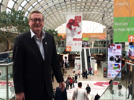
It’s already been a busy year for John, his passport and his ever-growing insights into emerging wine trends throughout the globe. John is undertaking shorter, more frequent trips to the UK and Europe so that he can be responsive in sharing his international knowledge with his valued clients.
John recently attended ProWein in Dusseldorf Germany, which is now regarded as the biggest trading show in the world. John says…
Prowein is a fantastic opportunity for me to meet with as many international clients as possible in a concentrated period of time. These exchanges are incredibly productive and the resulting work often hits the office before I’m even back in the country.
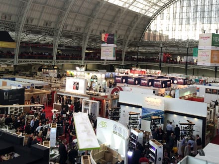
John was back in Australia for a few weeks after ProWein before heading off to the London Wine Fair, which he has participated in since 2002. This year saw him conduct six meetings a day, primarily with distributors. Regarding developments in the industry, John said…
It’s interesting to note the move towards trendy, quirky wine label designs in the U.K. I’ll be keeping an eye out to see how this develops further in the coming year.
John will be back for a total of 13 days before heading off again, this time to Vinexpo in Bordeaux. Stay tuned for further travel updates on this and subsequent trips.
