By: John Jewell
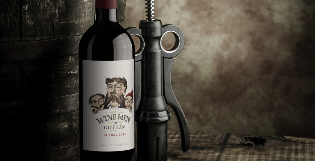
Rejuvenating the Wine Men of Gotham label was about finding a way to pull the existing label into the current market; the key to achieving this was colour.
The existing Wine Men of Gotham label had been in the market for a number of years and was ready for a facelift to ensure it stayed on course. The first task was to take the original black and white illustration and add colour in such a way that the design would feel fresh but still be recognisable. To ensure the illustration had stronger cut-through, the background needed to be stripped back to a crisp white, allowing the now coloured illustration plenty of white space to punch out of the label. Rather than being heavy-handed with varietal colours on the label, bold coloured capsules were used to reinforce individual varietals and make them easier to identify at a glance. This ensured the integrity of the label design was not compromised, but still achieved the varietal differentiation that consumers look for in the retail space. The rejuvenated Wine Men of Gotham label continues to project the same premium cues as the previous label, and also delivers a fresh new image that will see the brand stay relevant in the market for many years to come.
04/03/2015
New Work: Fruit Ardour Wine Label Design
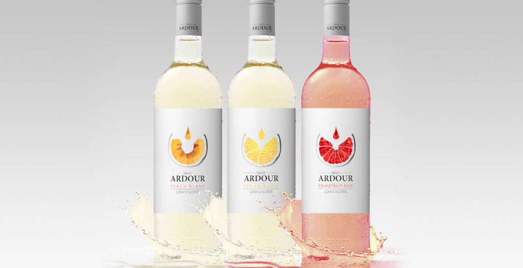
Fruit wine is the rising star of the wine market and with it comes the challenge of simultaneously appealing to a new-style of wine drinker, while also engaging the seasoned palate.
This new wave of wine is recognizable by its colourful and fun labels. The design challenge is to harness this youthful exuberance while simultaneously appealing to the traditional wine connoisseur. With Fruit Ardour, the brief was to develop a label that had strong wine cues, delivering a more serious offering whilst still emphasising the fruit aspect.
This brief was achieved primarily through the sophisticated and subtle use of colour and white space. The simple, uncluttered white background is reminiscent of high-end wine labels, whilst the singular use of colour delivers easy varietal differentiation without heading into “juice box” territory. Silver capsules provide continuity across the range, and add to the sophisticated finish.
The central graphic represents both wine being poured into a glass, as well as a geometric visual of the specific fruit, further emphasising the fruit connection but doing so within the domain of wine.
The resulting labels effortlessly combine the best of traditional wine with the modern vibrancy of fruit wines.

Across many industries within the commercial world, the digital revolution has changed the way that individuals and organisations go about their work. The designing and printing of premium wine labels is no different. Pencils and stencils have been replaced by complex design software and when it comes to the actual printing, the costly means of analogue production is being replaced by digital technologies.
Conventional printing methods are by no means obsolete technologies; they still have their place for longer print runs and on specialised projects. In recent years however, the quality of digital printing technology has progressed dramatically and now the quality of ‘digital offset’ rivals its traditional counterpart. In addition, what makes digital printing so enticing these days is that the range of papers and substrates is more extensive than ever before; be it premium papers, textured papers or transparent polymeric films.
Ultimately, digital printing gives both designers and label printers more flexibility than was ever available with analogue printing.
Here’s our short take on how and why:
Design/Proofing/Samples
Artwork can be loaded onto digital presses within seconds. We, along with our clients, are able to work hand-in-hand with label printing companies, allowing us to review proofs as they are printed and even make immediate changes while we wait.
Multi-versioned runs
Digital printing allows for cost-effective multi-versioning of labels within one print run. This is perfect for different vintages, varietals and even when catering to different geographical markets.
Cost-effectiveness
There was a time when commercial label printing was very much centered on long print runs. The longer print runs essentially absorbed the high set-up fees; this is no longer necessary. Short runs, anywhere from as little as 1000 labels, can be produced cost effectively.
Short lead times
Minimal set-up and no need for producing print plates means reduced turnaround times. It is now possible to be applying wine labels to bottles that were printed and finished less than 24 hours ago.
Finishing touches
When it comes to premium wine labels, the focus isn’t solely on the quality of the print. Premium wine labels use finishes such as hot foil stamping, embossing and spot varnishing, all these options can be used to great effect with digitally printed labels.
As more and more designers and printers move their businesses towards digital printing, the ability for greater creative freedom is being realised and this ultimately benefits not only clients, but also the industry as a whole.
label.co.uk (the label printers ltd) is an online label printing company that has embraced the digital revolution and invested heavily in a fleet of state of the art presses, finishing machines and an online ‘web2press’ procurement and management format. The company produces premium quality wine labels and other product labeling for brands of all shapes and sizes worldwide. The company stems out of the wine producing region of Germany (operating as ‘etikett.de’ in mainland Europe) and also owns and operates a number of conventional offset machines to aid with print runs that are longer in nature.
For more information about digital label printing, please contact John Jewell Design.

We asked Brett Lewis of Davies Collison Cave a few questions on registering a Trade Mark.
Do you need a Trade Mark Registration?
A trade mark registration is very often a key business asset. It turns an intangible property right into a tangible one, something that can be sold and licensed.
Registration typically provides exclusive rights and not only to the actual mark registered. The rights can be enforced against unauthorised users of that mark and deceptively similar marks.
In addition, a registration typically blocks others from registering the same or similar mark in relation to your product or service area and closely-related areas. For example, registration of a mark for wines can block others from registering in relation to other alcoholic beverages and even non-alcoholic wines!
What Can Be Registered as a Trade Mark?
Almost anything that distinguishes your product or service from those of your competitors is a trade mark and almost anything can be registered. This includes words, logos, product shapes, aspects of packaging, sounds and even scents.
The benefits of owning a trade mark registration, Why bother?
It’s all about acquiring and consolidating your rights, blocking others, giving you a competitive edge and creating a valuable property right. A brand is a key business asset: a strong brand adds significantly to the value of the business it represents.
Is it expensive?
The costs will vary from case to case but are relatively small in the overall context of the business development costs, brand creation, product launch and ongoing marketing. Registrations run for renewable periods of 10 years so the annual cost is small
The Process
- Searching –
Proper clearance searching is a highly skilled task and developing the correct search strategy to capture all relevant marks is key. There is no substitute for a professional search but a good starting point is the official database of trade marks. Here’s a link: http://pericles.ipaustralia.gov.au/atmoss/falcon.application_start. Before you apply and even more importantly, before you make a commitment to a new mark invest in a full clearance search. - Registration/application –
Registration/application – The process is long: the delay between filing an application and obtaining a Certificate of Registration is at least 8 months but the rights are retrospective to the date on which the application was filed.
International Registration
National applications can be filed in almost every country. There are also regional registrations, like the Community Trade Mark for the EU and international registrations covering 90+ countries. Choosing the right registration path at the outset is an important decision and should be left to a professional firm.
How Davies Collison Cave can help
Davies Collison Cave is a specialised Intellectual Property firm and is widely recognised locally and internationally as the leading IP firm in Australia. It has offices in Melbourne, Sydney and Brisbane and strong relationships with corporate clients and other IP firms around the world. The firm specialises in acquisition and enforcement of trade mark rights and these notes were contributed by one of its partners, Brett Lewis: [email protected]
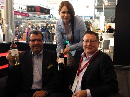
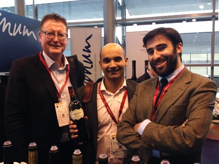
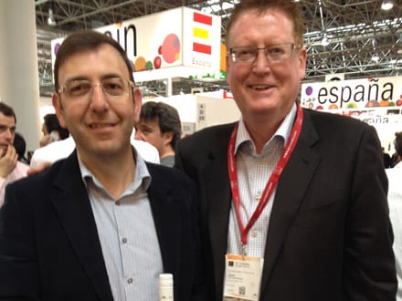
John’s latest travels saw him take in 14 cities in just 17 days, a whirlwind trip that was as productive as it was fast-paced. From Shanghai to London, Denmark to Sweden, each new destination saw John meeting with existing clients to discuss upcoming projects, as well as engaging with new clients, and researching and visiting printing suppliers.
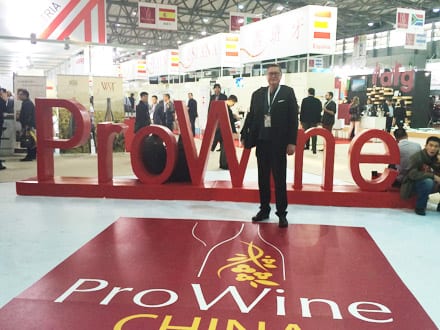
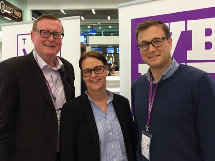
The trip began with a 4-day stop at ProWine China and despite the initial hiccup of a missing plane ticket and an expired Visa, John says.
I had 4 solid days of quality meetings with clients, both existing and new, and all eager to get design work underway. The perfect way to start such a busy trip.
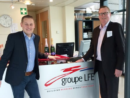
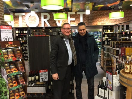
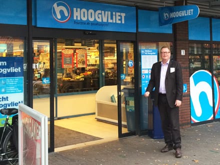
From ProWine it was off to Europe where, in addition to fostering client relationships, John took the opportunity to get out into the retail environment,
It’s imperative that I use these trips to study the shelves, see what designs are currently in the market in each location, and also take note of the way products are being displayed in-store. I filter all this back to the team and when I return we have a number of round-table discussions to identify new global trends.
It’s this process that ensures JJD is constantly at the cutting-edge of design. In addition to the market research, John says
I also get a buzz from seeing labels we’ve created out on shelves and performing successfully on the global stage. This is reinforcement not just for myself and the team that we are on-point, but it’s also reassurance for our new and existing clients.
During his travels, John was also looking to identify new technologies in printing and label application and was impressed by the calibre of suppliers he was able to unearth. If you’d like to take advantage of the knowledge John has acquired from his most recent travel, contact John Jewell Design.
Fast Five with John Jewell
What was your favourite show of 2014?
Without question, Prowein Dusseldorf. 10 years and still going strong, it’s one of the most powerful wine shows in the world thanks to the amount of trading that takes place and the professional manner in which it’s run.
Most beneficial show to attend?
I would have to say it’s a tie between Prowein and London Wine Show. We did some great business at both shows this year.
What did you take from your travelling this year?
It’s been interesting to see the current global trends in what people are drinking, as well as the evolving design styles in the different countries and how that will affect consumer attitudes and preferences in the future. I can’t say too much more – don’t want to give away all my secrets!
Why do you travel?
Quite simply, to build the John Jewell Design business. This occurs not only through face-to-face interaction with clients, but the market research undertaken on these trips is just as important to ensure the business can continue to grow and be relevant in the competitive design market.
What’s next for 2015?
I am planning shorter trips but more frequently throughout the year. This will allow us be more responsive in following up business opportunities, in turn, allowing us to better service our clients. We get such a great response from clients during these trips, but in a fast moving industry, these need to be followed up quickly or momentum is lost. This change to travel will really set the pace for the year.
03/12/2014
New Work: Fractal Wine Label Design
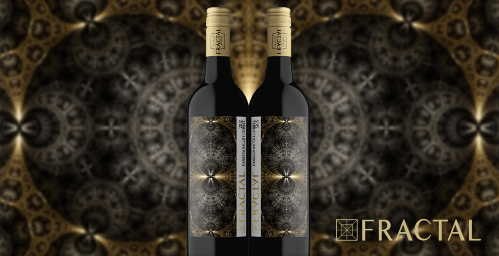
In creating the Fractal wine label, John Jewell Design was tasked with turning winemaker Bruce Clugston’s concept into reality. With a background in mathematics, Bruce was intrigued by fractal designs – structured mathematic formulae which give rise to beautiful patterns – and was searching for a way to utilise these captivating images on a wine label.
Bruce engaged the team at John Jewell Design, whose first task was to research fractal images and then search the globe for somebody who could produce the right designs utilizing this specific mathematical technique. A digital artist was finally located in the USA, and a consultative process began to source designs that best reflected the wines they would adorn.
The chosen images, once skilfully structured to work within the realm of a wine label, were then further enhanced by the use of fragmented foil, designed to give the patterns even more depth, as well as to illustrate the premium nature of the wines. In addition to the foiling, the packaging is further enriched by the use of gold and silver capsules. The final product is a stunning representation of Bruce’s initial vision and John Jewell Design’s knowledge and expertise.
If you’ve got an idea for a label and need the expertise of an award-winning design firm to help bring it to life, contact John Jewell Design.
A word from Bruce Clugston…
The fractal labels look amazing… They should win awards… Thank you to everyone.
Bruce Clugston, Wineinc
To keep your label relevant in a fast moving market, John Jewell Design believes there are two options; rejuvenate or renovate. Both are equally important, and it takes the skill of the John Jewell Design team to read the market and understand which option is the best for your brand.
To rejuvenate your label, subtle tweaks are made to the existing design. This breathes new life without making drastic changes or straying too far from the existing look. This option is utilised when the current label is still performing well, however requires a boost to ensure it stays on course and doesn’t begin to decline in appeal. The rejuvenated label is instantly recognisable as the same brand, but with updates to keep it fresh.
Renovating a label sees the development of a totally new design, only keeping identified key elements crucial to ensuring existing consumers are able to recognise the label on the shelf. When renovating a label, often a bold new approach is taken to ensure that the new design is ahead of the curve. This strategy ensures that the new design will have relevancy for years rather than just months, and also enhances the design’s ability to jump-off the shelf in an otherwise cluttered marketplace. Renovating a label is often the best course of action when a brand has plateaued and needs a fresh new image to reenergise sales, and encourage growth and reengagement from consumers.
If you think your label could use a facelift, contact the team at John Jewell Design and let their expertise determine if it’s time to rejuvenate or renovate.
20/10/2014
Wine Industry Outlook Conference 2014
John recently visited the Wine Industry Outlook Conference in Adelaide. John found the conference very informative.
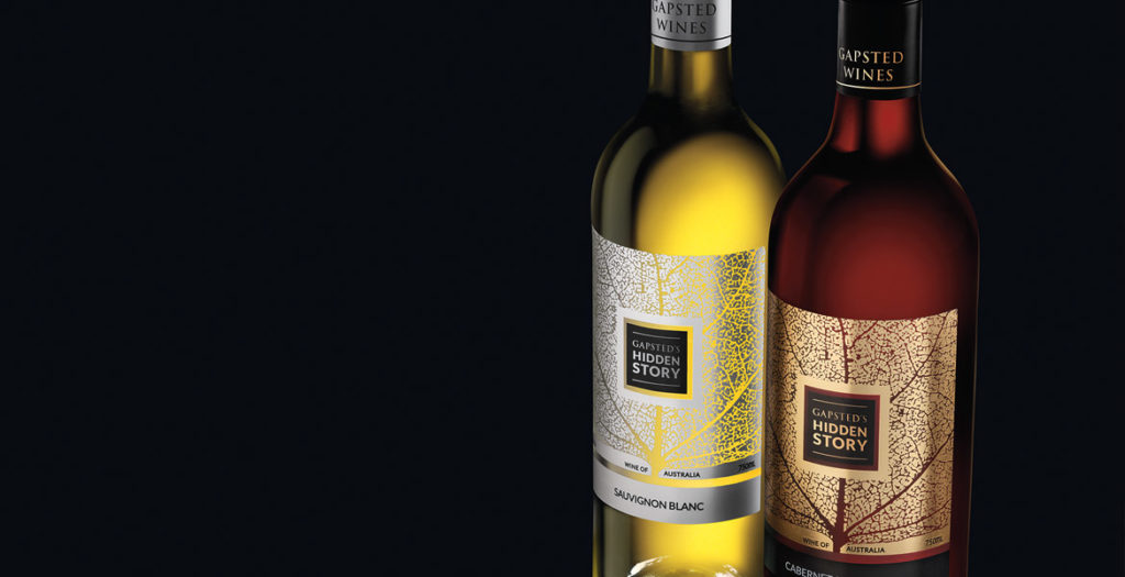
The innovation of the Hidden Story label lies in the combination and application of both paper, gold and silver foils on a clear adhesive label stock. This development for wine labels delivers a premium expensive look for a global market whilst still being cost effective for the client.
John Jewell Design devised the concept for the label, then sent the artwork to printing partners in Germany to prepare full-spec mock-ups for review. The print results were astounding and the overall concept achieved the brief of producing a label that would create maximum interest in a crowded retail environment, whilst delivering something not often seen in the industry.
The design’s objective was to convey the family lineage through a simple graphic representation. This was achieved twofold by illustrating the detailed veins of a leaf, which, upon further inspection, also depicts the silhouette of a tree. Both interpretations of the image symbolising the Gapsted Wines family tree.
So as not to detract from the powerful design, the branding was purposely kept to a minimum, and instead of producing a text heavy back label, a QR code is utilised, leading consumers to the Gapsted website for further information about the brand and the wines.
As times rapidly change, everything ages faster. Brand rejuvenation is an integral part of keeping your brand fresh and relevant to today’s consumers and can breathe life into a company, resulting in growth.
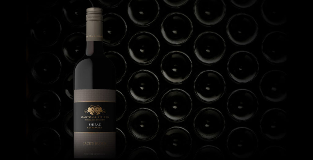
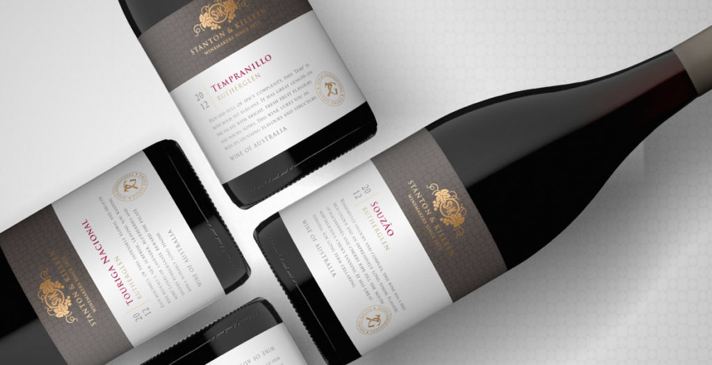
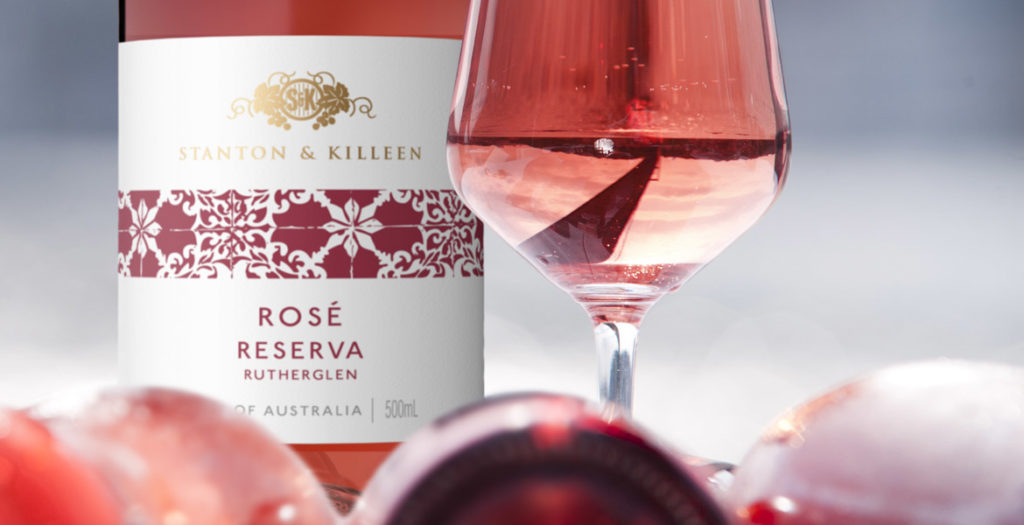
When updating the look and feel of an established brand, it is important to build on the brand’s heritage, to improve on their strengths and appeal to a new generation of consumers without alienating existing relationships. This is something John Jewell Design kept in mind when working with the internationally recognised Stanton & Killeen range.
The brief was to create a range of labels that reflected a sense of place and touched on the long history of the winery.
John Jewell Design developed a comprehensive look and feel that is truly in sync with the overall brand identity. From the Icon range through to the Limited Release, Premium and Everyday range the new labels project a sense of heritage and quality, with the use of rich gold speaking to the distinguished nature of the wines.
We feel the new labels stay true to our 140 year history, yet also invite new people to connect with our brand using contemporary design elements.Natasha Killeen
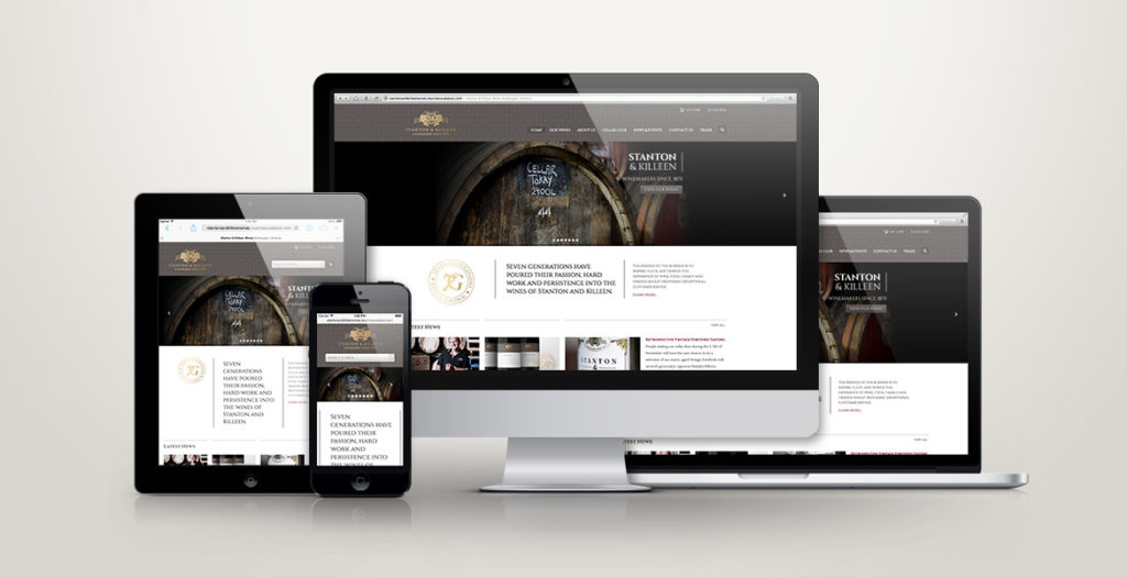
John Jewell Design also rebuilt the Stanton & Killeen Wines website which was very outdated in both look and functionality. Launched in February this year the new site has been a great success creating a modern, user-friendly design that unifies the Stanton & Killeen brand.
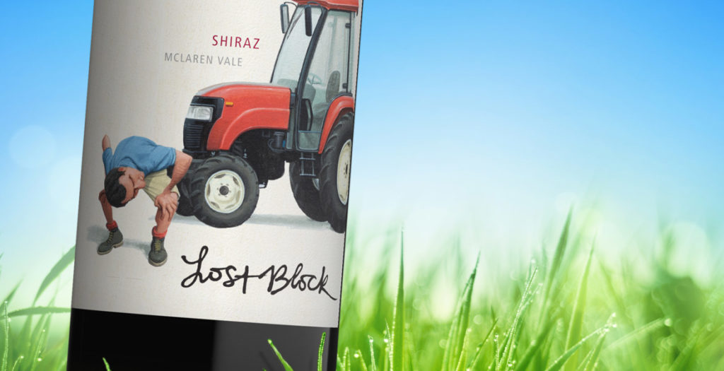
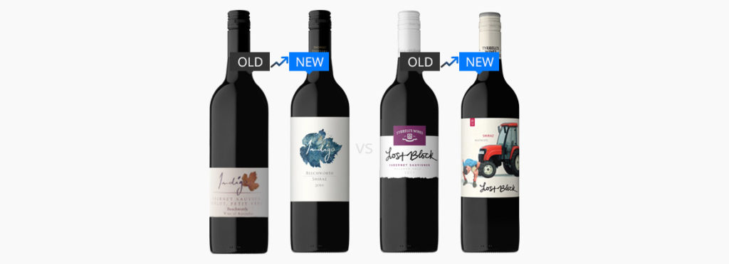
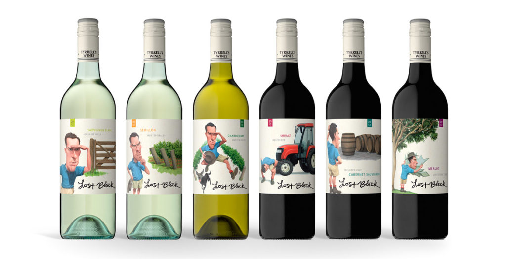
The strength of the new Lost Block labels lies in the distinctive and dynamic illustrations that were brought to life after months
of development.
The previous labels focused solely on typography, however when it came time to re-energise the brand, the brief given to the team at John Jewell Design
was to create a label that would appeal to a younger demographic while also conveying the story of the Lost Block in a contemporary fashion.
Illustration was key and months were spent on draft sketches to fine-tune the image of the Vineyard Manager, as his presence on each label would play an
integral role in tying the range together. A distinctive scenario was then created to distinguish each varietal, while still utilizing the same design
cues to ensure that each label worked together as part of a cohesive larger story.
Earthy tones were used to create the individual scenarios, whilst the distinctive blue of the vineyard manager’s shirt allows him and his ‘searching’ to
take center stage in each illustration.
To provide existing consumers of Lost Block with an easily identifiable link between the old and new labels, the original typography of the “Lost Block”
was preserved, and the Tyrrell’s name was incorporated into the capsule.
With bold illustrations and a fresh new face, this rebranding of one of Tyrrell’s flagship brands, re-energises it for a whole new generation of wine-lovers.
A word from Tyrrell’s…
What we wanted to achieve with this refresh was a more graphic depiction of the ”Lost Block” story, in an interesting and quirky way, we are very happy
with the final resultMike Cutrupi, Sales & Marketing Manager Tyrrell’s Wines
17/04/2014
Prowein – March 2014
John travels have seen him recently return from Prowein in Germany and Chengdu Wine Show in China.
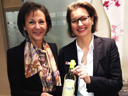
Prowein – Germany
John spent his time in Prowein catching up with our European clients, meeting with potential new ones and, with what little time he had left, exploring & researching the international market discovering new styles, trends & labelling techniques in the wine industry.

John’s discoveries will help John Jewell Design develop an extremely creative and varied style of labels whilst also focusing on developing a portfolio of BIB designs that are both revolutionary in the packaging and the imagery.
John also travelled extensively throughout Germany meeting with clients and printers.
It is always fascinating to see what the world is doing in wine and beverage packaging and discovering new wine trends like the “Hugo” brands in Germany and the raft of fruit wine blended products in the market in Europe. It is particularly gratifying to see the explosion of Prosecco sparkling styles now available John Jewell
John also found a number of brilliant printers in Germany that can produce the packaging that the John Jewell Design team needs to be able to satisfy our creative desires. There are some exciting design developments on the horizon.
