January 2016
24/01/2016
Wine Infusions
The whispers about wine infusions are now a buzz that cannot be ignored.
Led by European trends, predominately from Germany and the Netherlands, this category is growing rapidly. Winemakers and retailers alike are making strong moves towards wine infusions in an effort to secure the coveted 18-24 female demographic.
But what exactly is it that attracts consumers to wine infusions, and how can your label design capitalise on this trend?
There’s a whole host of reasons why wine infusions are generating so much interest amongst consumers. First and foremost, wine infusions are both lower in alcohol and lower in calories. For 18-24 year old females – who are generally very health conscious – this alone is hugely enticing.
Secondly, the addition of natural plant and fruit flavours means the wine infusions have a hint of sweetness that makes for a far more palatable drinking experience for those new to the world of wine. This, combined with the addition of a light spritz, makes for an overall easy drinking experience, particularly served over ice in the warmer months.
To a wine novice, the “rules” around wine can be confusing, and traditional wine blends are often perceived as harsh and too dry for an untrained palate. Fruit-driven infusions remove the mysticism around wine, providing a sweet, satisfying entry point for new consumers.
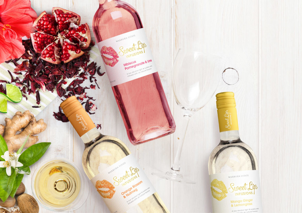
All this must be kept in mind when developing labels for wine infusion brands. It’s important to ensure the labels are both accessible and engaging to appeal to the new generation of wine consumer, steering clear of any old-world wine label cues. Labels should be bright and fun, reflecting the vibrant colours of the wine infusions themselves, whilst maintaining an overall finish that is both fresh and uncluttered.
The recently designed Sweet Lips reflects the above thinking. The label employs vibrant, striking colour that simultaneously draws the eye and acts as a subconscious cue to the flavours within. The vivid colours are given room to shine on a crisp white background with minimal distractions, while the use of gold foil adds a premium feel to the label.
If you’re interested in developing your own wine infusion brand, John Jewell Design has a range of off-the-shelf options available on their website for you to review and purchase. Check them out here.
21/01/2016
A year in travel
As a seasoned traveller who undertakes several international trips a year, John Jewell implemented a new travel strategy in 2015, undertaking shorter, more frequent trips, allowing leads and subsequent projects to be followed up faster and more effectively. With 2016 well underway, what are John’s thoughts on the new strategy?
The new approach to travel worked incredibly well in 2015. It allowed for increased exposure to international trends and even more dedicated face-to-face time with existing clients. When you travel as much as I do, it’s important to continually evaluate and refine the year’s travel strategy to make sure the time spent abroad is as productive as possible for both myself and my clients.
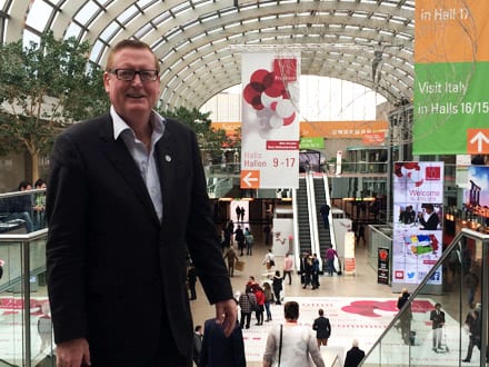
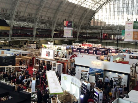
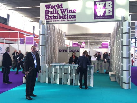
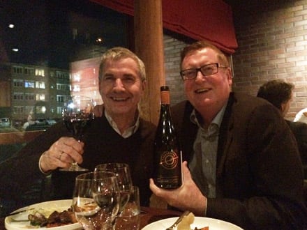
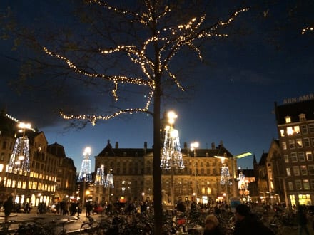
John spent almost 3 months overseas in 2015, attending wine shows such as Prowein, London International Wine Fair, Bordeaux Wine Fair and the Bulk Wine Exhibition in Amsterdam. The time abroad is also used to visit retailers to identify emerging trends and any shifts in the market. Of his discoveries for 2015, John says,
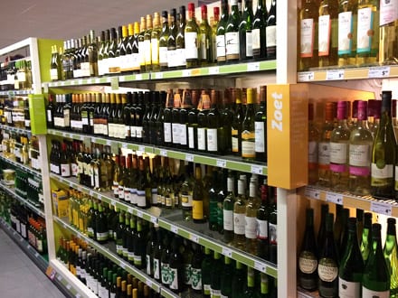
Supermarkets and wine stores are ranging wine by flavour profile rather than grape variety (i.e. Red wines are listed as either light, easy of powerful. White wines are listed as dry, medium sweet or sweet and Rose is listed as either fresh or sweet. Sparkling is still listed under the sparkling category), this is a big change in the way wine is displayed and we’ve yet to see this reflected in Australian retail outlets.
The other shift that has become evident in the last 12 months is the move in London and China from conservative wine label designs to more modern and contemporary styles. Specifically in China, this change seems to be driven by young entrepreneurs having an increased influence on the market.
Year after year, John still believes Prowein in Dusseldorf is his most successful, saying,
I’ve been attending Prowein for 12 years now and it continues to be the stand-out. In 2015 I was booked out for 3 days straight with meetings every 45 minutes for 8 hours each day.
The continual success of John’s visits to Prowein means this year he’ll be accompanied by Melissa, another member of the JJD team to help in delivering even greater outcomes from the fair.
The extra pair of legs on the ground isn’t the only change for the year ahead, 2016 will also see John attending additional wine shows in New York, Shanghai, Singapore and Hong Kong.
With all this locked in and other plans in the works, 2016 is already shaping up to be a busy one!
