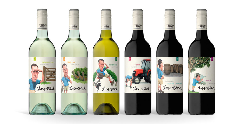
In: wine label design
The strength of the new Lost Block labels lies in the distinctive and dynamic illustrations that were brought to life after months
of development.
The previous labels focused solely on typography, however when it came time to re-energise the brand, the brief given to the team at John Jewell Design
was to create a label that would appeal to a younger demographic while also conveying the story of the Lost Block in a contemporary fashion.
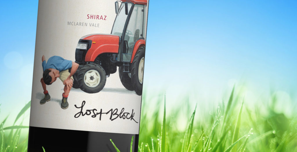
Illustration was key and months were spent on draft sketches to fine-tune the image of the Vineyard Manager, as his presence on each label would play an
integral role in tying the range together. A distinctive scenario was then created to distinguish each varietal, while still utilizing the same design
cues to ensure that each label worked together as part of a cohesive larger story.
Earthy tones were used to create the individual scenarios, whilst the distinctive blue of the vineyard manager’s shirt allows him and his ‘searching’ to
take center stage in each illustration.
To provide existing consumers of Lost Block with an easily identifiable link between the old and new labels, the original typography of the “Lost Block”
was preserved, and the Tyrrell’s name was incorporated into the capsule.
With bold illustrations and a fresh new face, this rebranding of one of Tyrrell’s flagship brands, re-energises it for a whole new generation of wine-lovers.
A word from Tyrrell’s…
What we wanted to achieve with this refresh was a more graphic depiction of the ”Lost Block” story, in an interesting and quirky way, we are very happy
with the final resultMike Cutrupi, Sales & Marketing Manager Tyrrell’s Wines
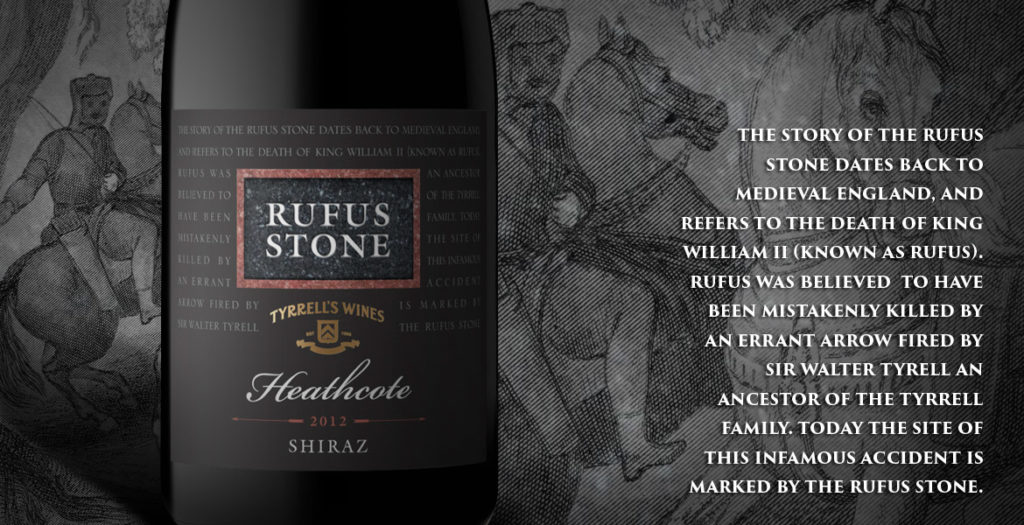
After nearly 20 years the Rufus label needed an update. John Jewell Design was able to provide that whilst maintaining the key elements of the packaging.
Bruce Tyrrell, Tyrrells Wines
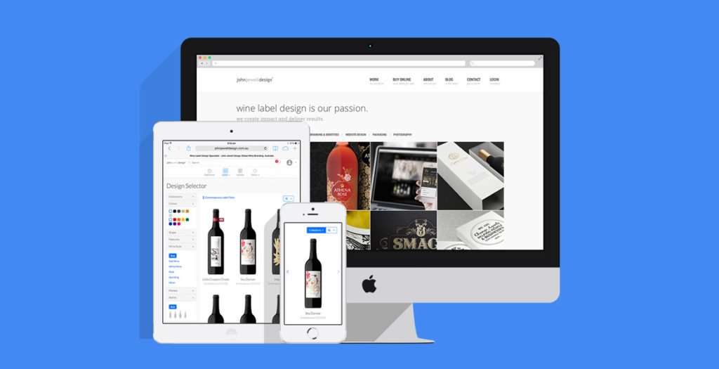
A great way to start the new year!
John Jewell design has kicked off 2014 with a brand new website that leads the way in both functionality and design.
With sharp lines and a crisp, clean aesthetic, the site is easy to navigate and provides the perfect setting for showcasing the best that John Jewell Design has to offer.
The new-look site boasts brand-new features such as the sophisticated “Design Selector”. It allows clients to search and filter label designs, get up close and personal with the easy-to-use zoom function, as well as reserve or store their favourite label designs.
Accompanying the release of the site, John Jewell Design has also launched two inspired new collections within their label catalogue. The “Promo Sale” collection is aimed at clients that have a tight budget and timeframe. It delivers premium, inexpensive design concepts ready for immediate use. The “Shrink Sleeve” collection is an innovative way to enhance any brand and achieve maximum shelf appeal.
All of these features work seamlessly across a range of different platforms, whether it be PC or Mac, phone or tablet, you can access the site from wherever you are.
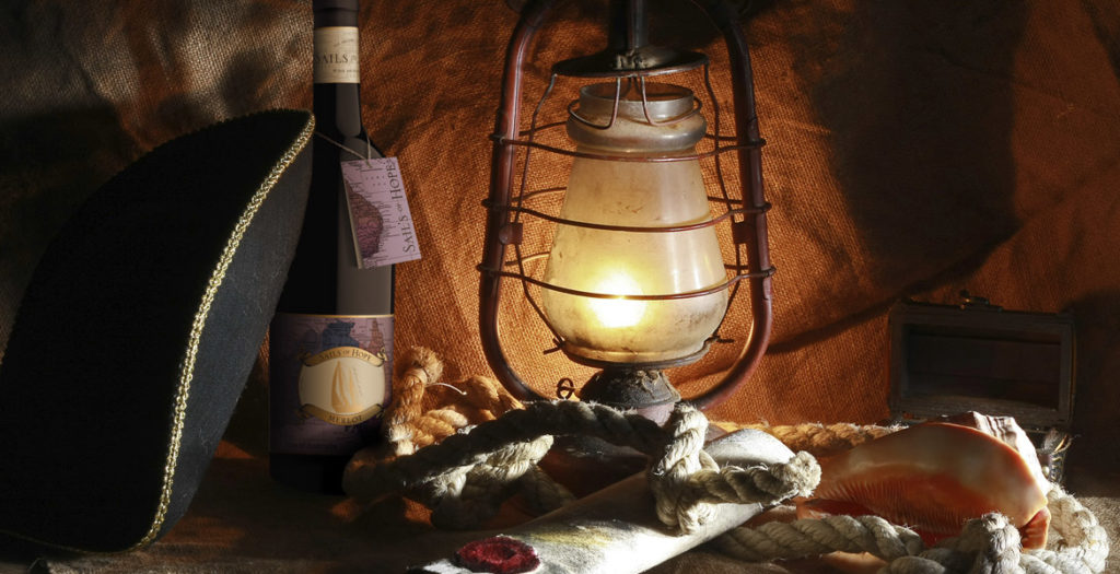
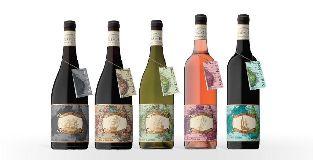
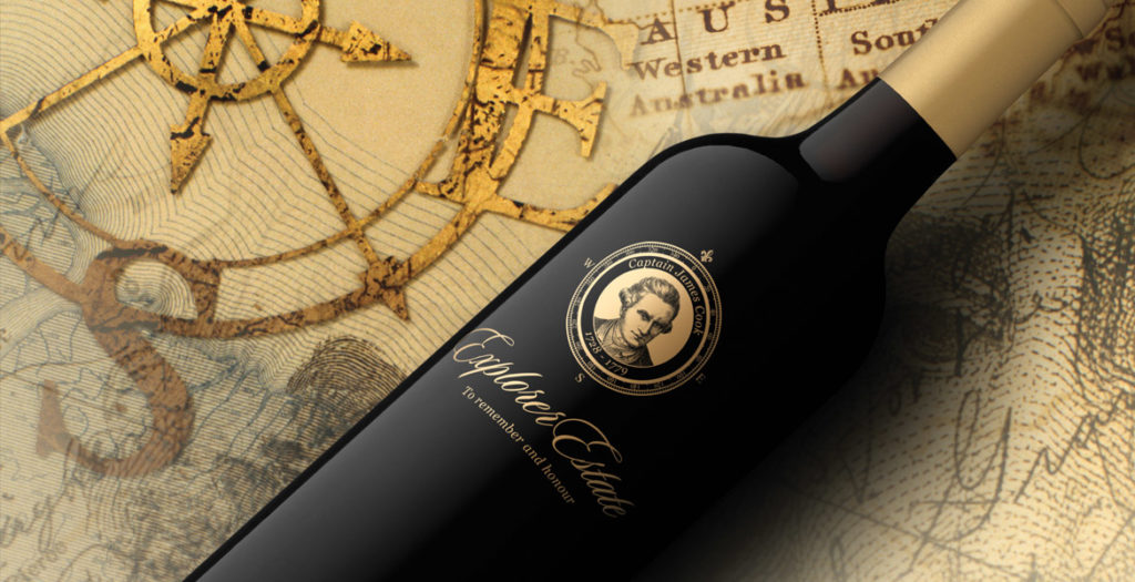
The ‘Sails of Hope’ label provided a unique opportunity for the team at John Jewell Design; create a heritage-style label, but give it a modern, youthful edge.
Starting with traditional ship illustrations and a request that the map of Australia should also be incorporated, our talented designer Bri was able to meld these elements with a lush, contemporary colour palette and a subtle use of rich, gold foil. What resulted was a label that spoke of history and tradition, whilst also portraying a youthful spirit. The clever use of colour allows the label to appeal to a broader audience, whilst still conveying a sense of prestige and quality.
The addition of the neck tag was another important feature of the design. Its seamless integration into the packaging allows the label to remain uncluttered whilst still providing consumers with detailed region and tasting information. It acts to strength shelf presence, providing consumers with a point of difference and by design, it’s removable nature means it can be kept as a cue for repeat purchase.
A word from Mica Australia…
Once again, the team at John Jewell design have done a tremendous job of bringing to life our vision; creating unique, eye-catching labels for a new range of wines. They were professional, easy to work with and created labels that were very much in line with our design brief. We are more than impressed with the quality of the work produced.
Josh P Sawyer, Mica Australia
12/11/2013
New Work: Summer White Wine Label Design
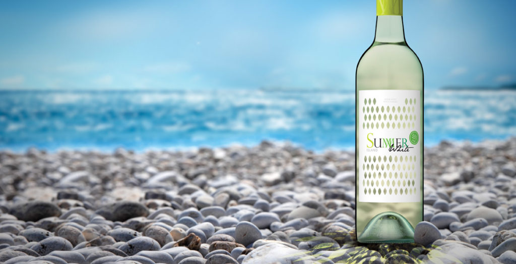
Innovative wine label design!
We were looking for an eye-catching and fresh approach for a category that is just building up in Europe. John Jewell Design came up with a great idea first time round. They createda cost-effective packaging concept taking into account technical feasibility. We are confident that this label will be the break-through for our product!
Heidrun Bebendorf, WSK OSTRAU GmbH
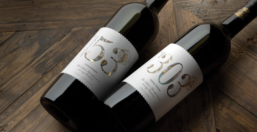
We have been very impressed with the design of our 2 labels, the ‘53’ and ‘303’. John Jewell Design has struck just the right balance in creating something of a contemporary style while at the same time maintaining a distinct level of elegance and sophistication, which is perhaps more associated with traditional ‘old world’ label design.
We needed something that would be eye-catching and stand out on the shelf, yet at the same time we needed to be mindful of what consumers in our target market have come to expect in terms of wine label design. It couldn’t be anything too eclectic and ‘out there’, but we also wanted to get away from some of the boring clichés common of the more traditional label styles. John’s design accomplished all of that, and we could not be happier with how our target consumers have responded to these labels. The end result has been a pair of labels that are stylish, attractive to the eye and unique in their own way.
Josh Sawyer, Marketing Coordinator Mica Australia
28/03/2013
Catalogue Revamp
In the last three months John Jewell Design has been working hard to create new innovative wine label designs for our catalogue. There are now over 250 wine labels for our clients to choose from in all styles to suit your needs. These labels can be accessed from our online catalogue.
Happy browsing.
15/01/2013
New Work: Athena Rosé Wine Label Design
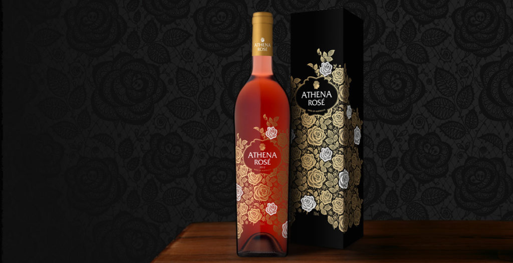
A feminine aesthetic, a premium offering and a touch of mysticism were the key drivers of the brief in creating Athena Rosé.
This stand-alone Rosé would join the current stable of wines, however it was to be a completely unique proposition, with a specifically female target market and designed to be seated as a super premium offering within the range.
To achieve the feminine atmosphere that our client was seeking, the completed imagery features an intricate lace-like design, which is further enhanced by the use of gold foil with striking white accents. The artwork was screen printed directly onto the bottle and by using this technique we were able to achieve an elegant sense of fluidity that would not have been possible with traditional label printing methods. This also allowed the colour of the bottled Rosé to play an integral part in the design, filling the space between the roses, enhancing the beauty of the artwork and ensuring the gold foil shimmers.
The rose-patterned design wraps completely around the bottle, delivering a lush, seamless finish, while the use of minimal text allows the beauty of the design to shine through without distraction.
With a name heralded from a Greek goddess, the label has a sense of wonder, a touch of the divine, and so an image of Athena’s face in profile was incorporated into the design to tie-back to the brand name.
To underpin the feminine nature of the brand, a slim, elegant French bottle was selected, allowing the design ample room to dreamily encompass the space, and was completed with a gold foil capsule.
The elegant imagery of Athena Rosé was reinforced by its application across all packaging and marketing materials, ensuring a complete sensory experience for consumers.
A word from Mica Australia…
We’ve been fortunate enough to work with John Jewell on a number of occasions now and we’ve always been very impressed with the quality of his work. In this instance however, when it came to the final design for our ‘Athena Rose’, his work exceeded all of our expectations and we’re absolutely delighted with how the artwork turned out. With only a short marketing brief from which to get an idea of the direction we wished to take, John has come back with a design that perfectly hits the mark. It’s detailed, intricate and extremely sophisticated; a design that we feel confident will help to position the product as intended in the eyes of target consumer segments.
John Jewell is very capable and passionate designer that has an intimate knowledge of what makes for a successful wine label. I cannot recommend him highly enough.Josh P Sawyer, Mica Australia
This is fantastic work! When the design came out, we knew it was going to sell well. The finished product was even better than we expected, our customer loves it. Thanks John Jewell Design!
George Wang, WinWorld Australia
21/11/2012
New Work: Journey Wines Label
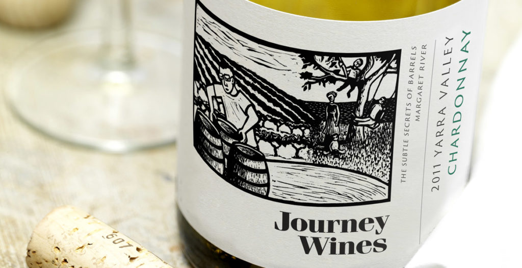
I couldn’t be happier with Kim’s work on the Journey Wines label design. They are brilliant at interpreting a brief, the reaction to the labels in the market has been exceptional!
Damian North, Managing Director & Winemaker, Journey Wines
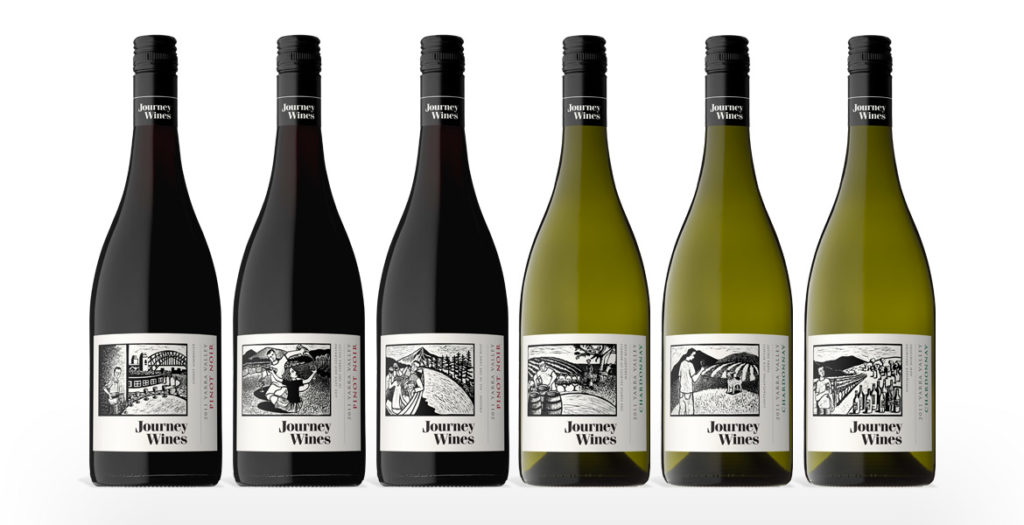
Linocuts by Shana James
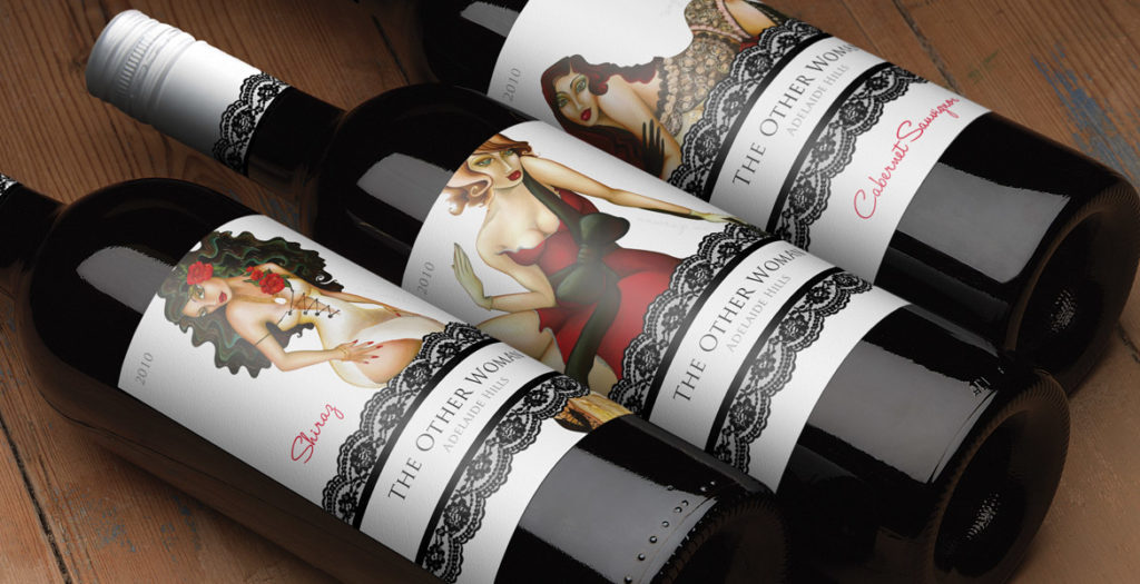
John Jewell Design has won bronze at the 2011 LATMA Label Competition.
The striking, contemporary label design was entered in the Flexo – Colour Process category and was printed by Studio Labels, Adelaide. Graphic designer Kim Ratcliffe, from John Jewell Design, created the award winning ‘The Other Woman’ wine label.
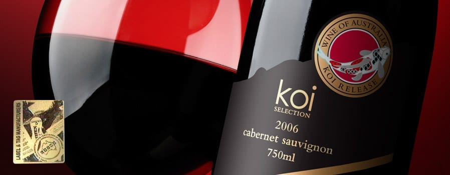
Albury design firm, John Jewell Design has won silver at the 2010 LATMA Label Competition.
The striking, contemporary label design was entered in the Flexo – Colour Process category and was printed by Studio Labels, Adelaide. Graphic designer Megan McPherson, from John Jewell Design, created the award winning ‘Koi Selection’ Cabernet Sauvignon wine label for a client in Guangzhou, China.
