In: wine infusions
24/01/2016
Wine Infusions
The whispers about wine infusions are now a buzz that cannot be ignored.
Led by European trends, predominately from Germany and the Netherlands, this category is growing rapidly. Winemakers and retailers alike are making strong moves towards wine infusions in an effort to secure the coveted 18-24 female demographic.
But what exactly is it that attracts consumers to wine infusions, and how can your label design capitalise on this trend?
There’s a whole host of reasons why wine infusions are generating so much interest amongst consumers. First and foremost, wine infusions are both lower in alcohol and lower in calories. For 18-24 year old females – who are generally very health conscious – this alone is hugely enticing.
Secondly, the addition of natural plant and fruit flavours means the wine infusions have a hint of sweetness that makes for a far more palatable drinking experience for those new to the world of wine. This, combined with the addition of a light spritz, makes for an overall easy drinking experience, particularly served over ice in the warmer months.
To a wine novice, the “rules” around wine can be confusing, and traditional wine blends are often perceived as harsh and too dry for an untrained palate. Fruit-driven infusions remove the mysticism around wine, providing a sweet, satisfying entry point for new consumers.
All this must be kept in mind when developing labels for wine infusion brands. It’s important to ensure the labels are both accessible and engaging to appeal to the new generation of wine consumer, steering clear of any old-world wine label cues. Labels should be bright and fun, reflecting the vibrant colours of the wine infusions themselves, whilst maintaining an overall finish that is both fresh and uncluttered.
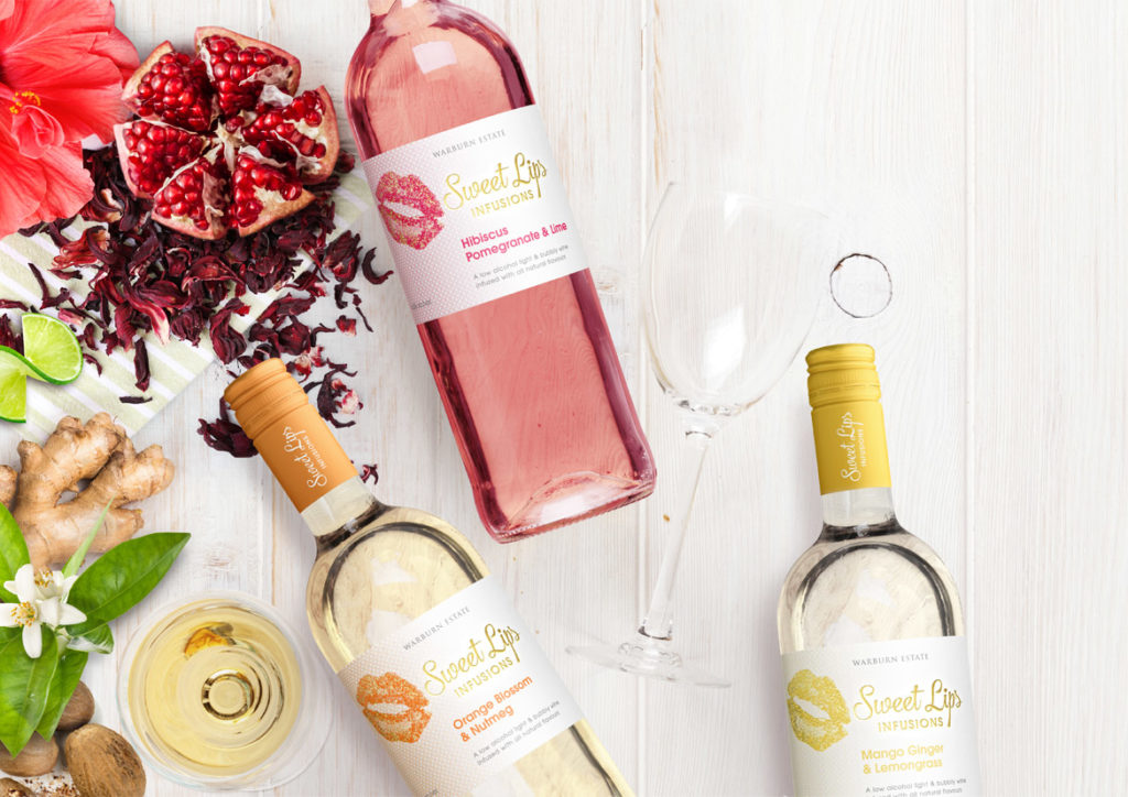
The recently designed Sweet Lips reflects the above thinking. The label employs vibrant, striking colour that simultaneously draws the eye and acts as a subconscious cue to the flavours within. The vivid colours are given room to shine on a crisp white background with minimal distractions, while the use of gold foil adds a premium feel to the label.
If you’re interested in developing your own wine infusion brand, John Jewell Design has a range of off-the-shelf options available on their website for you to review and purchase. Check them out here.
