In: brand rejuvenation
Often when we think of updating a label we imagine a complete overhaul with major changes to logo, layout, colour and typeface. This doesn’t always have to be the case though and sometimes the most effective label updates are those that require a subtle nip-and-tuck rather than an entire facelift.
The Challenge:
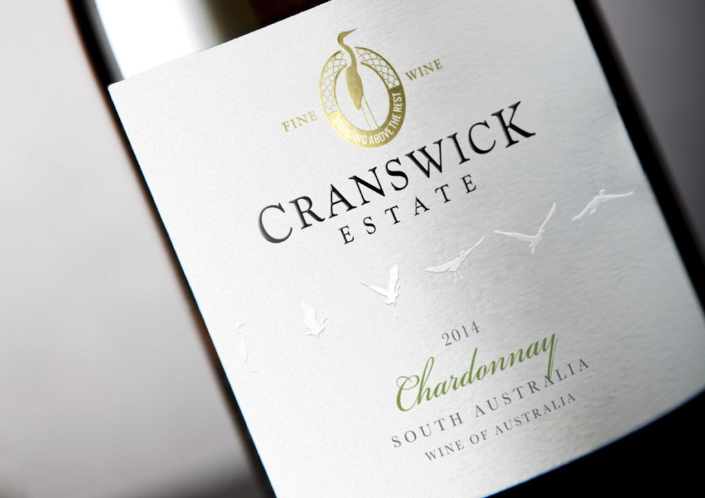
The Cranswick Estate label had provided eight solid years of service and whilst it was a solid performer, the march of time required certain updates be made to ensure relevancy in a busy marketplace, whilst still remaining true to the core elements of the original label.
The Solution:
The first task was to identify the key elements that would be carried across to the new label – such as the crane motif and logo style – as well as deduce what new elements were to be incorporated to breathe freshness into the design.
To create a contemporary look, the die-cut lozenge made way for a straight label that immediately raised the tone of the whole design and set the scene for the changes to come. The crane image from the existing logo remained the same but the design was reworked from a solid-colour block into a gold foil portrayal that was both intricate and refined, and served to add premium quality cues.
The bird flight path was retained, however the background label colour was changed from white to a soft grey and the birds were then embossed and changed to white. With this new treatment, they were then moved into the middle of the label to give them prominence and ensure their new look was given plenty of room to fly off the label and grab consumer attention.
Finally, a subtle tweak was made to the varietal font to deliver a classic feel without straying too far from the original.
In Closing:
When a brand is strong and the imagery is still considered crisp and clean, only small changes need to occur to achieve a striking, contemporary update whilst still remaining true to the label that came before.
08/06/2015
The Impact of a Wine Label

Why are labels so important to our wine-buying choices?
In a busy bottleshop, where shelves are crowded and the choice can be overwhelming, it’s not the winemaker’s resume or even the price that will sell your wine. Learnings from consumer psychology tell us that most wine sales are made purely on the strength of a label.
The reality is most consumers aren’t connoisseurs; they are customers looking to buy an experience.
What their searching eyes see on your wine label lays the foundations for that experience. Purposeful and carefully crafted visual cues subtly influence perceptions of price, quality and even taste.
To encourage a hand to reach deeper into their pocket, consumers expect to see labels that feature minimalist, uncluttered designs and an elegant, refined font. Adding texture – such as embossing – provides a tactile feature that activates increased perceptions of price and correlates with heightened anticipation and an increased drinking experience.
To sell a wine at a value-for-money price point, labels need to visually jump off the shelf through the careful construction of bright colours, bold, fun graphics and quirky or unique fonts.
At the end of the day, your label sets the tone for your customer’s experience and is often as important – if not more important – in driving the sale than the wine itself.
John Jewell spends several months every year traveling the world and acquiring insights into consumer psychology, preferences and trends to bring back home and translate into eye-catching, award-winning labels for his clients. If you have a label or brand that could benefit from John’s experience and knowledge, give him a call on: +61 (0)2 6040 4433 or send him an email.
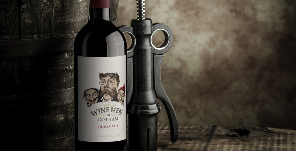
Rejuvenating the Wine Men of Gotham label was about finding a way to pull the existing label into the current market; the key to achieving this was colour.
The existing Wine Men of Gotham label had been in the market for a number of years and was ready for a facelift to ensure it stayed on course. The first task was to take the original black and white illustration and add colour in such a way that the design would feel fresh but still be recognisable. To ensure the illustration had stronger cut-through, the background needed to be stripped back to a crisp white, allowing the now coloured illustration plenty of white space to punch out of the label. Rather than being heavy-handed with varietal colours on the label, bold coloured capsules were used to reinforce individual varietals and make them easier to identify at a glance. This ensured the integrity of the label design was not compromised, but still achieved the varietal differentiation that consumers look for in the retail space. The rejuvenated Wine Men of Gotham label continues to project the same premium cues as the previous label, and also delivers a fresh new image that will see the brand stay relevant in the market for many years to come.
To keep your label relevant in a fast moving market, John Jewell Design believes there are two options; rejuvenate or renovate. Both are equally important, and it takes the skill of the John Jewell Design team to read the market and understand which option is the best for your brand.
To rejuvenate your label, subtle tweaks are made to the existing design. This breathes new life without making drastic changes or straying too far from the existing look. This option is utilised when the current label is still performing well, however requires a boost to ensure it stays on course and doesn’t begin to decline in appeal. The rejuvenated label is instantly recognisable as the same brand, but with updates to keep it fresh.
Renovating a label sees the development of a totally new design, only keeping identified key elements crucial to ensuring existing consumers are able to recognise the label on the shelf. When renovating a label, often a bold new approach is taken to ensure that the new design is ahead of the curve. This strategy ensures that the new design will have relevancy for years rather than just months, and also enhances the design’s ability to jump-off the shelf in an otherwise cluttered marketplace. Renovating a label is often the best course of action when a brand has plateaued and needs a fresh new image to reenergise sales, and encourage growth and reengagement from consumers.
If you think your label could use a facelift, contact the team at John Jewell Design and let their expertise determine if it’s time to rejuvenate or renovate.
As times rapidly change, everything ages faster. Brand rejuvenation is an integral part of keeping your brand fresh and relevant to today’s consumers and can breathe life into a company, resulting in growth.
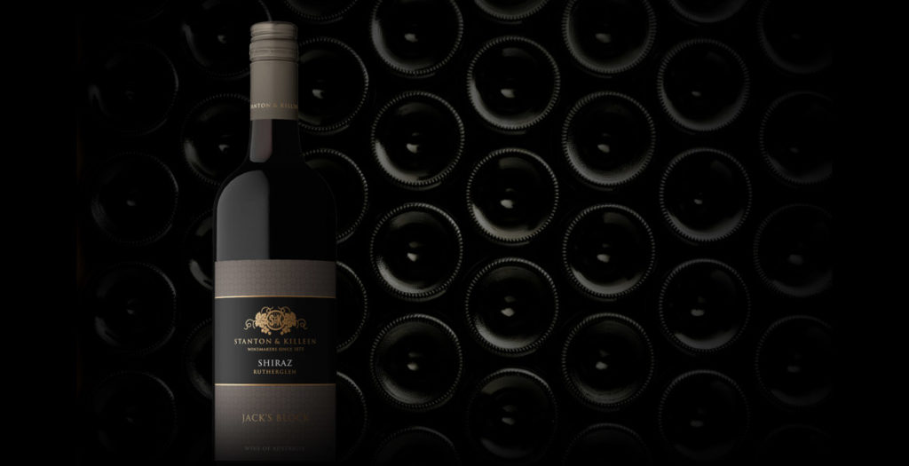
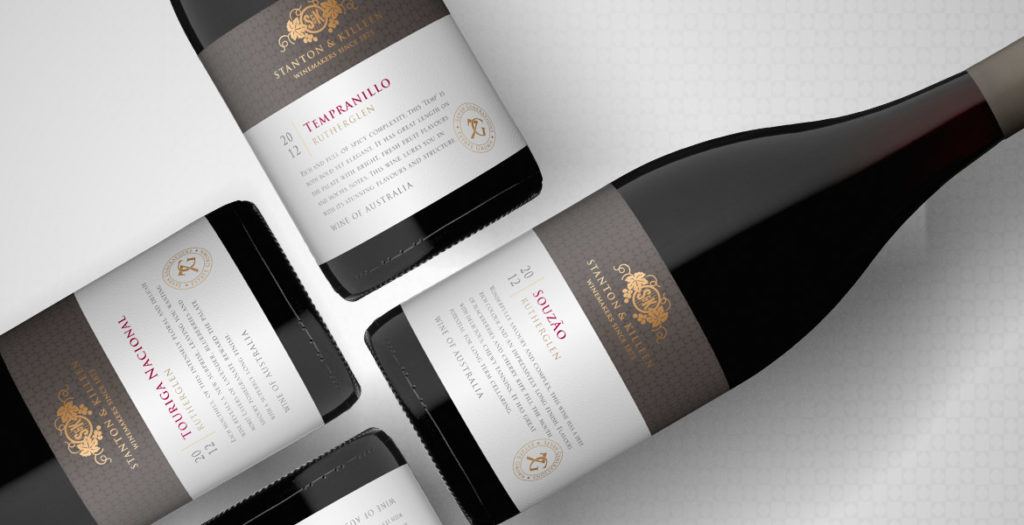
When updating the look and feel of an established brand, it is important to build on the brand’s heritage, to improve on their strengths and appeal to a new generation of consumers without alienating existing relationships. This is something John Jewell Design kept in mind when working with the internationally recognised Stanton & Killeen range.
The brief was to create a range of labels that reflected a sense of place and touched on the long history of the winery.
John Jewell Design developed a comprehensive look and feel that is truly in sync with the overall brand identity. From the Icon range through to the Limited Release, Premium and Everyday range the new labels project a sense of heritage and quality, with the use of rich gold speaking to the distinguished nature of the wines.
We feel the new labels stay true to our 140 year history, yet also invite new people to connect with our brand using contemporary design elements.Natasha Killeen
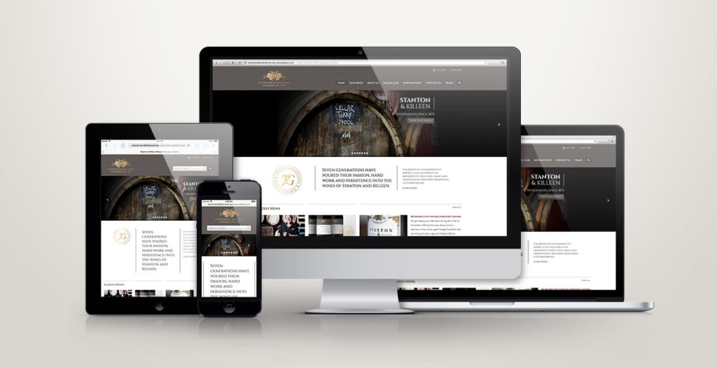
John Jewell Design also rebuilt the Stanton & Killeen Wines website which was very outdated in both look and functionality. Launched in February this year the new site has been a great success creating a modern, user-friendly design that unifies the Stanton & Killeen brand.
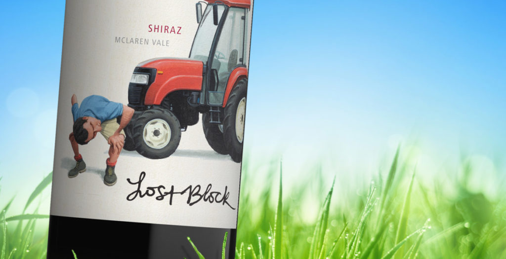
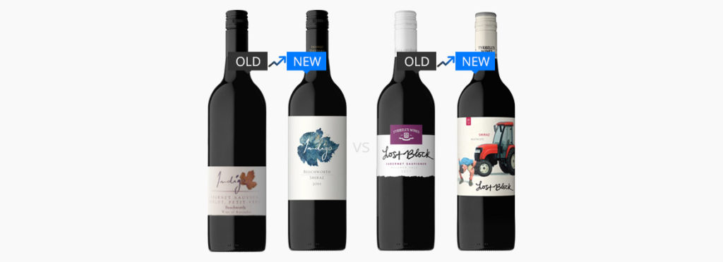
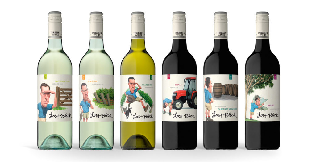
The strength of the new Lost Block labels lies in the distinctive and dynamic illustrations that were brought to life after months
of development.
The previous labels focused solely on typography, however when it came time to re-energise the brand, the brief given to the team at John Jewell Design
was to create a label that would appeal to a younger demographic while also conveying the story of the Lost Block in a contemporary fashion.
Illustration was key and months were spent on draft sketches to fine-tune the image of the Vineyard Manager, as his presence on each label would play an
integral role in tying the range together. A distinctive scenario was then created to distinguish each varietal, while still utilizing the same design
cues to ensure that each label worked together as part of a cohesive larger story.
Earthy tones were used to create the individual scenarios, whilst the distinctive blue of the vineyard manager’s shirt allows him and his ‘searching’ to
take center stage in each illustration.
To provide existing consumers of Lost Block with an easily identifiable link between the old and new labels, the original typography of the “Lost Block”
was preserved, and the Tyrrell’s name was incorporated into the capsule.
With bold illustrations and a fresh new face, this rebranding of one of Tyrrell’s flagship brands, re-energises it for a whole new generation of wine-lovers.
A word from Tyrrell’s…
What we wanted to achieve with this refresh was a more graphic depiction of the ”Lost Block” story, in an interesting and quirky way, we are very happy
with the final resultMike Cutrupi, Sales & Marketing Manager Tyrrell’s Wines
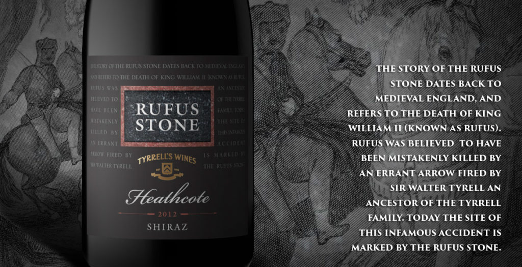
After nearly 20 years the Rufus label needed an update. John Jewell Design was able to provide that whilst maintaining the key elements of the packaging.
Bruce Tyrrell, Tyrrells Wines
