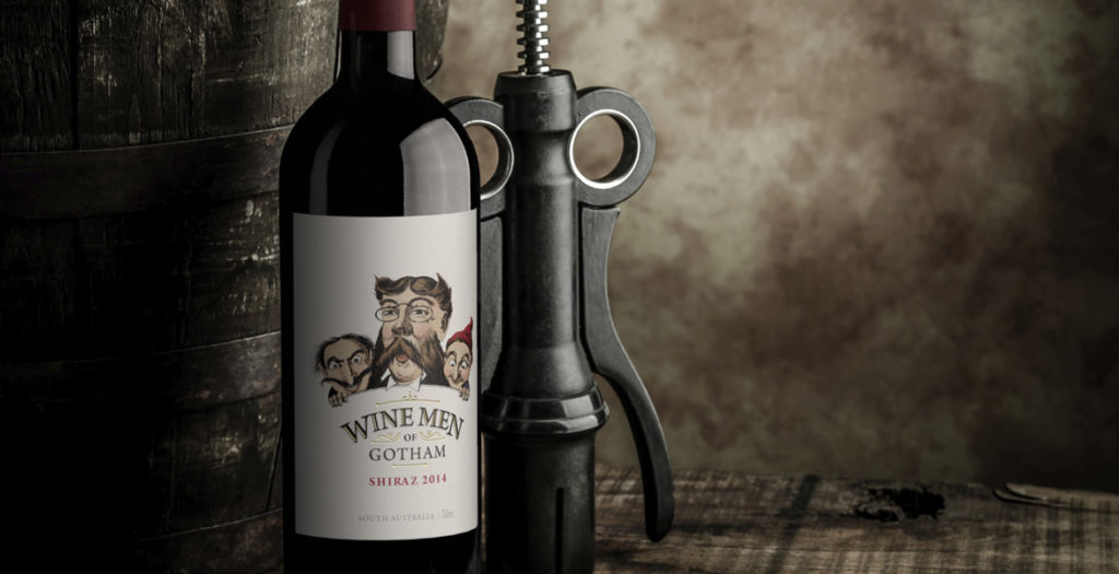
Rejuvenating the Wine Men of Gotham label was about finding a way to pull the existing label into the current market; the key to achieving this was colour.
The existing Wine Men of Gotham label had been in the market for a number of years and was ready for a facelift to ensure it stayed on course. The first task was to take the original black and white illustration and add colour in such a way that the design would feel fresh but still be recognisable. To ensure the illustration had stronger cut-through, the background needed to be stripped back to a crisp white, allowing the now coloured illustration plenty of white space to punch out of the label. Rather than being heavy-handed with varietal colours on the label, bold coloured capsules were used to reinforce individual varietals and make them easier to identify at a glance. This ensured the integrity of the label design was not compromised, but still achieved the varietal differentiation that consumers look for in the retail space. The rejuvenated Wine Men of Gotham label continues to project the same premium cues as the previous label, and also delivers a fresh new image that will see the brand stay relevant in the market for many years to come.
